How to Insert a Layout, Collection and Blog to a Static Site in Shopify
Drive 20-40% of your revenue with Avada
To make your website more beautiful and to help you present more detailed information on your products or brand to customers, inserting a layout, collection, and blog to your static site is a must; however, the layout, collection, and blog can be hard to maintain. With the writing on how to insert a layout, collection and blog to a static site which includes the detailed guideline, we hope that you can easily insert a layout, collection, and blog to your static site and easily maintain them.
In this instructional writing, we will convert a free HTML 5 template into a Jekyll site. Please read the steps carefully to get your problems solved in a few minutes.
Related Posts:
- How to add selection conditions for an automated collection on Shopify
- How to insert Disqus to your blog in Shopify
- How to insert breadcrumb navigation to your store in Shopify
How to insert a layout, collection, and blog to a static site
1. Setup
Step 1: Download and setup your theme
In this instruction, we will be using the theme called Creative, which can be downloaded here. After the theme is downloaded, you have to unzip it, navigate to the directory in the terminal then run jekyll serve.
$ cd ~/Downloads/creative # or wherever you've unzipped the template
$ jekyll serve
Step 2: Open your site
To open and see your site, open your browser then navigate to http://localhost:4000 .

2. Layouts
Since it’s a four-page static site and the header, navigation, and footer of each page are repeated, we need to reduce this repetition with a layout.
Step 1: Create /_layouts/default.html
In this step, the first thing to do is to create /_layouts/default.html and copy the contents of index.html into it.
Next, replace the content in the layout that changes between pages with placeholder variable. You also need to replace all the contents of <title> with {{ page.title }}, which helps you to easily change it on each page.
<!DOCTYPE html>
<html lang="en">
  <head>
    <meta charset="utf-8">
    <meta http-equiv="X-UA-Compatible" content="IE=edge">
    <meta name="viewport" content="width=device-width, initial-scale=1">
    <meta name="description" content="">
    <meta name="author" content="">
    <title>Creative - {{ page.title }}</title>
    <!-- Bootstrap Core CSS -->
    <link rel="stylesheet" href="/css/bootstrap.min.css" type="text/css">
    <!-- Custom Fonts -->
    <link href='http://fonts.googleapis.com/css?family=Open+Sans:300italic,400italic,600italic,700italic,800italic,400,300,600,700,800' rel='stylesheet' type='text/css'>
    <link href='http://fonts.googleapis.com/css?family=Merriweather:400,300,300italic,400italic,700,700italic,900,900italic' rel='stylesheet' type='text/css'>
    <link rel="stylesheet" href="/font-awesome/css/font-awesome.min.css" type="text/css">
    <!-- Custom CSS -->
    <link rel="stylesheet" href="/css/creative.css" type="text/css">
    <!-- HTML5 Shim and Respond.js IE8 support of HTML5 elements and media queries -->
    <!--[if lt IE 9]>
    <script src="https://oss.maxcdn.com/libs/html5shiv/3.7.0/html5shiv.js"></script>
    <script src="https://oss.maxcdn.com/libs/respond.js/1.4.2/respond.min.js"></script>
    <![endif]-->
  </head>
  <body id="page-top">
    <nav id="mainNav" class="navbar navbar-default navbar-fixed-top">
      <div class="container-fluid">
        <!-- Brand and toggle get grouped for better mobile display -->
        <div class="navbar-header">
          <button type="button" class="navbar-toggle collapsed" data-toggle="collapse" data-target="#bs-example-navbar-collapse-1">
          <span class="sr-only">Toggle navigation</span>
          <span class="icon-bar"></span>
          <span class="icon-bar"></span>
          <span class="icon-bar"></span>
          </button>
          <a class="navbar-brand page-scroll" href="/">Start Bootstrap</a>
        </div>
        <!-- Collect the nav links, forms, and other content for toggling -->
        <div class="collapse navbar-collapse" id="bs-example-navbar-collapse-1">
          <ul class="nav navbar-nav navbar-right">
            <li>
              <a href="/about.html">About</a>
            </li>
            <li>
              <a href="/services.html">Services</a>
            </li>
            <li>
              <a href="/portfolio.html">Portfolio</a>
            </li>
          </ul>
        </div>
        <!-- /.navbar-collapse -->
      </div>
      <!-- /.container-fluid -->
    </nav>
    {{ content }}
    <section id="contact">
      <div class="container">
        <div class="row">
          <div class="col-lg-8 col-lg-offset-2 text-center">
            <h2 class="section-heading">Let's Get In Touch!</h2>
            <hr class="primary">
            <p>Ready to start your next project with us? That's great! Give us a call or send us an email and we will get back to you as soon as possible!</p>
          </div>
          <div class="col-lg-4 col-lg-offset-2 text-center">
            <i class="fa fa-phone fa-3x wow bounceIn"></i>
            <p>123-456-6789</p>
          </div>
          <div class="col-lg-4 text-center">
            <i class="fa fa-envelope-o fa-3x wow bounceIn" data-wow-delay=".1s"></i>
            <p><a href="mailto:[email protected]">[email protected]</a></p>
          </div>
        </div>
      </div>
    </section>
    <!-- jQuery -->
    <script src="/js/jquery.js"></script>
    <!-- Bootstrap Core JavaScript -->
    <script src="/js/bootstrap.min.js"></script>
  </body>
</html>
Step 2: Remove the HTML content
Next, you are now able to load the default layout on index.html and set a title in the front matter. After that, you can remove the HTML content in the layout.
---
layout: default
title: A Bootstrap theme
---
<header>
  <div class="header-content">
    <div class="header-content-inner">
      <h1>Your Favorite Source of Free Bootstrap Themes</h1>
      <hr>
      <p>Start Bootstrap can help you build better websites using the Bootstrap CSS framework! Just download your template and start going, no strings attached!</p>
      <a href="/about.html" class="btn btn-primary btn-xl page-scroll">Find Out More</a>
    </div>
  </div>
</header>
<aside class="bg-dark">
  <div class="container text-center">
    <div class="call-to-action">
      <h2>Free Download at Start Bootstrap!</h2>
      <a href="/services.html" class="btn btn-default btn-xl wow tada">Download Now!</a>
    </div>
  </div>
</aside>
Step 3: Fix up the other pages
In this step, you have to fix up about.html, services.html, and portfolio.html which all have a block of HTML for the heading.
...
<section class="bg-dark">
  <div class="text-center">
    <h1>About</h1>
  </div>
</section>
...
So as to reduce the repetition in the source code of every page, creating another layout that inherits from the _layouts/default.html is the next thing you should do.
Following the content below, let’s create _layouts/page.html.
---
layout: default
---
<section class="bg-dark">
  <div class="text-center">
    <h1>{{ page.title }}</h1>
  </div>
</section>

{{ content }}
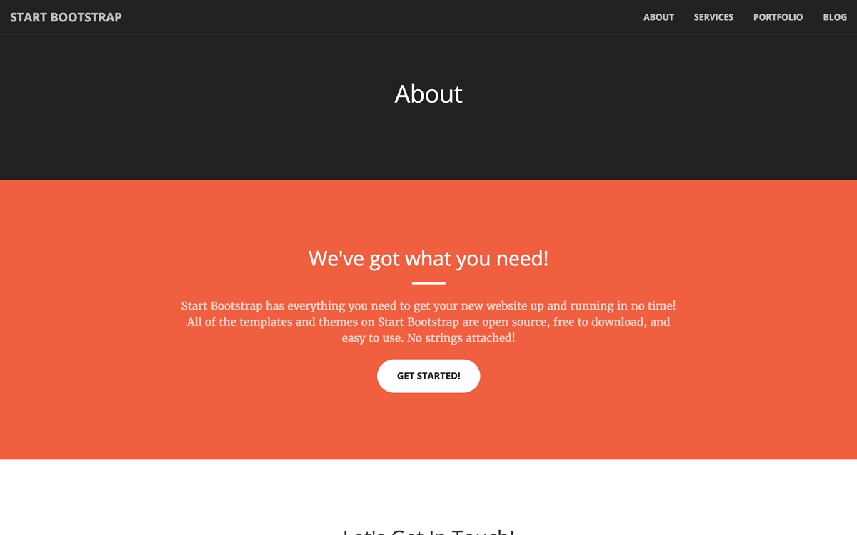
This layout can now be used in about.html, services.html and portfolio.html without repeating source code. This is an example of how about.html looks like:
---
layout: page
title: About
---
<section class="bg-primary" id="about">
  <div class="container">
    <div class="row">
      <div class="col-lg-8 col-lg-offset-2 text-center">
        <h2 class="section-heading">We've got what you need!</h2>
        <hr class="light">
        <p class="text-faded">Start Bootstrap has everything you need to get your new website up and running in no time! All of the templates and themes on Start Bootstrap are open source, free to download, and easy to use. No strings attached!</p>
        <a href="#" class="btn btn-default btn-xl">Get Started!</a>
      </div>
    </div>
  </div>
</section>
3. Collection
In portfolio.html, each portfolio item has an image, category and project name, and the rest of the code is repeated. To avoid repeating the code, we use a collection.
<div class="col-lg-4 col-sm-6">
  <a href="#" class="portfolio-box">
    <img src="/img/portfolio/1.jpg" class="img-responsive" alt="">
    <div class="portfolio-box-caption">
      <div class="portfolio-box-caption-content">
        <div class="project-category text-faded">
          Category
        </div>
        <div class="project-name">
          Project Name
        </div>
      </div>
    </div>
  </a>
</div>
Step 1: Create _config.yml and set up a collection
The first thing to do is to create _config.yml and set up a collection.
collections:
  portfolio:
Keep in mind that when updating _config.yml, you have to restart Jekyll so that the changes take effect.
Step 2: Create a _portfolio directory and add portfolio items
After creating _config.yml and setting up a collection, you can now create a _portfolio directory and add six portfolio items. Each portfolio item includes image_path, category, link, and project_name in the front matter. This is an example of a portfolio item for work that we did for Google - _portfolio/google.md.
---
image_path: /img/portfolio/1.jpg
category: Web Design
project_name: Google
link: https://google.com
---
Step 3: Loop over collection documents and output item details
To finish adding a collection, you need to iterate over the collection documents and output item details in /portfolio.html.
---
layout: page
title: Portfolio
---
<section class="no-padding" id="portfolio">
  <div class="container-fluid">
    <div class="row no-gutter">
      {% for item in site.portfolio %}
        <div class="col-lg-4 col-sm-6">
          <a href="{{ item.link }}" class="portfolio-box">
            <img src="{{ item.image_path }}" class="img-responsive" alt="{{ item.project_name }}">
            <div class="portfolio-box-caption">
              <div class="portfolio-box-caption-content">
                <div class="project-category text-faded">
                  {{ item.category }}
                </div>
                <div class="project-name">
                  {{ item.project_name }}
                </div>
              </div>
            </div>
          </a>
        </div>
      {% endfor %}
    </div>
  </div>
</section>

4. Blogging
This section is the instruction on how to insert a blog to your website.
Step 1: Create a layout for the posts
First, you need to create /_layouts/post.htm and insert some basic HTML, which helps you to format the content.
---
layout: page
---
<section id="contact">
  <div class="container">
    <div class="col-md-6 col-md-offset-3">
      {{ content }}
    </div>
  </div>
</section>
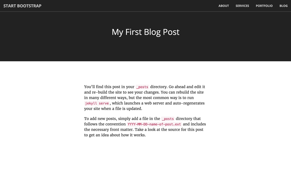
Step 2: Create the post
Next, create the first post /_posts/2016-06-01-first-post.md
---
layout: post
title: My First Post
---
You'll find this post in your `_posts` directory. Go ahead and edit it and re-build
the site to see your changes. You can rebuild the site in many different ways, but
the most common way is to run `jekyll serve`, which launches a web server and
auto-regenerates your site when a file is updated.

To add new posts, simply add a file in the `_posts` directory that follows the
convention `YYYY-MM-DD-name-of-post.ext` and includes the necessary front matter.
Take a look at the source for this post to get an idea about how it works.
Step 3: Create blog.html
In order to list all your post, create blog.html
---
layout: page
title: Blog
---
<section>
  <div class="container">
    <div class="row">
      <div class="text-center">
        <ul style="list-style-position: inside">
           {% for post in site.posts %}
             <li>
               <a href="{{ post.url }}">{{ post.title }}</a>
               - {{ post.date | date: "%d %B %Y" }}
             </li>
           {% endfor %}
        </ul>
      </div>
    </div>
  </div>
</section>
Step 4: Add link to /blog.html {#step-4-add-link-to-/blog.html}
In the navigation on /_layouts/default.html, insert link to /blog.html and your work are done.
...
<li>
  <a href="/blog.html">Blog</a>
</li>
...
All the posts are listed on blog page.
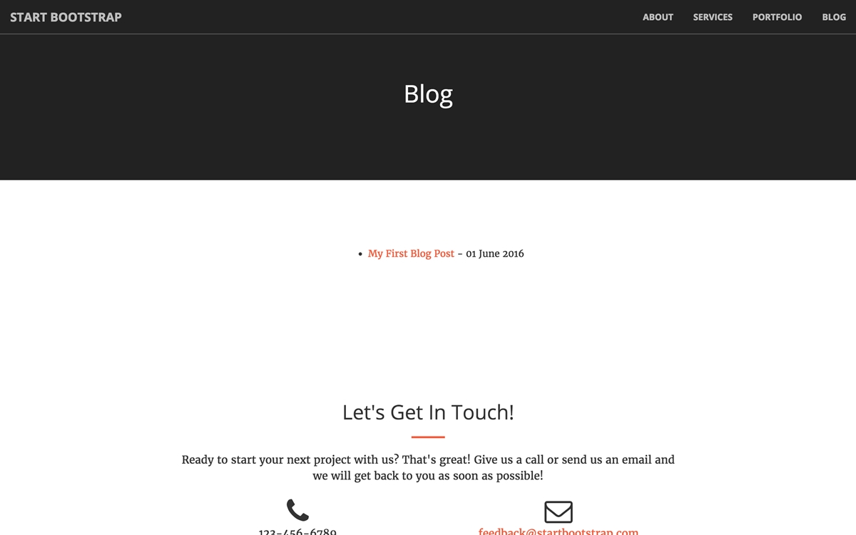
To see the entire post, please click on a link.
Conclusion
With this instructional writing on how to insert a layout, collection and blog to a static site, we hope that you can easily manipulate those above steps and make your site significantly more maintainable with Jekyll. If you want to improve your site and make it even better, here are some recommendations: improving the navigation</a>, inserting an RSS feed, inserting search, inserting an estimated read time to posts.

Catalog