
How to Create a Logo for Business? A Complete Guide
By Sam Nguyen

Drive 20-40% of your revenue with Avada
Related post
- How to use Instagram for business: The ultimate guide do beginners
- How to choose Shopify theme that sells: The ultimate guide
- 11+ best stock photos sites for your business free and paid
What Is A Logo And Why You’ll Want It To Be Great?
Have you ever seen a big brand without a logo? No? That’s because there aren’t any.
A logo is not just some eye-pleasing arts, fancy fonts and text combined together artistically, but a whole lot more than that; a logo has a huge impact on how customers will perceive its brand.
A logo is a brand’s face, and more often than not, it is more recognizable than the actual brand’s name!
Think of your logo as the picture you present on your dating profile. It is one of the very first impressions that decide whether or not people are interested and want to learn more about you. So you want to look your best, don’t you?
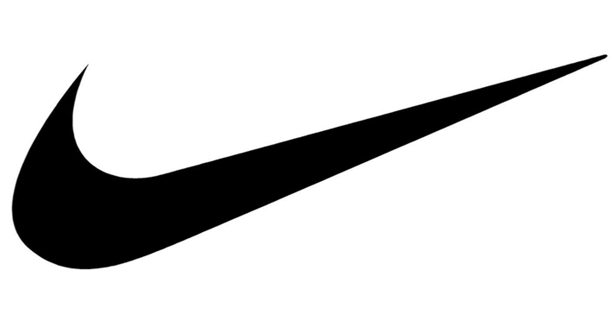
A logo can even stand for something bold, something iconic, such as the Apple logo stands for simplicity and elegance while the Nike logo stands for perseverance and victory.
Coming up with a cool and original logo isn’t easy, as you may know, and it’s likely that everyone who tries to generate some great ideas will find themselves banging their heads against the wall a few times along the process.
Don’t panic! What I’m explaining next will provide you with everything you need to know, from defining your brand’s identity to understanding what makes a great logo, in order for you to design the perfect logo for your brand. Keep reading to learn how to come up with a great logo.
7 Steps To Generate Your Ideal Logo
Define your brand identity
So, what is a brand?
It’s not your logo, it’s not your slogan. A brand is a combination of several things. Read 10 Best Free Slogan Generators here!
- It is how people perceive you; it’s how you make them feel.
- It is the commitments that you promise to deliver after your customers pay you.
- It is the expectation that they have of you before they come and do business with you.
All of these things combined generate an image of you inside your customers’ minds, and when they think of your brand, they think of this image.
So, how do you want people to think of your brand? How do you want to make them feel?
- Professional

- Full of energy
- Simple & elegant

The key is figuring out what the emotion behind your brand is.
And not until can you decide what feeling your brand is going to create that you can know what design style, color, typography can be used on your logo.
Understand design styles
Once you have a clear idea of your brand and what feeling it is going to stand for, the next thing you want to do is pick the right design aesthetic. This has to based closely on the feeling of your brand and there is no one style that is right for everyone, only what’s right for your brand.
Let me introduce to you 5 most widely-used design styles.
EMBLEMS
Emblems are logos that have text inside of a symbol. This gives your brand a classic look that represents time-lasting quality.
Emblems are arguably the oldest type of logo as they have been used since at least the middle ages, if not before.
When to choose an emblem?
You want your brand to represent a sense of tradition/longevity. You are looking for your logo to convey a sense of solemnity.
When to avoid an emblem?
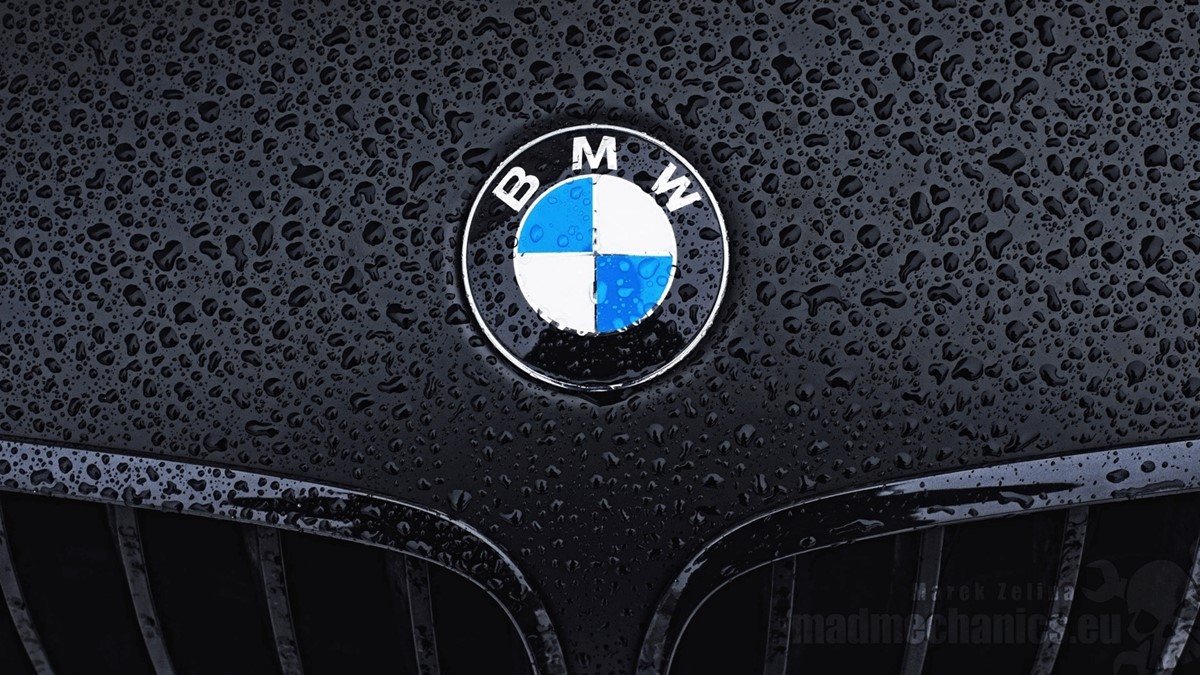
While the BMW and Ford logo look simple, emblems can get confusing to look at because of their many details, like this one.
If you have to scale down this one to, say, the size of the favicon on a website, it will be really hard to see the logo clearly. In other words, Emblems might not look great shrunk down really small. It also does not read well from far away (if you want to put it on a billboard).
So if you think these situations can be a problem, just avoid emblems.
LOGOTYPES
Logotypes are ones that are constructed completely out of the word(s) that make up the company’s name. Because the entire logo is just words, the main focus here is obviously typography. This style of logo closely ties a brand’s visual image to the company name.
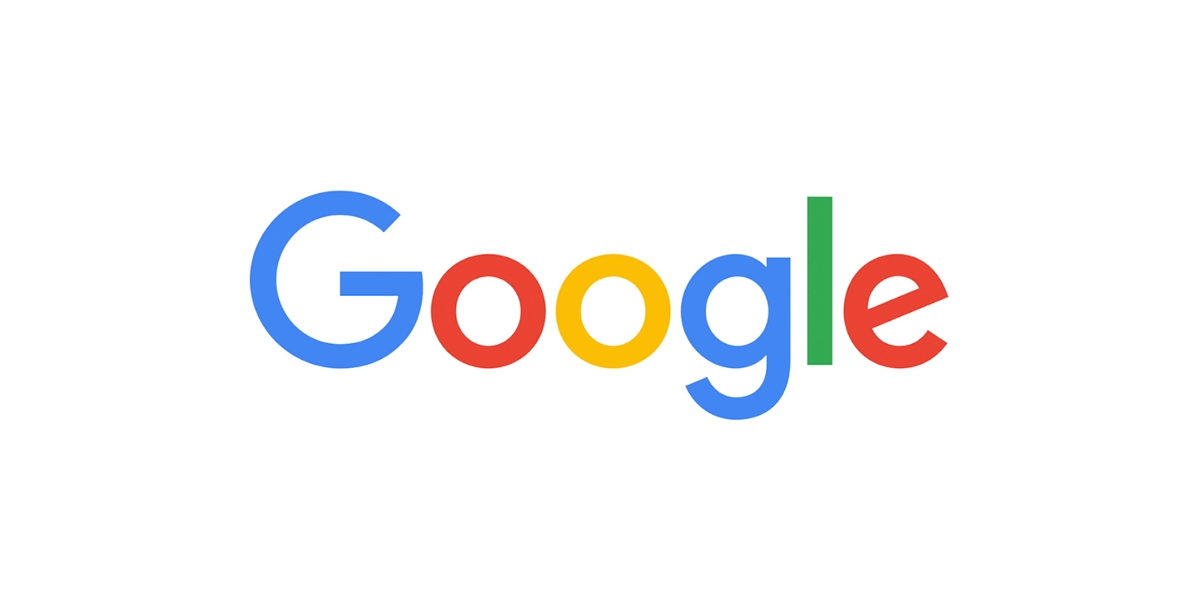
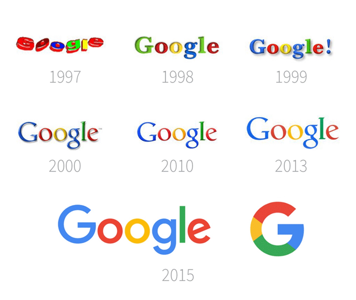
Because the shape, style and color of the words represent just as much meaning as the words themselves, you’ll have to put the majority of your focus on choosing the right font. And if you fall into the group who makes a nonsense word their names, such as Google, this point will be even more important to pay attention to, because a nonsense word created purposefully is called art, but randomly will be called, well, nonsense.
When to choose a logotype?
- It’s easier to get your name out there and get people to remember it when you are new. It requires much more marketing efforts to get the same result with emblems or any other style made of both a symbol and text.
- You cannot come up with a symbol logo of your brand that gives you a sense of satisfaction while the logotype version of it does.
- Your name is your brand. This will strengthen the connection between visual memory and name recognition.
When to avoid a logotype?
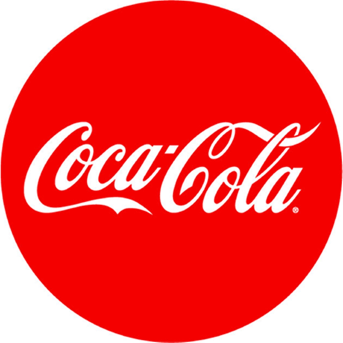
- You don’t want to redesign your logo every once in a while. Fonts follow trends. The neon bubble was once popular in the 80s now is completely outdated. The same thing just might happen to whatever font that is trending these days, Helvetica for example. Even Google and Coca Cola need to update their iconic logos to remain relevant and up to trend.
- Your company name is just really long.
MONOGRAM LOGOS

A monogram logo is made up of a combination of one to three letters (traditionally three) to create a single symbol.
Monogram logos are commonly used to represent the initials of a brand that is named in the acronym style (such as HBO – Home Box Office). The letters in this logo style may also be combined with imagery to illustrate the concept of the brand further.
As monograms are primarily made of letters, typography and font are also the keys. In comparison with logotypes, monograms provide more room for creativity for styling of the component letters, because legibility here is not much of an issue.

The fewer letters your logo has, the easier it is for people to read them correctly.
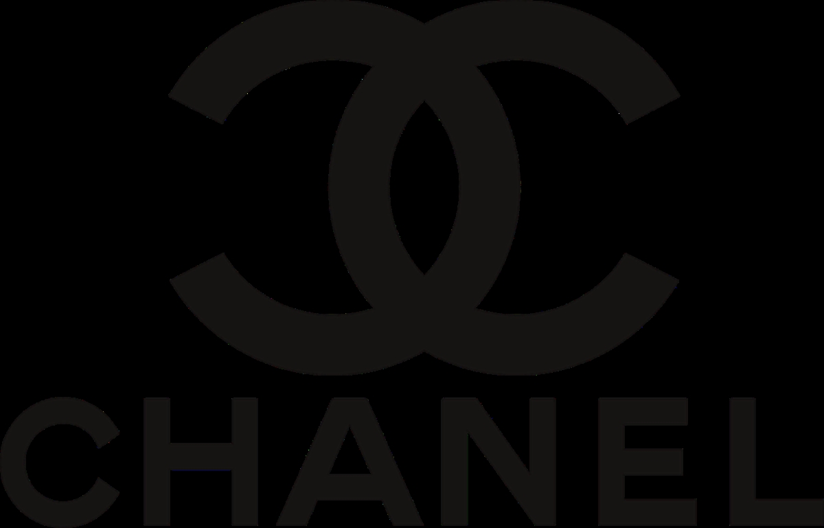
Monograms also have a weirdly elegant feeling to them when designed properly. This is why many high-end fashion brands use monograms for their logos (Louis Vuitton, Chanel, or Gucci).
When to choose a monogram?
- You want to have a close connection between your name and visual identity.
- Your name is an acronym of something.
When to avoid a monogram?
- There’s no reason you should avoid this style unless you cannot connect your brand name and visual identity in an attractive way.
BRAND MARKS
Brand marks are logos made of only graphic symbols and without text.
This logo style is commonly used by businesses in their branding because symbols take a shorter time for people to remember than text. They, on top of this, represent ideas more effectively than written words. Imagine, instead of its simple iconic logo, how many words would Apple have to use to convey the idea behind its brand?
You might notice as we move further down this list of the types of logos, we are also moving away from the use of text in logos. You can think of logos as a game of conveying ideas. Graphic symbols and text are the tools that you have to describe your idea. The fewer tools you have, the more difficult it is to convey your idea precisely. This means the further you move away from using text, the heavier the graphic symbol will have to carry.
This is why the imagery representing your brand should be easily recognizable, and further down the road will there need a huge amount of marketing efforts to explain the idea behind your logo.
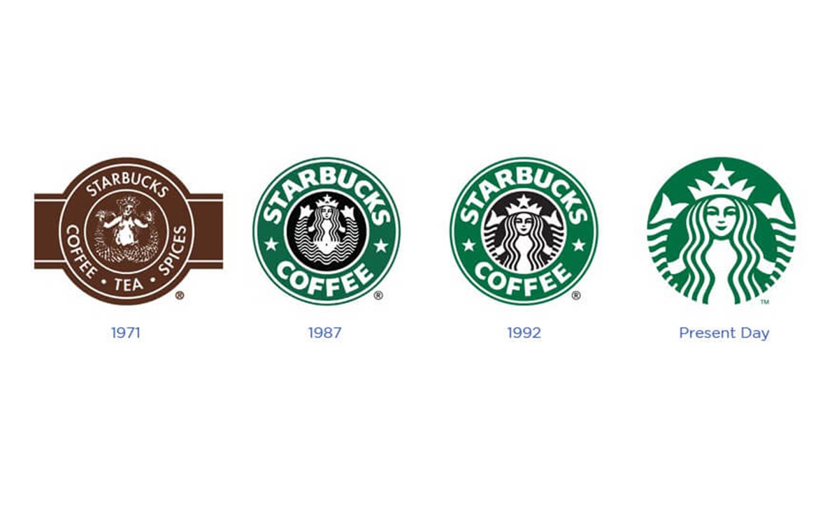
And for that it can be demanding (and perhaps costly) for a new business to exclusively use a brand mark. If you insist on using this logo style, I’d suggest you associate a wordmark with your graphic symbol for a while before you can get rid of the text entirely. You can see how Starbucks’s brand mark has evolved over time.
When to choose a brand mark?
- It feels to you that your brand identity will be represented more effectively by a graphic symbol than by text.
When to avoid a brand mark?
- As mentioned above, if your business is new, it’s hard for customers to understand right away what you’re doing if you just use a brand mark. The amount of marketing efforts and costs to explain yourself will be massive, so if you’re not able to accommodate this requirement at the beginning, you should stick with logotypes. If you want a brand mark, you can have your logo redesigned later when your brand has become more recognizable.
COMBINATION MARKS
Your logo does not have to be black and white, it does not have to be this and not that. There’s no rule that says you can only go for one logo type (if there is, break it!).
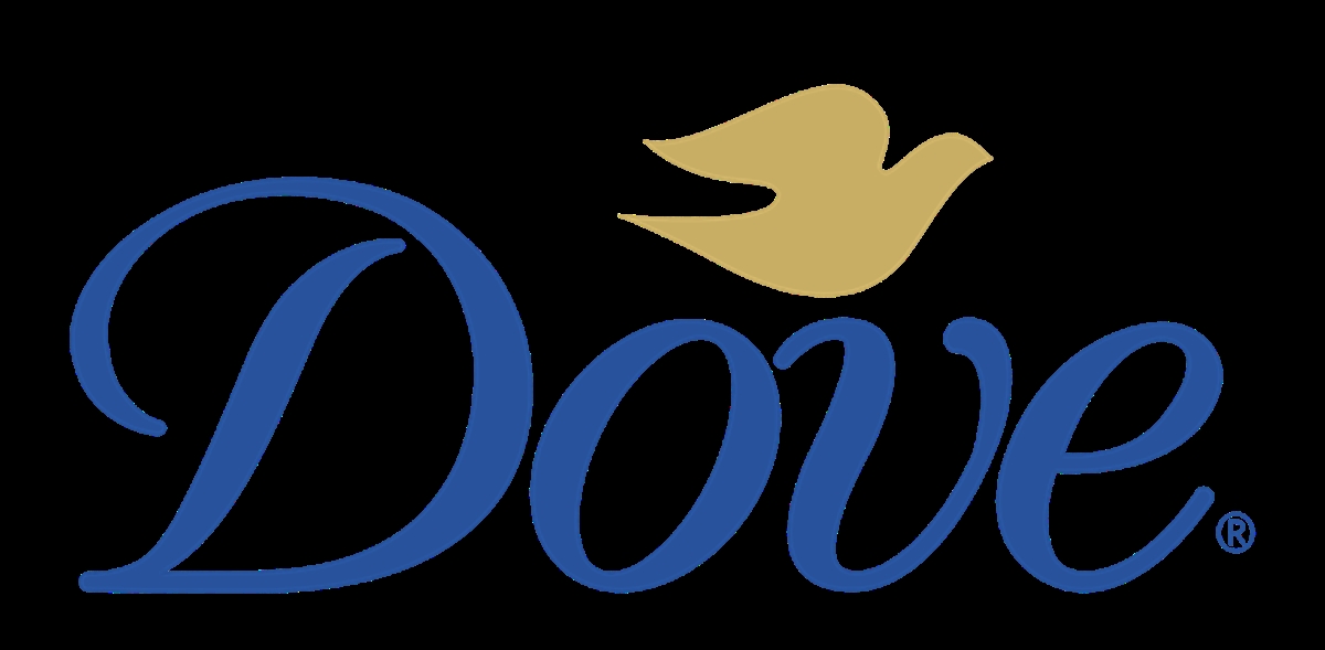
You can combine 2 or all of the logo types I have mentioned, depending on how creative you are. You can combine a brand mark with a logotype like what Dove does with their logo.
The greatest feature of combination marks is that they’re really flexible, so they are highly recommended for new brands. You can have both of the components, or you can keep the graphic symbol and remove the text where that is needed.
When to go for a combination mark?
- If you’re all about imagery but feel like you need some text to more effectively convey what your brand represents, or if you want a flexible logo that is highly adaptable for different situations, Combination marks are an ideal choice.
When to avoid a combination mark?
- You just want to focus on simplicity; combination marks are hard to design because you’ll have to be able to create harmonization between the graphic symbol and the wordmark. Combination marks can get more complicated to use; every time you want to put your logo on something, you would have to question whether you should put only the symbol, or only the wordmark, or both.
Understand Typography
There are 6 different font types.
1. SERIF FONTS In typography, a serif is the small extra stroke found at the end of the main vertical and horizontal strokes of some letters.
Serif fonts arouse feelings of class and heritage. This makes them suitable when you want your brand to feel “established” and reliable.

Serif fonts suits “formal” situations best (this is why Serif fonts are widely used in CVs). They’re perfect for brands who want to represent and promote their trustworthy nature. Often, serif types are ideal for financial companies and academics establishments. Some of the most popular options are Times New Roman, Georgia and Garamond.
2. SLAB SERIF FONTS Slab serif fonts are a “subset” of serif fonts, slab serif fonts look almost similar to serifs, but have specific slab sections in them. This group creates feelings of confidence, and a sense of bold attitude.
Favorite Slab Serif options are Courier, Rockwell and Museo.
3. SANS-SERIF FONTS
Sans serif fonts are clean, modern, and classy. They’re favorited by brands who want to convey a straightforward, simple, and no-nonsense attitude. In typographic logo design, sans serif fonts arouse a sense of honesty and simplicity. The message is clearly conveyed and not distracted by any decorative elements.

The simple, yet powerful nature of sans serif fonts makes them perfect for brands who want to put clarity and simplicity on a pedestal. These typefaces are widely used on clothing brands, technology companies, and businesses that are focused on “forward-thinking” ideals and brand purposes.
Some of the best sans-serif fonts are UTM Avo, Century Gothic and Helvetica.
4. SCRIPT FONTS
Script fonts mimic handwriting styles, and are generally a lot more energetic than their serif counterparts. Their hand-written nature provokes feelings of creativity, brevity and freedom. If these are the feelings that your brand is set out to promote, then script is the perfect choice for you. Nonetheless, a lot of script fonts are difficult to read, so it’s crucial to make certain that the one you go for is legible.
Script fonts, among typographic fonts, are arguably the most likely to inspire emotions and creativity. They can be particularly useful for brands who seek to show off their creative side. The key to successfully using script fonts is using it with caution. While they look artistically and creative, they can also be difficult to read if not designed properly.
A couple of suggestions for script fonts are Lucida Script, Lobster and Zapfino.
5. DISPLAY FONTS Finally, if you’re looking for typography logo design inspiration, you can’t get more creative than display fonts. These are originally script, serif or sans-serif fonts, but fired up with extreme features such as swashes or exaggerated serifs.
Highly unique and stylised, these fonts add personality and energy to your business. They are also very flexible as you can easily convey whatever personality is right for you.
By tweaking, twisting, and fine-tuning your fonts, you can demonstrate your business as being casual, direct, fun, or unique. Some of the most common display fonts include Bombing, Gigi, and Jokerman.
Understand colors
Basically, each color arouses certain emotions and ideas.
-
Red: Red provokes excitement, passion and energy. It’s a great choice if your brand is energetic and wants to stand out.
-
Orange: Though in the same color range, orange is much less popular than red, but it’s just as exciting and energetic. This is a vibrant, playful and refreshing color.
-
Yellow: If you want to look accessible and friendly, yellow is the right choice. It gives off a youthful energy.
-
Green: Green is especially powerful for brands who want to establish a connection to nature.
-
Blue: Blue is a classic choice. It can make us feel calm and cool, and it symbolizes trustworthiness and maturity.
-
Purple: Purple is of luxury. Also, depending on the shade, it can get mysterious or feminine.
-
Pink: If you’re going for girly, nothing is more suitable than pink. With shades like pastel rose, millennial pink or neon magenta, pink can give your logo a grown up and cool, but still youthful and feminine look.
-
Brown: Brown may sound like a strange color choice at first, but it works perfectly for rugged and masculine vintage logo design. It can give your brand a handmade, unique and aged look.
-
Black: If you are looking for a sleek, modern and luxurious look, black will be a great choice. A minimalist black and white logo is the way to go if you want to keep it simple.
-
White: You want your logo to look clean, modern and minimalistic? Use lots of white in your logo. As a neutral color it works in combination with all other colors, but adds a clean, youthful and elegant touch.
-
Gray: Gray is the ideal color if you want to achieve a mature, classic and serious look. Darker shades look more mysterious, while lighter shades are more accessible.
COMBINE COLORS
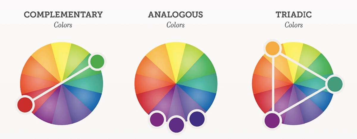
You certainly don’t need to stick with a single-colored logo, but you can combine several colors to tell a complete color story about your brand. To choose colors that are compatible with one another, let the color wheel guide you.
-
Complementary colors lie opposite from each other on the color wheel. They bring out the best in both colors and create a very dynamic look.
-
Analogous colors fall close to each other on the wheel. If you want your logo colors to be harmonious, these will work well together.
-
Triadic colors draw from three equal sections on the color wheel. Pick these for a stimulating and bold effect.
Find inspiration
Here is the truth about creativity. Creativity is not creating something out of thin air, it’s creating something new and unique, but on the back of something else.
This means you don’t have to pull ideas for your logo out of thin are. You can have a look outside and find logos that inspire you or ones that convey the same feelings that you want your brand to represent.
Then you can imitate the style that inspires you on your own brand name and make your own logo.
There are tons of well-known logos out there for you to learn from. You just have to look for them.
Communicate with your designer
At this point, you should understand all of the important elements that make a complete logo, now let’s go for the most important part of the process: getting your logo created!
It’s important for you to communicate what you want to have on your logo with your designer if you want it to come out perfectly. Try to write a clear creative brief and make as clear as possible what value your brand represents, what emotions you want it to convey and so on.
This will help your designer understand who you are and what you need. Just be well prepared and make you that you will give your designer as much information about your company and style as you can.
Also, try to stay open to suggestions. Keep in mind that your designer is an expert and has a great sense for what makes a great logo. When you and your designer work together, you will be much more likely to receive an outcome that makes yourself satisfied.
Evaluate the result

This step can be the hardest in the entire process, so you should get some feedback from families, friends or even potential customers and see what they think about the created logo. Don’t panic! You won’t have to follow all of the opinions that they give; which ones do not feel right to yourself, just skip them. Asking people for opinions does not hurt as you’re the one who have the final say anyway. This might give you some important insights that make your logo perfect.
Here are some questions to ask yourself and the people who you’re going to seek opinions from when evaluating your logo:
- Can it be told in 2 seconds what your business does?
- Is it simple and memorable?
- Is it flexible? Can it be applied to all your brand’s needs?
- Is it timeless, or would you have to redesign it in a couple of months?
- Is it unique? Does it separate you from your competition?
- Is it appealing to your target audience?
- And most importantly, do you like it?
It is obvious that your brand’s needs and expectations for a logo depend on the product that you sell. A logo for children’s clothing is probably simpler and more playful than one for sophisticated high-end wine with an intricate label, or a high-tech phone application. So don’t forget to take a step back and look at the bigger picture.
This is not just about personal taste, it’s also about what works best for your brand.
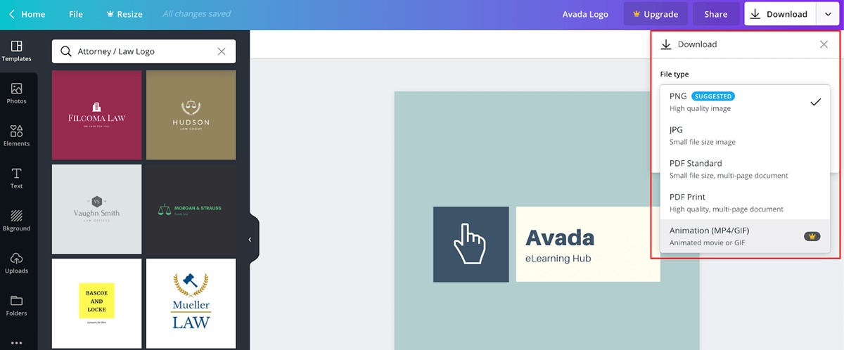
6 Best Online Tools To Create A Logo (free and paid)
Your can read full Top 12 Free Logo Maker Software here!
There are a lot of tools that have been created to help people with no access to designers create their own logo with just a few clicks.
Logo generators are also much cheaper than hiring a designer, so it is a good choice for those who start their businesses on a budget.
These tools basically do the same thing. First they need you to input your company name.
Then they will show you a few design samples and ask you to choose which ones are your favourite.
Their algorithm, then, will analyze your personal preferences and output suggestions that are as close to your favorites as possible.
As you might see, these tools will handle the legwork for you, which is creating the logo based on your preferences. All you need to do is input your brand name in, the tools will handle the rest.
Though they all do almost the same thing, each tool has its own algorithm to analyze your preferences, so I would suggest you to use several of them to have a wide variety of options.
From there, you can use the knowledge you have learnt from above to choose a logo that is a perfect match for your brand.
Here is a list of 6 best logo generators.
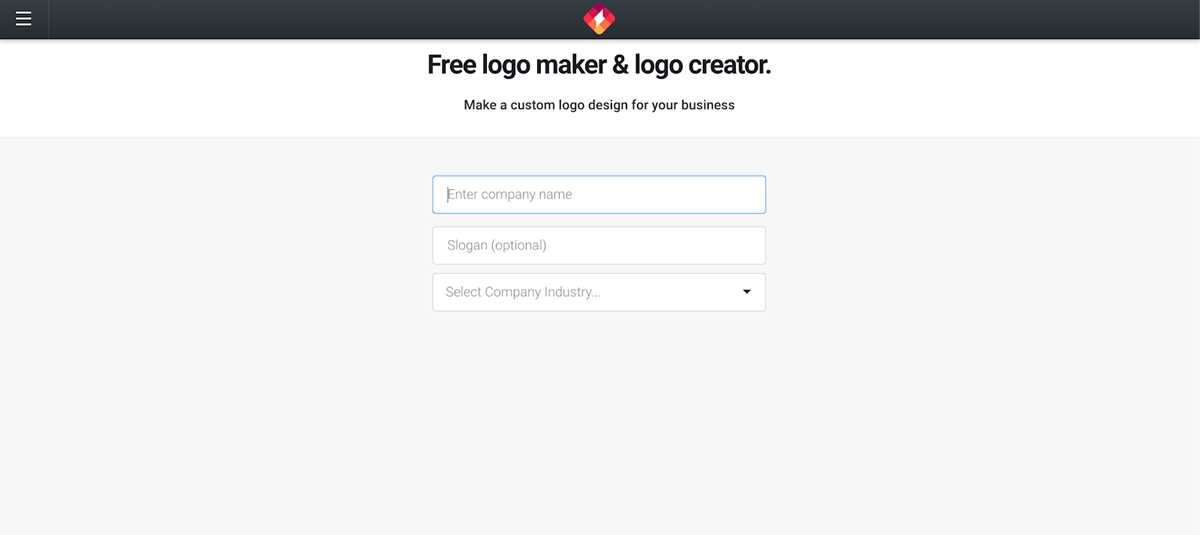
TURBOLOGO
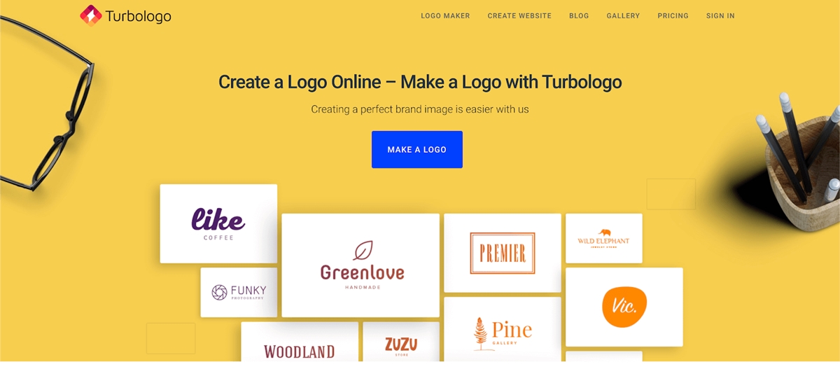
From my personal view, Turbologo has the best service among a dozen logo generators there are. The simplicity of creating a logo and the quality of the result is just fascinating.
After inputting your brand name and the required parameters of the logo, the tool will immediately begin to generate amazing design options.
Turbologo leans towards minimalism: simple shapes, eye-pleasing colors and a clear arrangement of elements. This is why I said this is the best logo generator (personal preference!!)
You will have to sign up to see the results, and pay to download them, but the pricing is very reasonable.
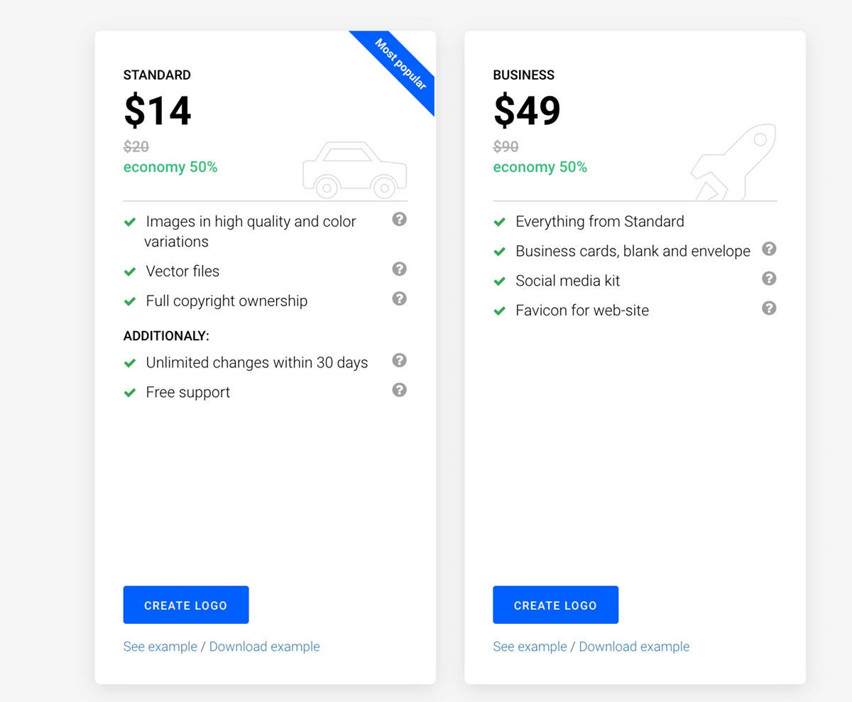
Turbologo provides several options for downloading a logo picture, including a logo with a transparent background, black and white and color options.
This is very convenient, because it will be easy to put a logo on a photo. Vector logo files enable you to use the logo for any further design that you may have.
Its service offers online support for 7 days a week. So I highly recommend Turbologo for the convenient and complete service it provides for creating a logo.
LOOKA
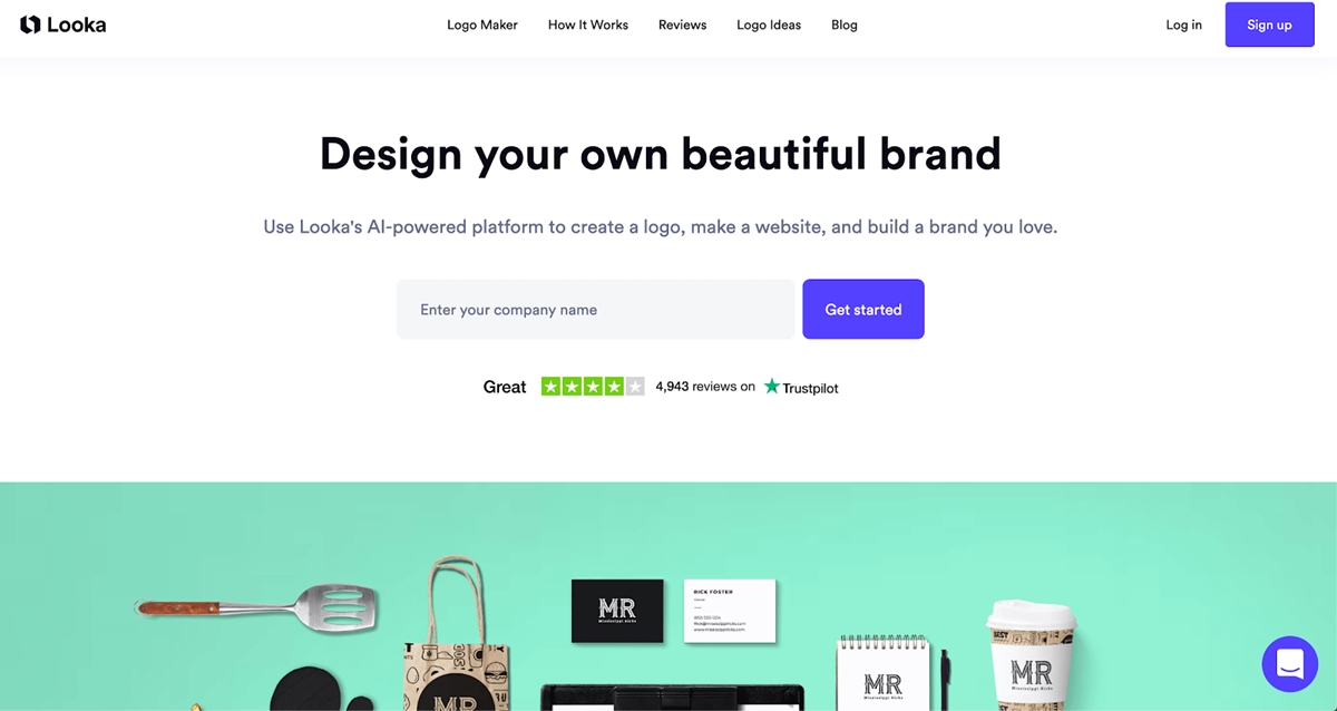
Looka is also as good as Turbologo logo-design-wise. The process of creating a logo is also very simple; input your brand name, industry, then choose your favorite samples, and there you go. Few minutes in and you can see the first results.
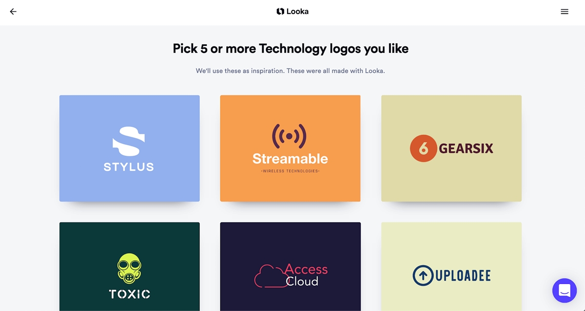
This app also has a very user-friendly user interface.
Overall, Looka received fewer points because of its higher price.
CANVA LOGO MAKER
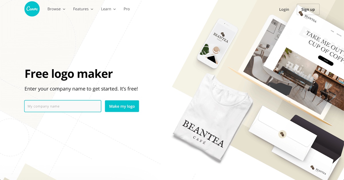
Canva is well-known for enabling people with little design expertise to create graphical designs of many types such as banners, postcards, Facebook or Instagram posts and a whole lot more.
Canva also offers a high-quality set of modern templates for logo design.
The biggest plus about Canva templates is that they are non-standard. Almost every logo generator is using universal templates, and doesn’t offer non-standard design options.
Canva, on the other hand, provides original design created by humans, not ‘AI powered’, so its designs look more alive.
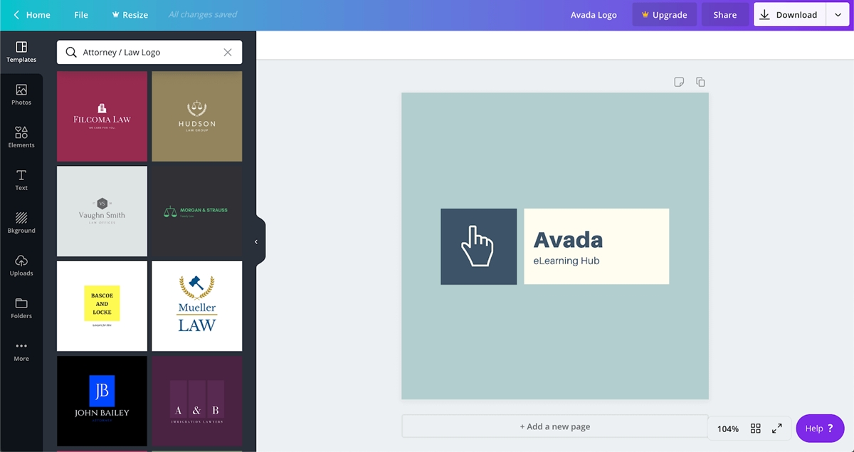
What you need to do after inputting your brand name is choosing the suggested template and replace the company name with yours.
The drawback of this approach is that there’s no uniqueness in the logo, because it is likely that somebody has already created logo with the same template (Canva is one of the most popular tools for design in the world).
You can make a change in the suggested design, but that requires you to be a bit of a designer, because there is no generator or smart-suggest tools.
Although Canva allows you to free download the logo for most templates, you can only download a picture, not the vector files.
This means that you will not be able to use the logo on anywhere, and this is a significant disadvantage.
Overall, Canva is a great tool where you can find modern logo template if you don’t worry too much about uniqueness.
Designhill Logo Maker
Designhill logo maker is an AI-powered tool which is easy to use. The tool helps you create a brand logo in just a few seconds.
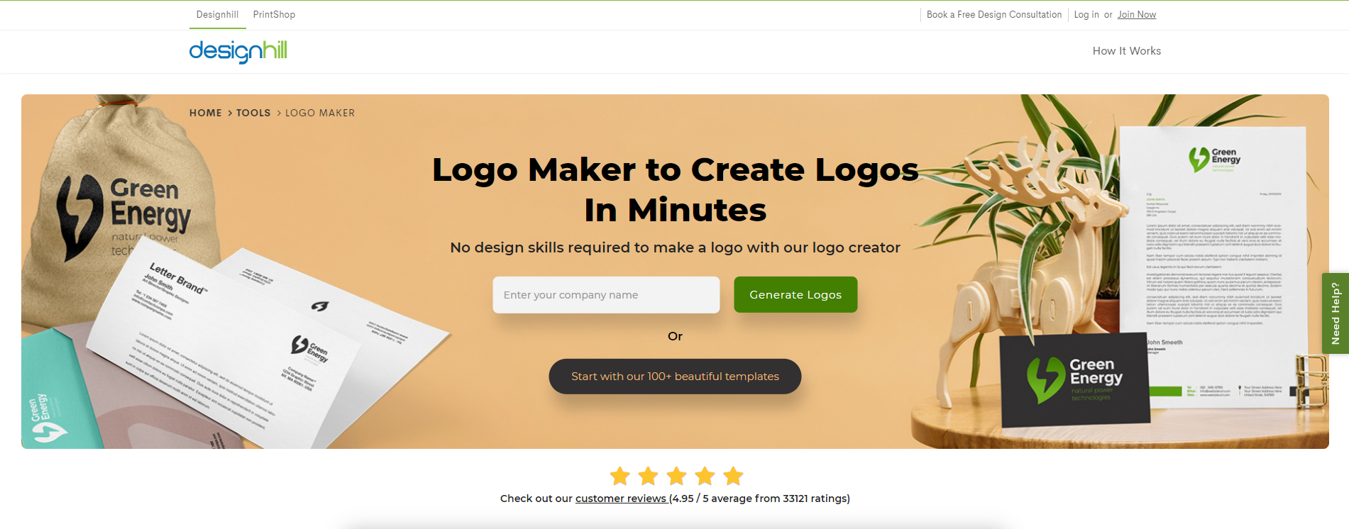
All you need to do is to enter your business name to get started. Once you’ve entered the business name, the logo maker lets you choose five or more logo styles templates to choose from. After that, it prompts you to choose appropriate colors. In case you need any help, you can use the chat option given at the corner for support.
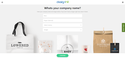
The next step lets you add up to five symbols or icons and gets you in action. You also need to sign up to see the end result. The logos created using logo makers look professional. The best thing about Designhill logo maker is that you don’t need to pay a monthly or yearly subscription fee.
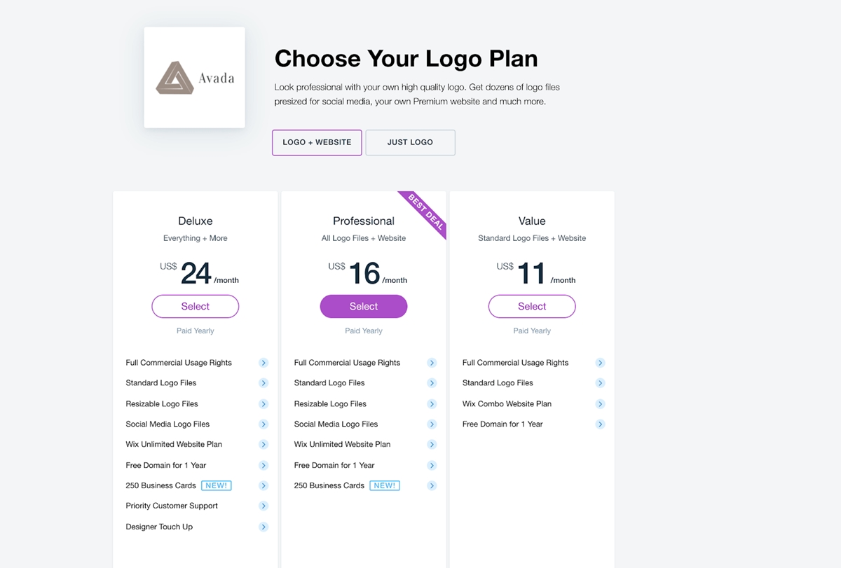
WIX LOGO MAKER
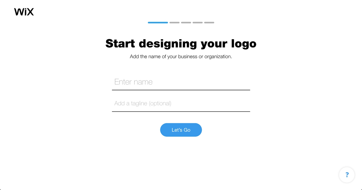
Wix logo maker is another interesting logo generator that is owned by the technology giant wix.com (a service for creating a website online).
With Wix logo maker, you have to create an account first before you proceed to create your logo.
This tool has a simple user interface and quite a good result.
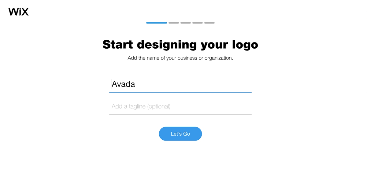
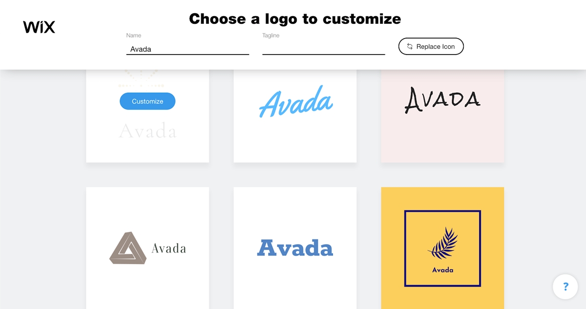
A minus point is, however, the number of possible patterns is very limited, and its pricing starts at $24 which is the most expensive in this group.
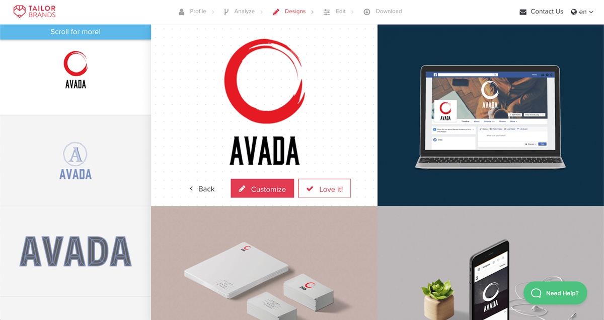
TAILORBRANDS
Tailor Brands is one of the most popular logo generators of today. This tool has been around for quite a while, and for that reason probably, it generates logos with a less modern feel than the previous ones.
TailorBrand offers you 3 options of logos: Name based, Icon based and Initial based.
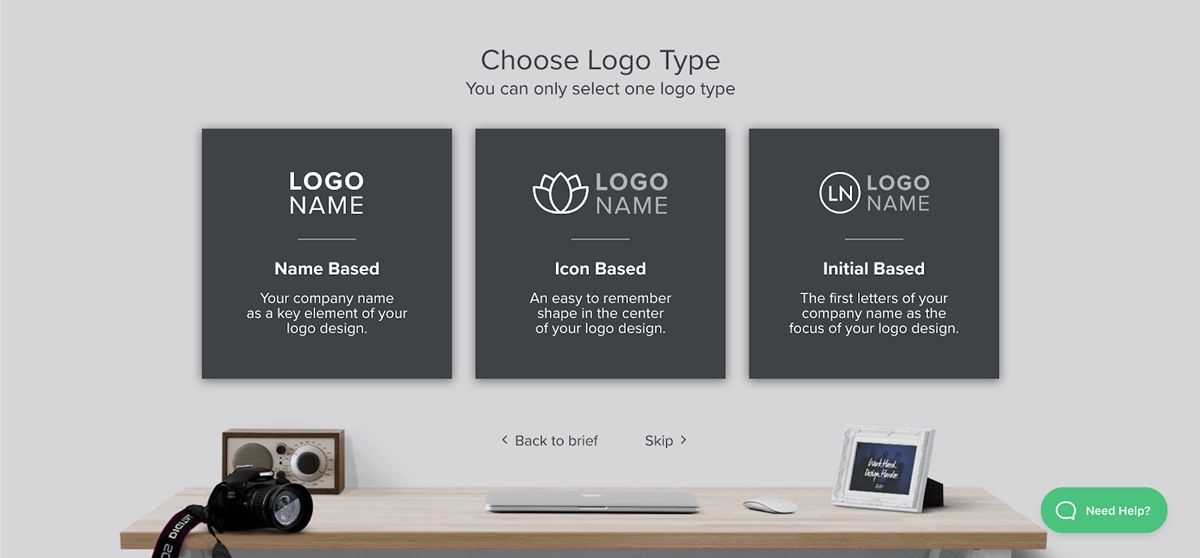
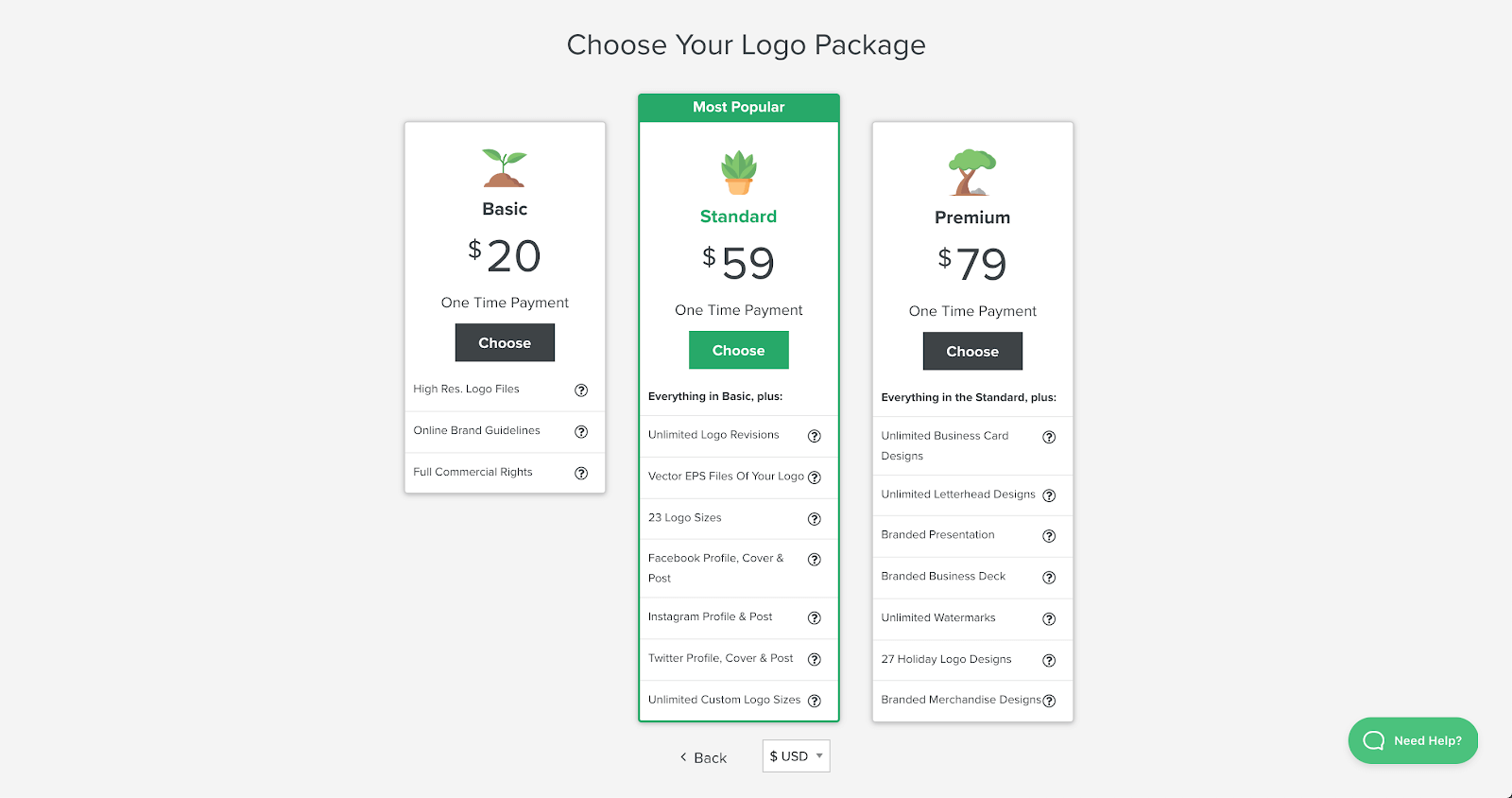
This service provides monthly and annual fee plans. I personally think the annual plan is not always necessary as you probably won’t really need to redesign your logo within 1 or 2 years, so it seems to be a waste of money.
Its pricing starts at $20, which I think is reasonable for a logo.
Again, among a dozen, these 5 tools are probably the best ones for logo generating, and I encourage you to try all of them so that you can have as many options as possible, then you can analyze them and pick off the best one.
Design.com

Design.com stands out as an invaluable asset for businesses and individuals looking for a smooth and easy logo creation. Emphasizing simplicity and creativity, it provides a seamless interface for designing logos that resonate with your brand’s ethos.
Its AI-powered tools ensure that logo design making is easy. In no time, you’ll have logos that are not just visually appealing but also meaningful. With a focus on enhancing brand identity, Design.com offers a diverse range of templates, ensuring that every logo reflects the uniqueness of its brand, making it a perfect companion for those seeking to make a lasting impression in both physical and digital world.
Conclusion
If you have read up to this point, I hope you have gained some insights that make it easier to create your first logo. I’m going to end my article with this, although it is important to understand the elements that make up a complete logo, it is even more important to know your brand from the inside out, because that is the only way you can convey precisely the values and emotions it stands for.


New Posts


