
11+ Incredible Tips to Optimize Landing Page & Boost Conversion
By Sam Nguyen
Drive 20-40% of your revenue with Avada
A landing page is where you put all your important product’s information and lead the customer to buy the product directly.
Landing page optimization enables you to cut down on customer acquisition costs, acquire more customers, maximize the value of your ad spend and boost conversion.
While the landing page and conversion are significantly interconnected, we all need to review our landing page frequently. If your landing page is not working well, read through these following Tips to Optimize Landing Page & Boost Conversion. We are sure that even the simple tweak is beneficial.
1. Use One Main Font Families
This is such a basic principle that you can ever follow smoothly. The font family such as Helvetica, Verdana, Arial, Roboto, ect. These are all different fonts with different options to add italics, bold, semi-bold, etc. Check out many fonts here with its popular pairings.
Why do you need to use just one or two font families?
Because customers’ eyes always desire the clean and unchanged typeface across a bunch of content across your landing page. When human eyes see a different typeface over another, they have to adapt again to that typeface, which makes them tired.
So, you should stick to one main font family no matter what to keep your customers focusing on the content you display.
2. Use Less Than or Equal to Three Main Colors
In addition to limited font families, we recommend you to use at max three major colors for your landing page. The fact that using too many colors on one page makes a less professional look. In many cases, adding too many blocks of different colors on one fold makes your page users confused about where they should click and what action they should make.
Also, you have to assign each main color a role on your landing page. For example:
- Take one color for important buttons like a CTA, and that color is the strong color to make the CTA stand out.
- Try contrasting colors for each important part on the page, so that customers can easily find out related pieces on your landing page.
Because customers have not so much patience for the navigating process on your page, so treasure the time and use colors smartly.
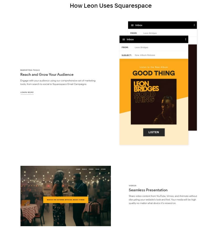
3. Utilize the Power of Images
Can you check your landing pages right now and ask yourself this question: are those images used on it relatable or meaningful? If the answer is no, please change them ASAP.
Because human eyes can recognize images faster than texts, images used should be a visual example for the product or service you want to sell or speak the message that you want to deliver. For example:
- If you sell clothes, think including the lifestyle that your target customer would live in the image.
- If you sell insurance for the retired, think about a picture including the worry-free future of your customers such as an old man fishing by the lake, which is a peaceful and dreamy but effective message.
Then start to brainstorm about your brand message now and use a useful image on your landing page!
4. Make Rooms for Negative Spaces
“The whiter space around an object, the more the eye is drawn to it”
White space or negative space is the area that you left empty without content on your landing page, which allows customers to rest their eyes and also use time to consume your content.
In the realm of user-experience-prioritized design, white space is mentioned as a useful tool to get attention. A drop in the density of objects makes customers notice the element that you want them to focus on.
One of the best practices to take advantage of negative space on the landing page is to use this tactic for the Call-to-action section that requires “all eyes are on”. After having gone through a bunch of information, it’s a good idea to provide customers space to slowly “absorb” your message and make a good decision.
Hence, take advantage of the white space to get rid of unnecessary information and lead customers to the final action, you will see a positive result.
5. Include Benefit-Centric Headlines
This tip seems obvious that every marketer has already implemented on their landing page, however, the reality proves the contrary point.
We may all acknowledge that we need to talk about the benefit but sometimes we don’t really acquire the idea of what customers need.
People only spend time reading what about themselves, no more, no less.
An attractive headline goes straight to the point and its responsibility is to catch the customer’s attention right at the first time. Only when you get their attention by the headlines, you can continue to explain your product’s features.
About how to craft an attractive headline, these following are some important criteria:
- Transform your product’s features to their impacts made on the customers’ issue when they choose to use your brand.
- Eliminate confusing words that used to test audiences’ readability. If you find it challenging to find out the right headlines that deliver the right message, our advice is to walk in customers’ shoes then you will name the benefits right.
- The right message will keep customers discovering more on your site. The longer they stay on your page, the higher chance that they’re gonna buy from you.
If you have already crafted attractive headlines and subheadlines, in many cases, customers can be completely persuaded by them, the next action will come soon and easily.
6. Add More Valuable Videos
Neil Patel has mentioned in his blog post that videos convert like crazy. Videos have the ability to deliver the message faster and more influential than images and text do. It also brings a feeling of authenticity and high-quality, for it includes many elements that are hard to fake. Moreover, videos keep your customers staying longer on the landing page, which is beneficial for SEO results. Videos can be a powerful weapon in the following type of content:
- Explain product’s features
- Evoke emotions
- Customers’ reviews
About the “explain product’s features” video, if you want to describe your products’ features, try to visualize them with clear and clear-cut cues and use examples to amplify the practical usage of product.
Besides, take advantage of voice in the video to explain ambiguous terms and make the video friendlier to watch. Let your customers watch the video in a relaxing state not a forceful one that they have to watch the video to understand about your brand.
For example, Neil Patel and his team’ trying to explain Crazy Egg’s unfamiliar product, they included all information of the company’s background and product’s features in one 2,5-minutes-long graphic video. This video then helped Crazy Egg to increase conversion rate by 64%.
As for videos to evoke emotion, we can name a few such as joy, pride, amusement, fear, pride, surprise, affection, uncertainty, etc. If you ever consider including emotion in your video, so yes it’s time you can start to implement that tactic.
You have to consider which type of emotion will help propel actions on your landing page and how it can resonate your customer’s demand with products. Because in many cases, emotion will become the strongest momentum for customers to take action then you will not want to miss this opportunity.
In regard to video testimonials, because of the authentic facet, they empower the testimonials immensely. Customers can always connect with people like themselves. If they see believable, authentical testimonials on the screen experiencing the same things and have got a solution for themselves, the solution would be reasonable.
Whether you are a B2B or B2C business, your customers all desire the actually successful case that they can replicate to tackle their current problem. This will be a big help to your landing page’ conversion.
7. Increase Trust by Trust Indicators
Trust issues have always been a trouble to many ecommerce store owners. Increasing trust by the trust indicators is a must-have tactic in landing page building. If you haven’t added these elements to your landing, check out right now and make changes.
There are seven key trust indicators that convert:
- Testimonials: written quotes (though sometimes they’re in video form) from highly satisfied customers who tout your product on your behalf.
- Business awards: impactful elements that motivate customers to choose your brand over the others with the recognition from associates
- Product reviews: customers’ review on their actual experiences with brand’s products and help your store to gain more feedbacks and improve better service.
- Shopping certificates: add SSL Certificate which secures important assets of customers such as credit card transactions, data transfer and logins, and more recently is becoming the norm when securing browsing of social media sites
- Multiple shipping methods: efficient shipping ability is an integral part in the e-commerce century, customers demand trusted and timely logistics. Offering multiple shipment options can be a huge advantage to e-commerce stores.
- Convenient returns: online shoppers put their trust on products’ videos or pictures, so you need to assure that they can give products back if there is something wrong.
- Customer support: available phones, emails or live chats that work immediately to attend customers’ queries, questions or complaints. Customer support is crucial across various industries, including e-commerce, SaaS, and legal services. For inspiration, consider e-commerce websites such as SchoolLockers, which prominently display their phone number on every landing page. Similarly, this attorney website Bergen County NJ Criminal Lawyer effectively integrates a live chat feature on all its pages, offering immediate assistance for customer queries, questions, or complaints.
All the trust indicators above are vital to landing pages. They both cultivate trust in your customers and strengthen the relationship between your brand and loyal customers. By any means, they all lead to higher conversion rate.
8. Match the Content of Ads and Landing Page
One business has several ads clustering around the internet such as e-newspaper, google search page, facebook, twitter, linkedin, ect. So, the expected flow will be that your customers are already interested in the ads content, they click on the ad to gain some useful information and take further action as they should to finish their journey and you will get benefit.
Having a look at this journey, the importance of content/message match between ads and landing page is surely undeniable. So what should you do in detail? Check out here.
There are several elements which we need to match between ads and landing page, they are:
- Context
- Design
- Message
- etc
In terms of context, for example, your ads tell customers about news that your company has been developed successfully. Then when they are redirected to the landing page, make sure that it mentioned some based information about the new product, not only the product itself with features and a contact form or a CTA.
About the design, make sure you have the same ads’ style and landing page’s style.
And about the message, try to explain/ answer/ clarify the message that you include in the ad so the audiences will not be confused of what information they get after having clicked on an ad.
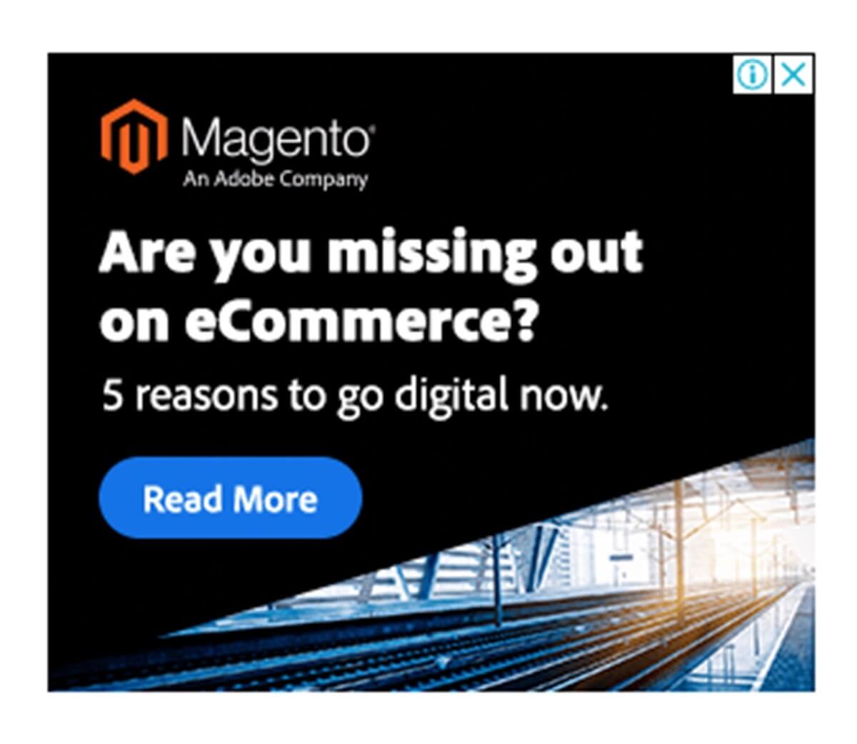
Check out this example of a bad match:
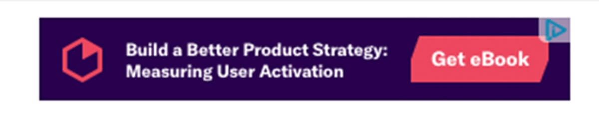
In the ads, we see a promising strategy that helps business measure user activation and a “Get eBook” CTA may instantly make us click on it to discover the interesting information. However, when go to the landing page, this is what we see:
A boring form with no guidance. We barely see anything related to product strategy or user activation. This is more than a failure that audiences will hit the browser’s button in a blink of an eye.
So, check out this example of a good match.
The ad directly asks audiences a question as a concern to all of the business at the present time. And here is the landing page.
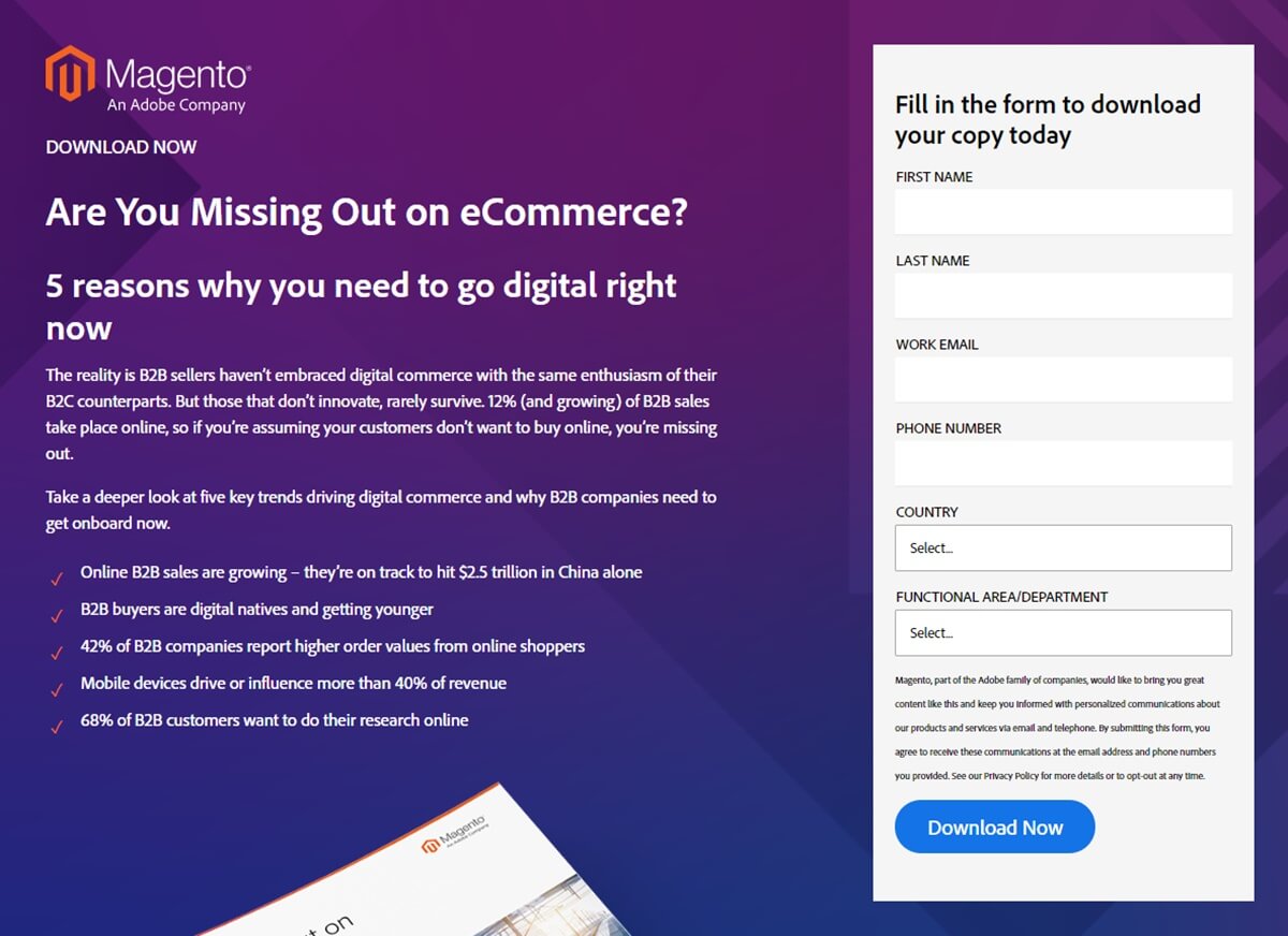
This landing page includes:
- A short context
- A straightforward answer
- A form to get the document
Although the landing page looks simple, it still satisfies audiences with concise content and a guide to the next action that they need to do. It gives answer to the question on the ad, provides context where the question is asked and guide audiences to the next move to start exploring the
An efficient landing page can prevent high bounce rates, wasted clicks and low conversion rate. So, make sure that you are not throwing money out of the window with ads.
9. Craft an Action-Oriented Call-to-Action
Most of the time, a CTA will be recognized by its contrasting color and size. And frequently, to maximize its magnetism we add its to a button. This button has a role to propel customers to instantly click on it to make your desired action.
Firstly, be highly specific on the action but inspiring enough to win the heart. You may want to get rid of these boring CTA such as “click now”, ‘by now” or “contact us now”. Instead of using those phrases, trying to use more friendly words such as “go to/discover/explore X”, or including the inspiring merit of acquiring your product, for example, “Speed up checkout process now” or “Eliminate cart abandoned rate right now”, “Let us send you the detailed plan”, “Start a free trial” etc. A valuable message with an action-oriented approach CTA would solicit customers to make final action quicker.
Secondly, you should not use only one CTA across the long landing page. Sometimes you don’t know which part of the landing page will successfully persuade customers first. The reading habit is different among the audiences and each topic on your landing page can attract a certain number of customers due to personal concerns. The number of CTAs depends on your landing page content’s structure. If you have a plain content, one CTA can be okay, but if your landing page is loaded with information, make sure to place CTAs here and there.
Lastly, another useful tactic that many sites utilize is creating a sense of scarcity. For instance, limiting the number of special-priced items can be an effective plot for any brand at any time. This deliberate scarcity influences your customers’ perspective of the products’ value that push them to eliminate hesitation from the decision-making process.
10. A/B testing
Naturally, if you want to know whether the change in the landing page is good or bad, you compare numbers showing performances between two versions. How could you do that work at one time and get the most efficient result?
A/B testing is designed to bring the solution. In an A/B test, you take a webpage or app screen and change its element to create a second version of the same page. This modification can be as simple as a single headline or button, or be a complete redesign of the page. Then, half of your traffic is shown the original version of the page (known as the control) and half are shown the modified version of the page (the variation).
Here are elements that A/b Testing tools all urge brands to do test on the landing page:
- Headlines and copywritings
- CTAs
- Images, audios and videos
- Subject lines
- Content depth
- Product descriptions
- Social proofs
A/B testing allows you to make careful changes to your user experiences while collecting data on the results. You can acknowledge why elements on the webpage impact your customers’ behaviors. Then you can be proven wrong—that your opinion about the best optimization can be proven wrong through an A/B test.
11. Optimize Landing Page for SEO
No matter how well you practice all the tactics above, the conversion may not be assured.
What leads to conversion?
It is the right traffic, which means targeting the right audiences.
How to target the right audiences?
The answer is that you have to do a set of actions to make your landing page SEO-friendly.
We all know that there is a free way to promote your landing page that is Google organic search result. And if you want to make sure your landing page targets the right but abundant group of audiences at the same time, you have to make at least Google algorithm display your page in front of your targeted customers at a good position.
Hence, here are some best practices that are critical to your landing page in terms of SEO.
- Content: create relevant and useful content, know who you are writing to and write to solve customers’ problems.
- Images: use relevant and high-quality images. Consider the image’s format and size to make sure they are not too heavy for the site which can cause low page load speed
- Keywords: determine the right keyword and place them strategically across the landing page’s content. This is very important for the page that needs to meet the right audiences. Try to make a good list of long-tail-keywords with which your customers intend to find your products.
- Title tag: it’s a name display on the search result page and browser’s tab. Make it compelling to encourage click-through. Include important keywords in title tag is also one way to inform the searcher and the audiences about the page’s content
- Meta Description: place important keywords in the short description under the title tags to give the searcher a brief on what you have on your page
- Image’s alt text: create alt text for all images on your landing page also help to describe your page’s content much better.
- Page load speed: 40% of people abandon a website that takes more than 3 seconds to load. Then check out your website speed and make improvements as needed with Google PageSpeed Insights.
- Backlinks: Google always puts a high value on pages which are linked to from other pages. Hence if you can secure your backlinks and grow them with influential sites, your site can get a better position more easily.
- Layouts and formats: give a clear structure and well-managed format of content will help the searcher to “understand” your page better.
- Mobile-responsive: one of the most important factors that influence the rank of the landing page. Make sure you have incorporated responsive images that adapt to all devices’ viewing.
Some considerably useful tools are listed on this post with its guidance which can enable you to go ahead on optimizing your SEO for landing pages.
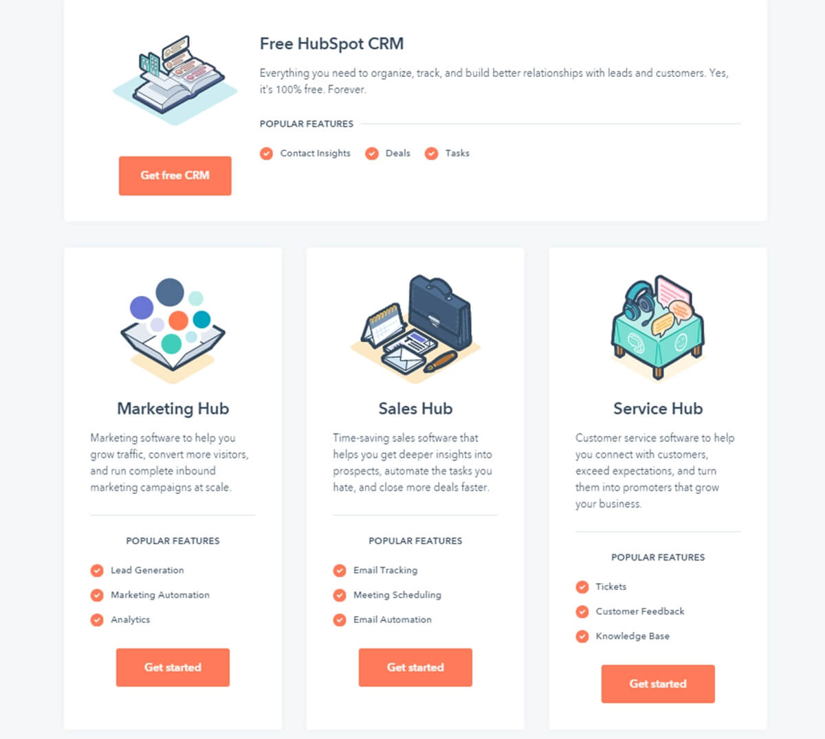
12. Assure the Responsive Landing Page
Customers can access your landing page via any device. While a visitor costs an amount of money, you will not want to drop just one because of the poor responsive landing page. So what is responsive web design?
“Responsive web design is the approach that suggests that design and development should respond to the user’s behavior and environment based on screen size, platform and orientation.”
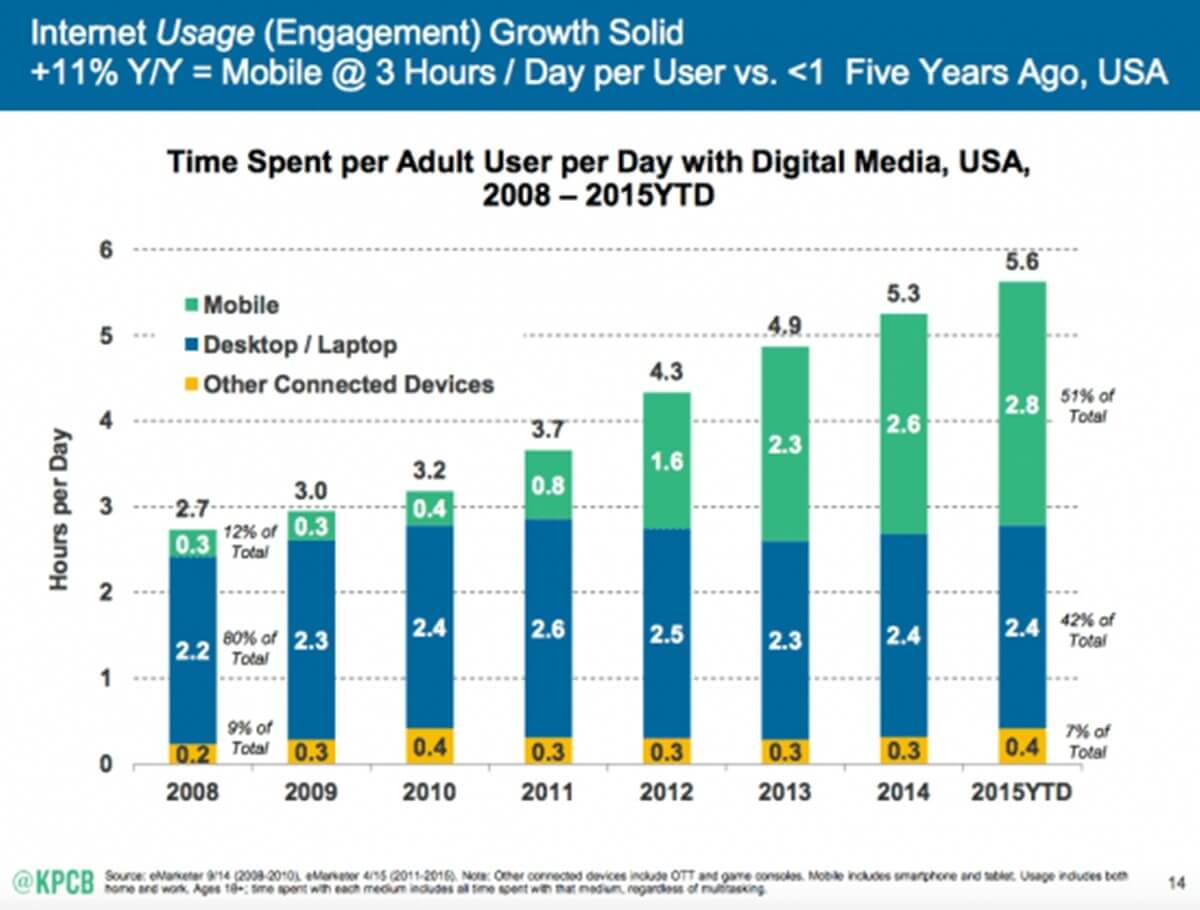
Look at the report above, you can see that the time of multi-screen users has been coming and you cannot drop your users just because of the design.
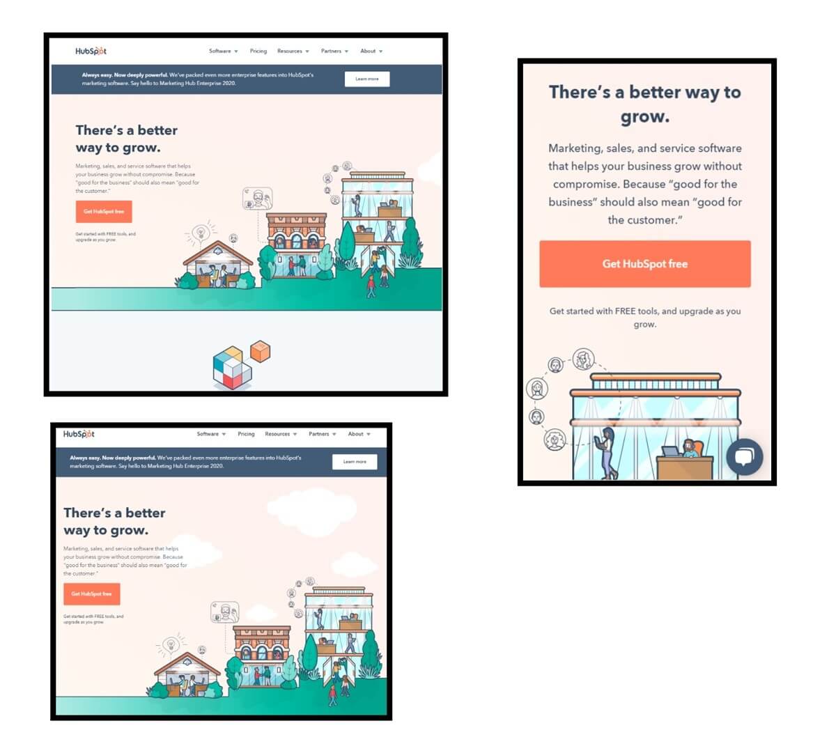
And this example from Hubspot’s landing page may show you the clearly how responsive landing page works and you should incorporate it right to your landing page to boost conversion.
The summary
The work of upgrading the landing page will be conducted periodically until you get the best result. Take your time to tweak things then test whether the modification makes a positive change to your conversion. We are here to provide you useful tips to Optimize Landing Page & Boost Conversion. And if you see the positive changes in your landing page’s performance, don’t forget to inform us about it right in the comment box!

New Posts


