
What is a Splash Page? Definition, Examples and More
By Sam Nguyen

Drive 20-40% of your revenue with Avada
You might be familiar with a landing page, which is the place where new customers land. But have you heard about the term “splash page”? If you are a web designer, you should not miss out on this article. We will explain to you what exactly it is and provide some useful tips to create an enticing splash page for your website.
Related Posts:
What exactly is a splash page?
A splash page is an introduction of a company to its website. It is not a landing page, but rather a wide window used for the promotion of a service or product, to disclose a promotion or to convey the information, before a user can access the web and see the rest of the pages of the site. This page usually has a single message and an exit link.
Take the splash page of garrisonfootwear as an example. The site uses a splash page to introduce to the visitors about the products of the company-footwear. Once somebody clicks “Find out more”, they will be directed to the site’s first page with more details about the business.
Football.com’s splash page enables them to go the extra mile and offers the visitors to their site memorable browsing experience.
Splash page vs. Landing page: What are the differences
First, let’s understand what a landing page is first. It is a standalone website built specifically for marketing and advertisement. As a place where your new potential customers land, therefore, it can make a profound first impression on them. Focus on the quality of your landing page as first impressions are lasting.
A landing page can help you increase your conversions by catching the visitors’ attention and immediately tempting them into action like subscribing or placing an order. A well-tailored landing page design relevant to your business’ overall objective and fully featured, your business can make huge progress.
The similarity of a landing page and a splash page lies in their features and their purpose. Nevertheless, we often mix them up as they both help catch attention immediately. Let’s find out the differences based on the following characteristics:
Length and company
The length of a landing page may vary; what matters is how to engage visitors with a suitable design for your business. while, a splash page is only about greeting and must be short. A landing page is always a standalone site, and a splash page does not necessarily have to be.
Length of creation
Because splash pages should be as short as possible, and it takes only a few minutes to create them. In contrast, to create landing pages, the process is more lengthy and takes longer. Luckily, a high-quality and intuitive landing page builder can help you do that no longer than an hour.
Which elements will you need on a splash page?
A typical splash page includes high-quality visuals, minimal (but important!) copy, and a call-to-action (CTA).
High-quality visuals
Splash pages feature high-quality visuals to catch the attention of visitors. These visuals are typically your website’s first introduction; hence, they should be on-brand, aesthetically delightful, and relevant to your audience’s interests. If you do not focus on doing this, the visitors will leave your site before browsing your homepage or content.
Background images, product photography, video, or animation can be your visuals. Note that video or animation may slow download time, and any users with an ad blocker enabled can not see it.
Minimal (but important!) copy
You should keep your copy short and action-oriented. Your visitors get discouraged from reading paragraphs of copy before accessing your site; it is infrequent that they click the back button and search for your products.
You should use a splash page that clearly explains an offer that your visitors can not get from your homepage or content.
A call-to-action (CTA)
A CTA enables your customers to take action instantly and then return to what they were here for, like your homepage or content. Besides, somewhere on your splash page, ensure that you also have an exit option.
An exit option enables visitors to land your site without having to send their email addresses. If you require people to enter their email address or click through to another offer, they will leave your site without taking action.
The things you display on your splash page may differ based on your goal. You can also add age verification to access your website, sensitive content warnings, requirements for the best user experience on your site (such as turn sound on, use Flash Player, run on a specific browser, and many more).
You can also ask them to enter their email in exchange for a discount code, to access a content download, to subscribe to your blog or newsletter, information on a limited-time sale or event, or announcement of new products.
How to create a splash page?
To design and set up a splash page for your website, check out the following tips:
Use overlays or popups instead of a completely separate splash page
A lightbox overlay or popup shows your splash page over the top of your visitor’s selected page. It helps them understand that they are in the right place, and if they are not interested, they can leave the splash page.
Make your splash page design responsive
Mobile devices make up more than 50 percent of all web page views – ensure that your splash page works for all guests to your site. Collaborate with your designers or pick a responsive template in your site builder to guarantee that each visitor’s screen width is tailored as per your splash page.
Help your users get where they want to go
Ensure that the visitor completes your CTA—or opts out, you direct them through to the page they initially wanted to browse. Your customer does not want to be redirected to your homepage while they are reading an article on your blog.
Keep it simple
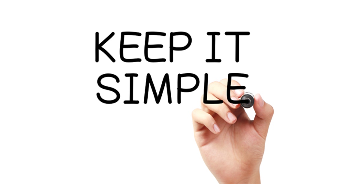
Simplify your splash page to provide better user experience and ensure faster load times. To do this, you should get your copy and CTA straight to the point, use simple JavaScript, and minimize the use of video, animations, and plugins on the page.
Keep an eye on the analytics

When you already have your splash page start to work correctly, it’s time to monitor results to know whether it works well or not for your website. Based on your goal, you can monitor the bounce rate, time spent on the page, click-through rate, and form submissions.
If after you include a splash page, but your performance does not improve or gets worse, then you may not have an adequate incentive, valuable information, or responsive user experience.
What is the purpose of a splash page?
Even though the power of splash pages seems unremarkable, they can be incredibly useful. Based on your objective, a splash page can be:
Fast-loading

Aa splash page has very little information. It allows you to immediately catch the visitors’ attention and deliver your information.
Serves as a showoff
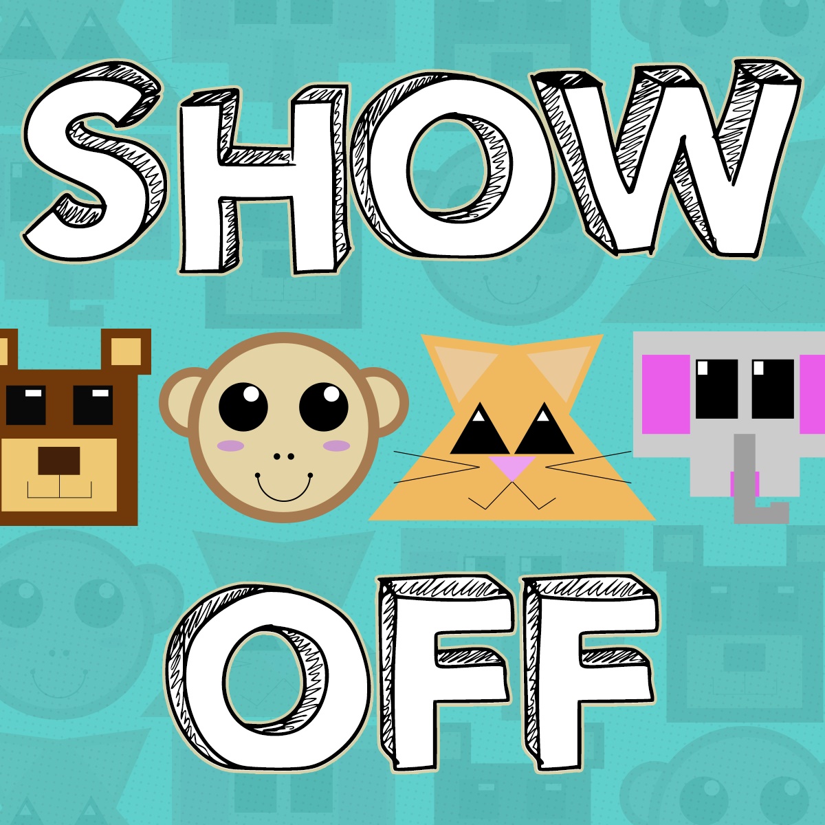
It can also serve as a showoff or a portfolio of your best work. Thus, you can display your work’s quality and leave a profound first impression on your visitors.
Allows visitors to choose
On a splash page, your visitors can select the site language or technology if your business website has a few versions,
Allows you to get feedback
Only by taking a look at which splash pages you had built helped your business’ performance, you can get the preferences of your potential customers.
Splash page best 10 examples for your inspiration
1. Zara

As a fashion brand, Zara features stunning on-brand visuals. Except for the cookie warning that almost every website has, there is a minimal copy, contributing to its being visually impressive. Also, to optimize the shopping experience, the website requires you to click your language and location.
2. Forbes
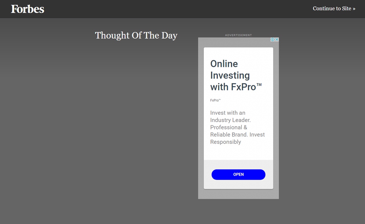
As a business magazine, Forbes features original articles on finance, industry, investing, and marketing. Its splash page includes the promotion of a product. It also has a minimal copy so that your visitors will not feel overwhelmed. If you are interested in this content, click “open”, otherwise, click “Continue to Site”.
3. Urban Influence

Urban Influence is an award-winning Seattle brand focused on strategy, branding, graphic design, web design, video, and interactive. Its splash page is stunning with the first introduction to the business, incorporated with videos so that visitors to your site will feel hypnotized and linger on your site longer.
4. CoLofts

CoLofts is a place for creative professionals who hope to be a part of a growing community. Located in downtown Edmonton near MacEwan University, CoLofts offers a unique living and working spaces in a lively and dynamic neighborhood. If you want to find yourself a place for your business, then the offices’ different sizes and shapes will not let you down. The visitors to their site will be deeply impressed with its splashing page emphasizing on their brand name.
5. Femme Fatale Paris
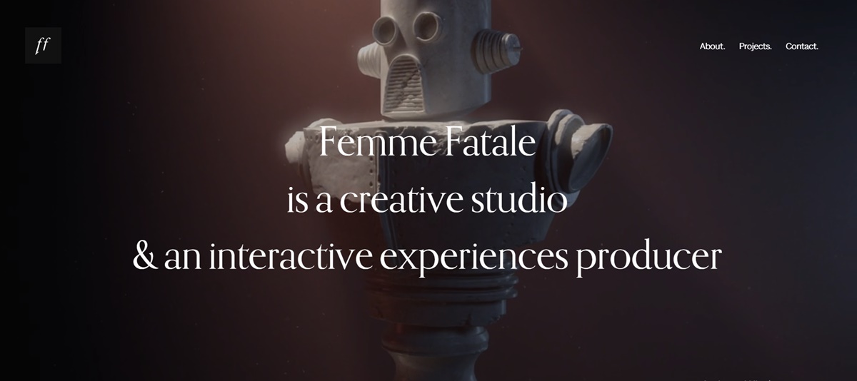
This French creative studio specializes in art direction, creative web development, animation & motion design. The simple splash page is very powerful in that it makes any visitor to their site know what type of studio it is.
6. Muse
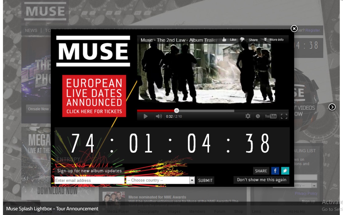
With inspiring countdown, it triggers expectations. A product drop, event, or webinar is counted down. Besides, the album trailer video brings more enthusiasm about the forthcoming release; thus, fans are more likely to sign up for updates. Before you add a video, you can consider doing some load testing to make sure the site runs smoothly and avoid any slowdown.
Also, its popup allows visitors to opt-out easily by tapping on “don’t show me this again.”
7. J. Crew
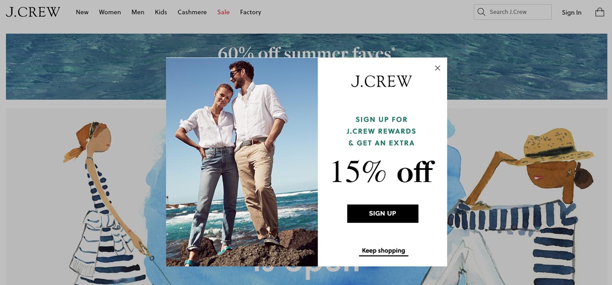
The actual photos display the high-quality products of J. Crew- clothing items, informing you of the purpose of its offer: 15% off discount. Besides, its inviting copy- “Join the crew” (based on its brand name) seems hilarious and unique.
Another thing to learn from this website is that it allows easy opt-out for guests to your site. J. Crew has an exit link at multiple points; they can feel satisfied as they can shop without having to enter their email.
8. Gimme Some Oven
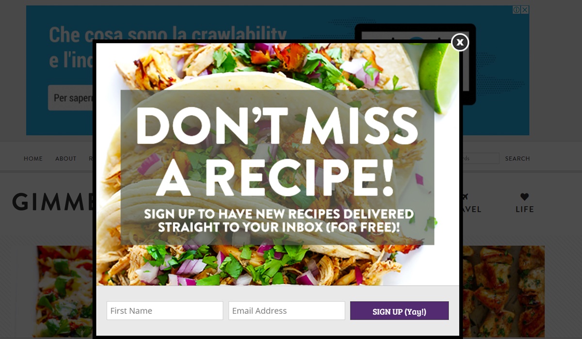
For this food blog, this mouth-watering salad image is so fit and can attract users’ attention from the first sight. It also features a clear and straight-to-the-point copy. Everyone can understand their message: If you sign up with your name and email, you will get new recipes.
9. KILLSTAR
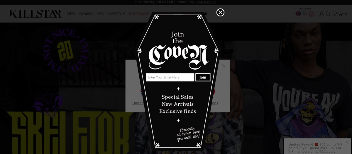
As a Clothing & Lifestyle company with a twist of darkness, KILLSTAR creates its splash page very creepily as its value proposition-it is shaped like a coffin. “Join the coven” feels fun and unique; it also contributes to its brand identity.
10. Tito’s
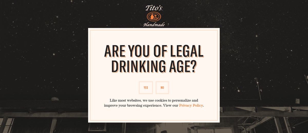
The use of Vodka’s logo, brand colors, and fonts all add up to a classy look on Tito’s splash page. The copy is also straight to the point with a simple and short message.
As it has age-restricted content, there is no easy opt-out; thus, users cannot skip past this page
Summary
To sum up, we have clarified to you What a Splash Page is, revealed to you the best websites that possess an impressive splash page. We hope that after this article, you would know how to create it and tailor it properly to your audience. And more importantly, the guests to your site will have an enjoyable user experience.
Now that you have your splash page up and running, you may want to Optimize your Landing Page to drive more traffic and increase conversion rate. To do that, make sure you check out our post here: 11+ Incredible Tips to Optimize Landing Page & Boost Conversion.
We hope that your splash page will help your website have better performance and attract more visitors.


New Posts


