
16 + Inspiring Lead Generation Forms That Immediately Convert
By Sam Nguyen

Drive 20-40% of your revenue with Avada
Have you ever been in this situation?
You completed a lead generation form, such as a registration form, a sign-up form, or a contact form, and said, “Wow, what a wonderful experience I just had completing this form!”
Well, maybe not.
But we bet that you might recall a bad experience you had while filling out a website form. Whether it was a long & boring form, a form that was difficult to locate on a company’s website, or one that just wouldn’t allow you to submit your responses for unknown reasons, most people can remember a time in which they had some type of issue filling out a web form.
Lead generation forms are essential to your business - they help attract web visitors and turn them into leads. The problem is: How can you generate an engaging lead generation form on your website?
This guide will show you 16+ of our favorite lead generation forms and include several best practices to help you create a great user experience and boost your own conversions.
What is a lead generation form?
A lead generation form is any form used to capture data and email addresses from website visitors.

Lead generation forms come in a wide range of formats, including registration forms, contact forms, lead magnet forms, and newsletter sign-up forms. Nevertheless, all of them aim the same goal: to turn your website visitors into leads and subscribers.
Why do you need a lead generation form?
Through your lead generation form, you can start building your email list. And we all know that the email list is the “lifeblood of any successful blog.”
The competition is increasingly growing, and it is getting harder to collect leads. Having a plain form, asking for visitors’ email addresses with no incentives can’t work the way you want to get more leads. That means you have to work eagerly to create content that people really want to see and find useful. Besides, you need to build your form with several elements that will make it great and properly work to capture more leads.
Let’s move to the next section to get some inspiration for your lead generation form.
16+ inspiring lead generation form examples
1. Airbnb
When you open Airbnb’s official website and click on their sign-up CTA, you will be brought to the form pictured below.
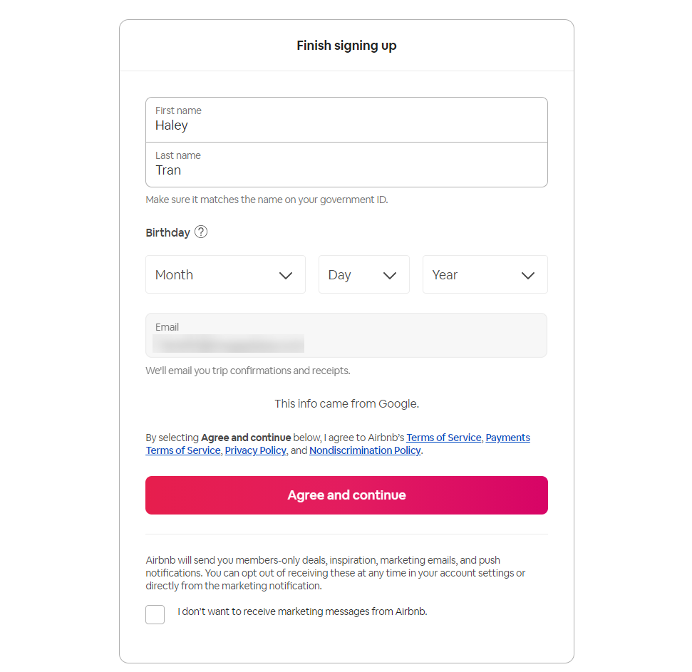
The lead generation form allows you to sign up using your Facebook, Google, Apple, or email account to speed up the process. When creating their form, Airbnb assumed that you might have questions come up during the sign-up process. That’s why there are buttons with question marks located next to specific form fields, explaining why Airbnb requires specific information.
Airbnb also confirms whether you want to receive their marketing messages or not before signing you up.
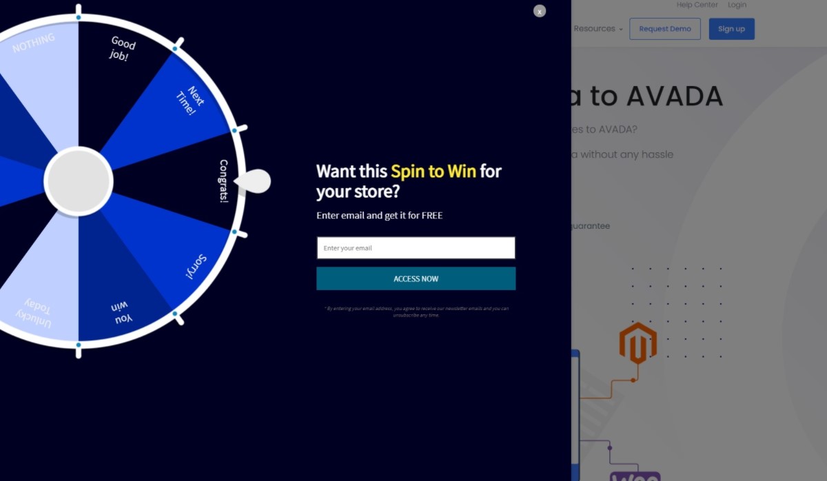
2. AVADA Commerce
The lead generation process doesn’t need to be one-sided. Actually, you can make it fun for your prospects by gaming the whole thing as well as incorporating an interactive activity into the mix.
Gamification of lead generation forms can motivate participation and promote engagement. It can also help simplify boring form completion and make it interesting for your visitors. For example, look at the below-given lead generation form by AVADA Commerce, a marketing automation platform that invites visitors to “spin the wheel.” You can apply other gamification options, such as quizzes and multiple-choice questions.
3. Broadcast2world
The lead generation form of Broadcast2world is located on a landing page that includes a video, an explanation of why visitors should sign up, and social proof.
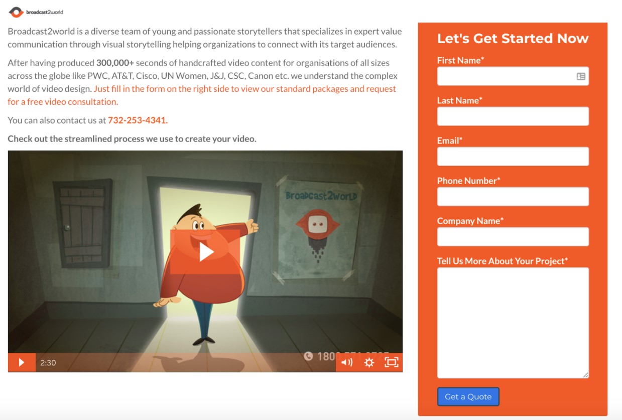
There is even contact information located next to the form, so you can get in touch with someone from the company to discuss any of your concerns or questions prior to signing up. And if that is not enough, the company added a long-text entry field to its form, where you can describe your questions or concerns.
4. BrokerNotes
You will be surprised to know that with this lead generation form, BrokerNotes saw an increase of its conversion rate from 11% to 46%.
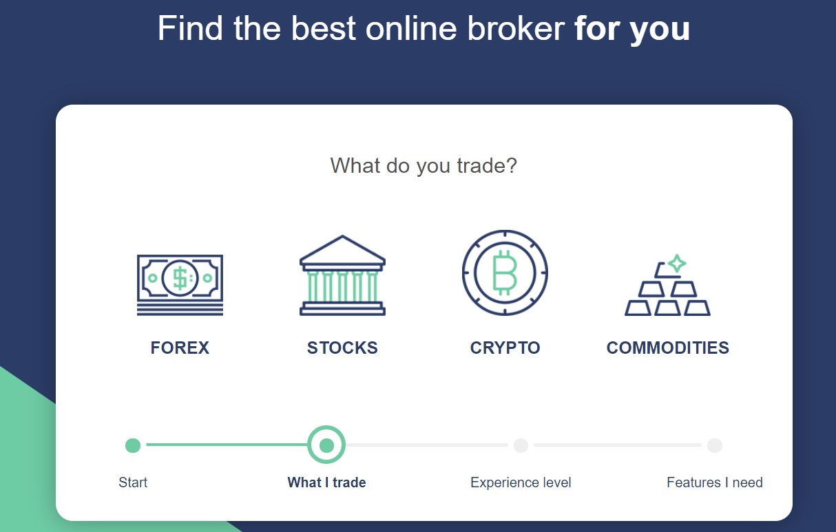
A key concept behind building this form was to not make it look like a form. In spite of common wisdom suggesting that you should not reinvent the wheel with things like forms, people just do not like forms.
By using non-standard user interface (UI) elements, like large clickable images and toggle sliders, BrokerNotes created a fun form. Of course, the data collected at the end was identical to if we used a traditional form.

From a psychological perspective, every UI element requires motor action (a movement or mouse click) rather than a cognitive action (having to think and type).
In the same way that a piece of software might be more intensive on your computer’s RAM than others, moto actions are actually less “load intensive” on the brain than cognitive actions. So, by reducing the cognitive load (e.g., the amount the user has to think to complete the form), you can make it easier for visitors, increasing lead generation form completions.
Another strategy used is conditional logic to display/ hide specific questions to specific visitors. For instance, if someone said they were a beginner trader, you shouldn’t ask them which trading platform they prefer, as it is unlikely that they would have one. For anyone who answered that they were an expert, this is an essential question to ask.
While this sounds like common sense, most lead generation forms ask the same cookie-cutter questions to every user. Conditional logic enables you to collect more information on users, while better segmenting them by asking the most relevant question to different audience segments.
5. Care/of
Care/of comes with a hyper-personalized multi-step form by providing visitors with a recommended program of vitamins, nutrients, along with other dietary supplements to boost their health. It is hard to get much more personal (or rewarding) than a lead generation form that promises to improve your life’s quality.
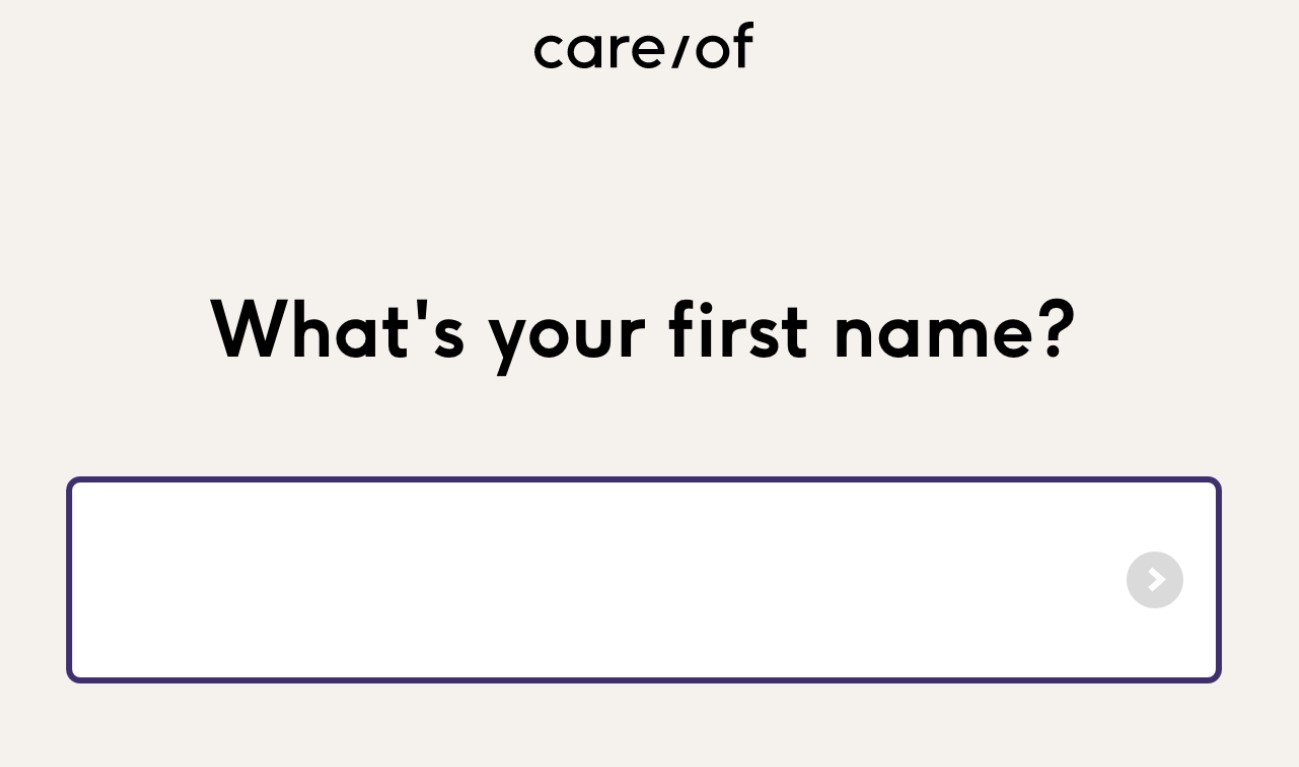
The brand provides personalized diary/ health advice and reinforces the idea that every customer should be treated as an individual. Therefore, it is no surprise that the form kicks things off by asking for your first name and addressing you directly.
That is a good start, but the nature of Care/of’s services means that superficial personalization has little value. This sign-up process needs to capture detailed information from visitors for the benefit of making the best recommendations.
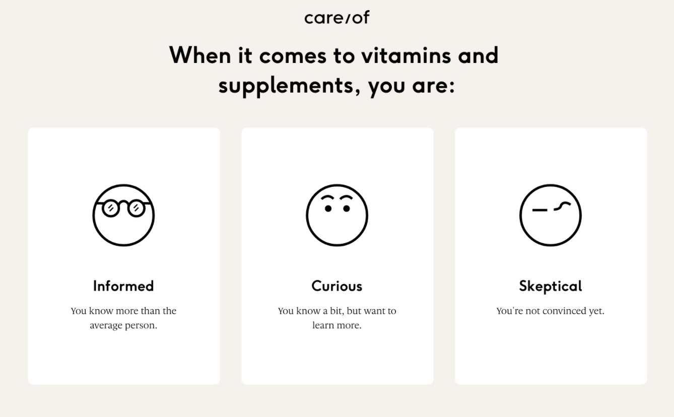
This sign-up process doesn’t disappoint, either. Multiple choice questions are well-matched with image selector buttons in order to create a quick, detailed sign-up process that helps Care/of segment their leads and deliver better follow-up content.
6. Compare The Market
Compare The Market has one of the most challenging jobs we have ever seen in terms of designing web forms. This is where visitors compare prices for a range of insurance, energy, and financial services - all of which require extensive data submission.

The brand isn’t going to win any awards for its visual aesthetic forms, but deserves lots of credit for the functionality put into these complicated forms. It begins with segmenting lead types right on the homepage and directing visitors to separate forms, relevant to the specific service they are interested in.
If you have ever requested an insurance quote online, you will know just how long and dull the process can be. Compare The Market has reduced the number of clicks required to complete this form to the absolute minimum.
One of the best ways to do this is by asking questions in a logical order. This allows Compare The Market to set the most probable answers as defaults to future questions. For instance, if you enter your vehicle registration number, all of the following questions are already answered by default:
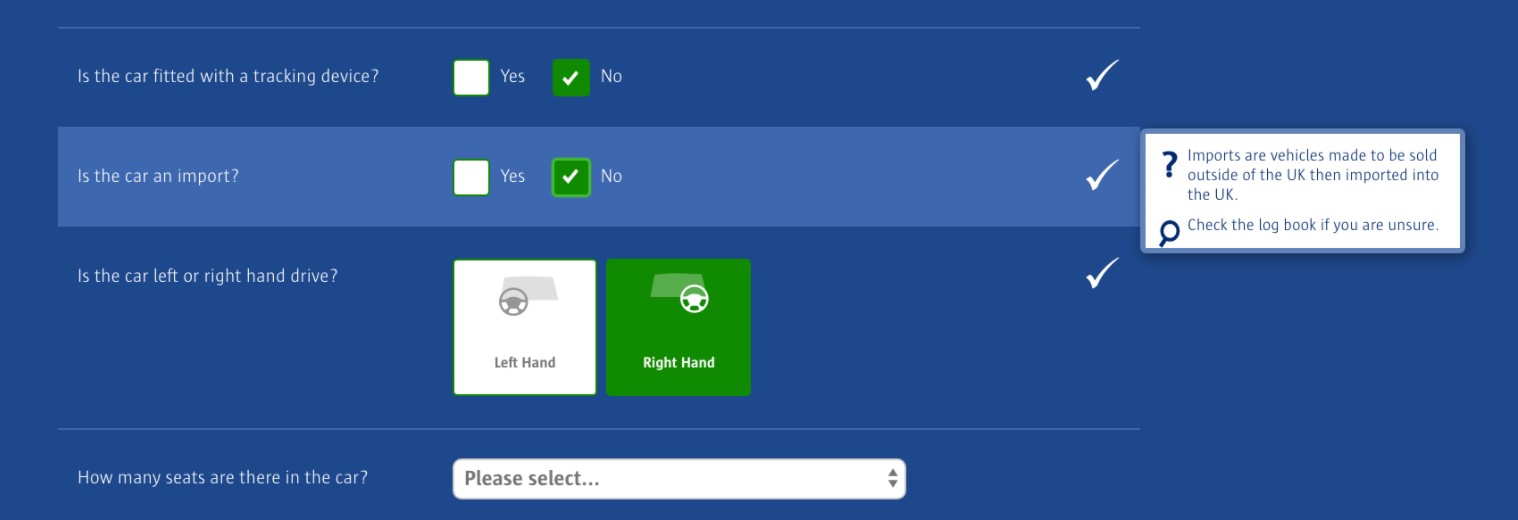
Another point that Compare The Market is particularly good at is providing good explanations for ambiguous questions. Instead of usual question mark tooltips, the brand has full pop-out explainers with icons when you hover any question.
Its handling of optional fields is also interesting. Using the same pop-out explainers from above, it explains how filling out optional fields will benefit your quote. This is an excellent balance between allowing users who are in a rush to skip these questions but still collecting extra information from visitors who are willing to invest more time to get a better or more accurate outcome.
7. Crazy Egg
One of the most important factors affecting form conversion rates is how much motivation your visitors have to use in the first place. One of the best ways to boost this motivation is to ensure that your lead generation form sells the benefits of itself.
Crazy Egg is an excellent example of this. Their lead generation form explains that by using their form, you’ll receive a heatmap that tells you to improve what is working, fix what isn’t, as well as test new ideas.
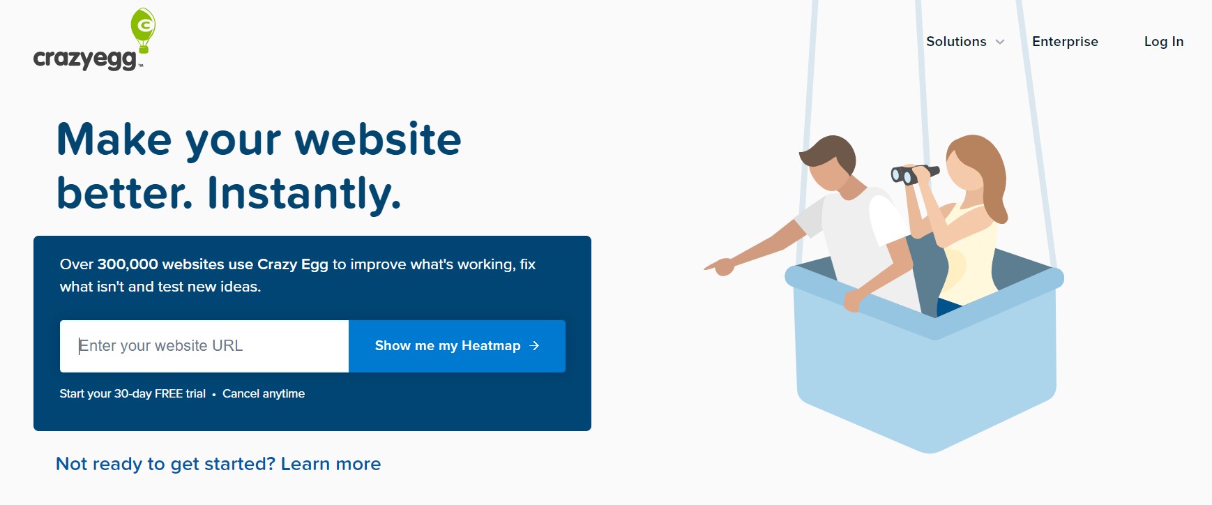
Besides, you can learn something from Crazy Egg’s CTA button copy. Consider your lead generation form from the perspective of your visitors and use language to reflect that. These people are going to read forms and you want them to feel comfortable and like you are speaking directly to them.
Crazy Egg does exactly this by using first-person pronouns in its CTA. This target leads directly and motivates them to press that all-important sign-up button.
8. eHarmony
Lots of the best lead generation forms begin with knowing what visitors are looking for before they start filling them out. In this case of eHarmony, people visit the website looking for love, and it is hard to think of an instance where intent and desire could be much higher.

To maximize the number of users that start filling out its form, eHarmony emphasizes the “Free” aspect of signing up. This is an added incentive, considering eHarmony is a paid dating service. Then, it removes friction by adding a multi-step design with click/ touch button image selectors in order to get the session started.

The brand knows that high intent means that people are willing to provide in-depth information about themselves, and thanks to the nature of eHarmony’s service, visitors understand they will be getting better results by filling out more information about themselves.
Thanks to this intent, visitors are happy to deal with longer forms, but the brand still works hard in order to reduce friction where it matters. By implementing multiple-choice touch answers and switching to a quiz-style format, eHarmony reduces typing to a bare minimum.
9. HubSpot’s Website Grader
While it looks like a simple tool, HubSpot’s Website Grader is actually a lead generation form in disguise. What’s interesting about it is that it only asks for two pieces of information before giving you value.
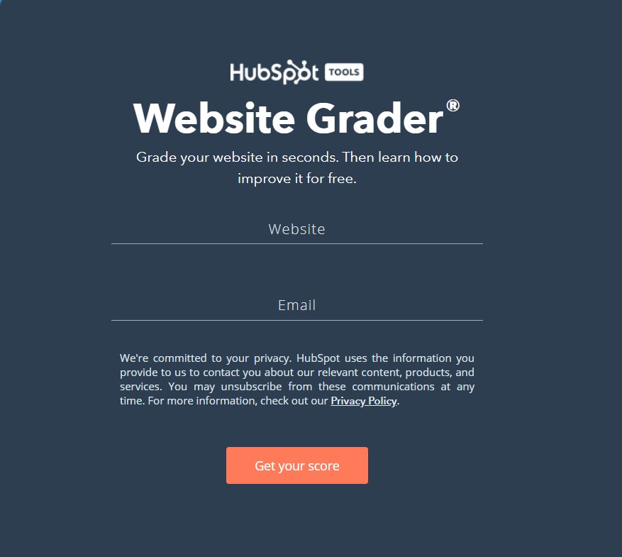
Once you have entered your website address and email, you are giving a personalized web audit of your website’s performance. If you click “Try HubSpot for Free,” you will be asked for more information - if not, they will still get in touch to try and sell their software.
The lesson here is noticing the power of a simple form and giving visitors some value (i.e., an audit) in return for their details.
10. Hulu
Hulu’s lead generation form is actually minimalist in terms of design. The form is quite easy to follow and understand with one of the only pops of color being the CTA, which is followed by some very straightforward form fields.
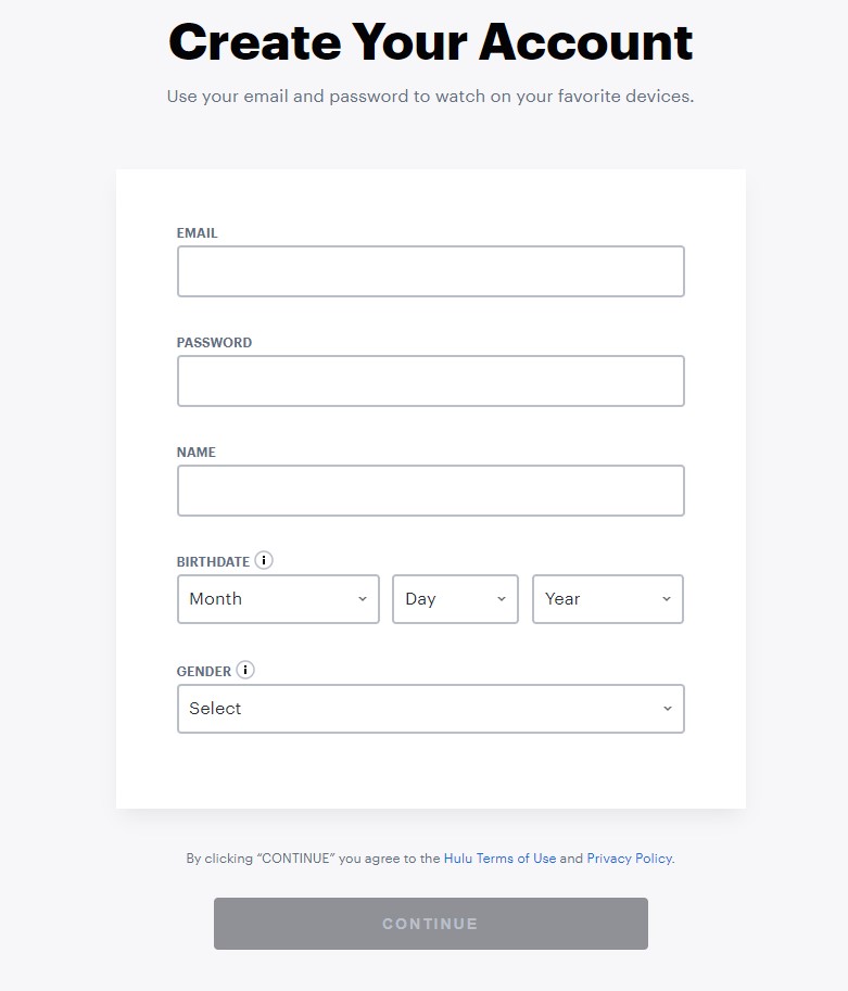
This is vital because it is a multi-step form, which means once you hit the “Continue” button, you will be directed to another landing page with more form fields to complete. The brand breaks up its form into multiple steps due to its length to make it appear less daunting.
11. Lemonade
Lemonade takes the pain out of looking for insurance with its personalized, conversational multi-step lead generation form.
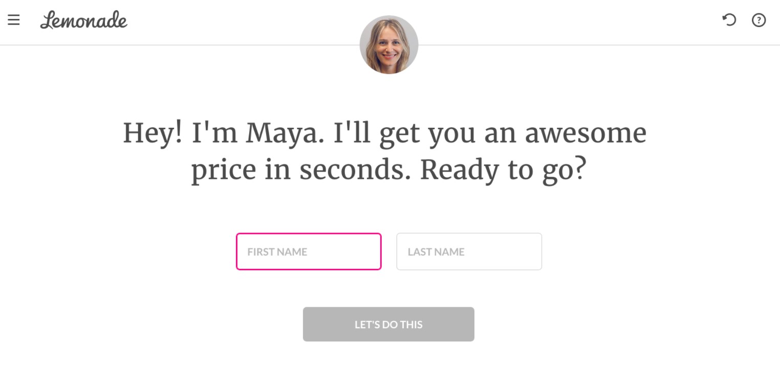
The brand has even put a face and a name to its chatty form in order to enhance the conversational feel of the user experience. More importantly, Lemonade makes the process all about the end user, mentioning users by name and guiding them through the key questions, one by one.
Lemonade makes everything good, from limiting the number of questions each step to using image selector buttons wherever possible. Its lead generation form is so close to getting a 10/10 score. However, the brand has left one crucial feature out: a progress bar to show visitors how much of the form they have completed.
12. Marketing Automation Insider
Marketing Automation Insider helps business owners choose the right automation software for their needs. This free tool guides them through several simple questions (quite similar to Lemonade) and then offers a free list of recommended tools.
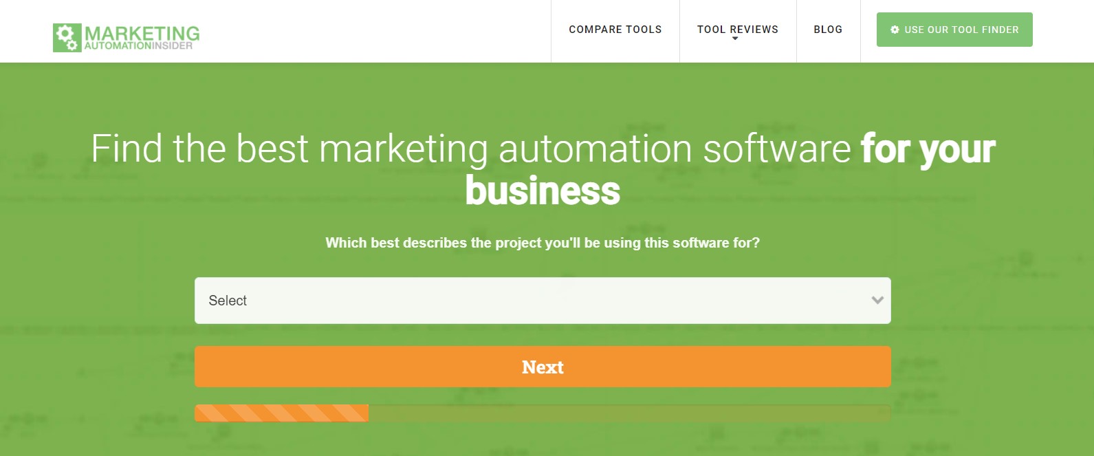
There are several key things happening here. Firstly, the end user is getting something of value for free, which ramps up the incentive to use the tool and fill out the form (great for completion rates, conversion rates, and all of that good stuff).
Second, there is that progress bar that Lemonade is so dearly missed, which not only tells visitors how much of the form they have completed, but also compels them to keep filling it out.
Lastly, the biggest success with this lead generation form is that the Q&A style format (also used by Lemonade) enables Marketing Automation Insider to capture all of the information necessary about prospects to segment them with great accuracy.
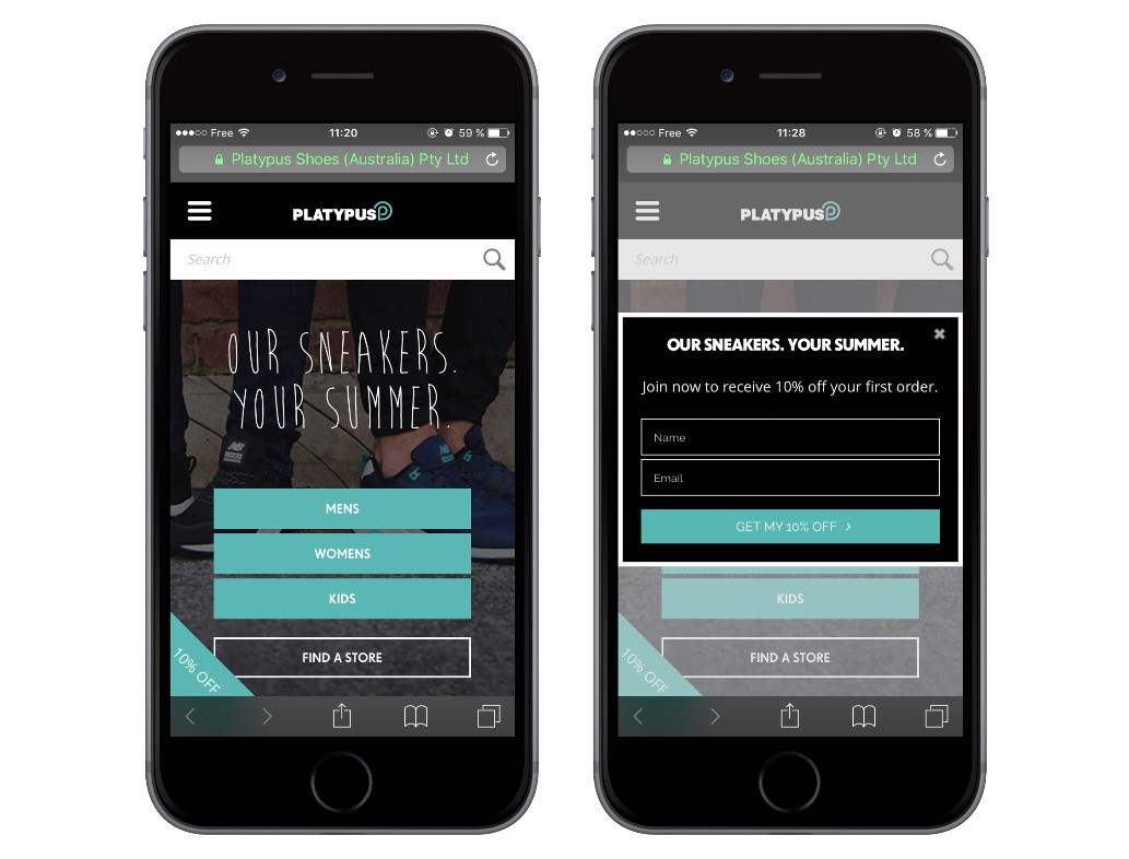
13. Platypus
Most Internet users browse the web from their mobile devices. This could be a huge sticking point for companies that only create lead generation forms for desktop experiences.
It is a really easy fix, though. Ensure that your lead generation forms are compatible to capture visitors scrolling with their thumbs. Platypus - an Australian shoe brand - does exactly this and has increased its email subscription by 144%.
14. Single Grain
Single Grain uses the sign-up process to qualify two different types of leads: those willing to pay for the services of the agency and those simply looking for free information.
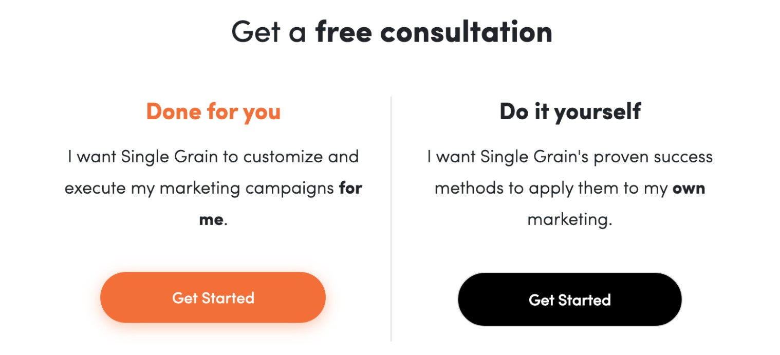
This enables Single Grain to prioritize the leads that demonstrate an early intent to work with the agency on a paid basis. Visitors who are simply looking to engage with free content are asked to provide some basic information (company name, size, etc.), and then Single Grain places them on the relevant email marketing list.
So, the agency can prioritize its efforts on leads that declare interest in working with them, while placing the rest on relevant lists in order to nurture content and email marketing campaigns, which will be designed to turn these weaker leads into potential customers over time.
15. Stitch Fix
Stitch Fix sends its users clothes to try, based on their preferences and personalized fashion advice from industry professionals. This highly-personalized service gives the brand full freedom to ask all the necessary from users, because they know the more information they submit, the better the service they are going to receive.
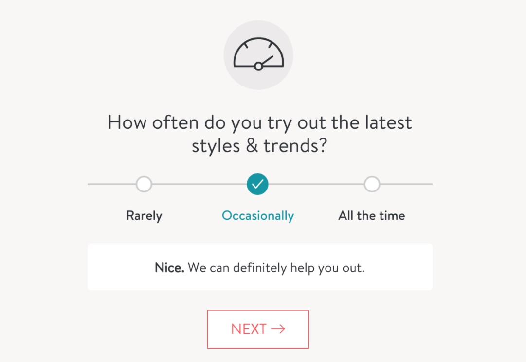
The brand has designed a hyper-personalized quiz-style sign-up process to keep this process intuitive to get to know more about each visitor. Each time a visitor selects an option, they will get feedback from the form, as you can see above.
Actually, the sign-up process is a bit long, but the experience remains engaging. Besides, the constant sense that data entry will be rewarded keeps you progressing.
16. Uber
Earlier, we looked at how Single Grain segments its sign-up process. Now, we have a similar tactic from Uber, but this time, it is used to qualify two types of leads: drivers and passengers.
The brand gets right to the point by asking visitors what they really want from its app - none of the “sign up first and we will ask the question later” nonsense. This approach immediately segments Uber leads and lets the company deliver one of two forms to each type of prospect.

The lesson here is that companies serving two sides of the same service (i.e., an eLearning platform for both publishers and learners) can segment lead types with the first interaction.
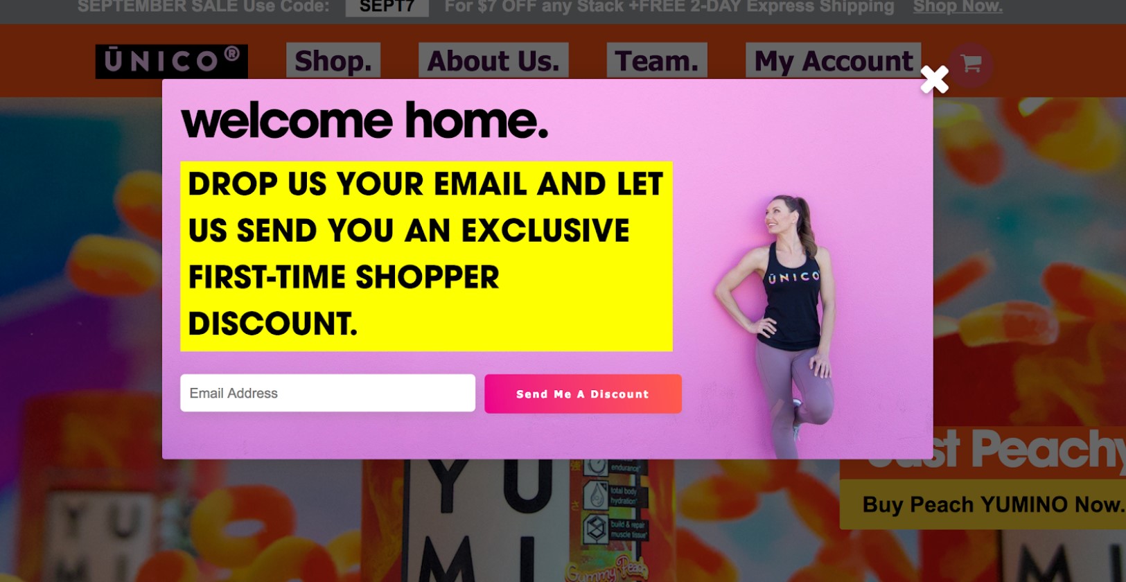
17. Unico Nutrition
Unico Nutrition has 2 lead generation forms on its website that appear at different times throughout the customer’s journey. The first one appears in a popup box the second you open its website. The lead generation form offers an incentive for providing your email address - an exclusive first-time shopper discount.
Its second lead generation form appears once visitors click a “Sign Up” CTA button. Its landing page has a dual purpose and contains two forms - a new customer sign-up form and a current customer login form. Whether it is your first time trying to log in or your hundredth, all of your interactions with your account will originate from the same landing page.
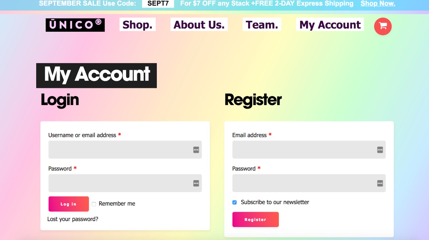
Finally, the appearance of both forms matches Unico’s colorful and fun website and branding.
6 best practices to build a high-converting lead generation form
Below are some tips to get your lead generation forms converting right from the get-go.
-
Customize your forms. Incorporate your brand fonts, colors, and recognizable visuals, so visitors feel comfortable handing over their information to you.
-
Keep your leads focused. Attention spans are proved to be at an all-time low (especially online), meaning it is hard to attract and keep website visitors’ attention before they sign up. Consider using punchy copy and a clear path to action to make sure they are engaged from start to finish.
-
Simplicity is the key. Don’t overcomplicate everything. Website visitors are actually no strangers to lead generation forms, thus say it as it is. Keep your form fields to a minimum and use easy-to-understand instructions, so visitors will know exactly what to expect.
-
Get creative. Don’t limit yourself to just form fields. Try throwing in some clickable alternatives and make the process a whole lot more interactive.
-
Tweak and optimize. It is unlikely that you’re going to create the most awesome, high-performing lead generation form straight off the bat. It often takes time to get right. That’s why it’s essential to consistently experiment with different form types and optimize each element to maximize your results.
-
Say thank you. It is quite a big deal for visitors to hand over their information. After all, inboxes are one of the sacred spaces we’ve left. Let them know how grateful you’re by thanking them for signing up, and then follow up with them instantly to validate their decision.
The bottom line
Lead generation forms can create a great user experience on your website and boost your conversions. With the outstanding examples and best practices mentioned above, you can craft a high-converting lead generation form, which works for your brand, business, and buyer personas in just minutes.
Get started by choosing a few tactics from these examples and implementing them in your own forms to see what works and skyrockets your number of conversions!


New Posts


