
13 Best Font for your Shopify Stores
By Sam Nguyen

Drive 20-40% of your revenue with Avada
Today customers expect to find what they want as quickly as possible without searching through the pages of irrelevant products and information. If consumers cannot find what they want, or simply become frustrated by the browsing experience, they can (and will) leave their search in a click.
One of the crucial aspects that keep the attention of website visitors is typography. Not only does selecting the right typeface help to express your message, but it also can impact your brand image and even make your brand more identifiable.
In this article, I will introduce to you the best fonts that you can use for your Shopify store and some mistakes that you should avoid when it comes to choosing a font. Now let’s jump right into the details.
Exclusive Offer: Get Shopify 33 days for just $1 + The Online Store Starter Kit
Start your 3-day free trial, and enjoy your first month of Shopify for 1$ plus the premium package designed especially for new Shopify merchants!
Related posts:
Why fonts matter for your Shopify store

An important concept to keep in mind when building an eCommerce website is “minimum interaction cost.” This is the minimum effort needed to decide whether a piece of content is worth reading. A study by the Nielsen/Norman group discovered that, on average, users read just 28 percent of the words on a website at maximum. The percentage varies slightly depending on the number of copies on the website. Still, combined with the fact that most people spend an average of 15 seconds on the web page, the statistics reinforce the simple truth: every word needs to be calculated carefully.
This is where fonts play an important role. When used correctly, the fonts will help the reader draw in, make them want to stay longer on your website, and hopefully lead the customer through the purchasing process successfully.
Best font for your Shopify store
Now let’s review what fonts you can use for your Shopify store. Keep in mind that this doesn’t mean you can’t use any other fonts that are outside of this list, but these fonts are just the most popular and reader-friendly there are.
Helvetica
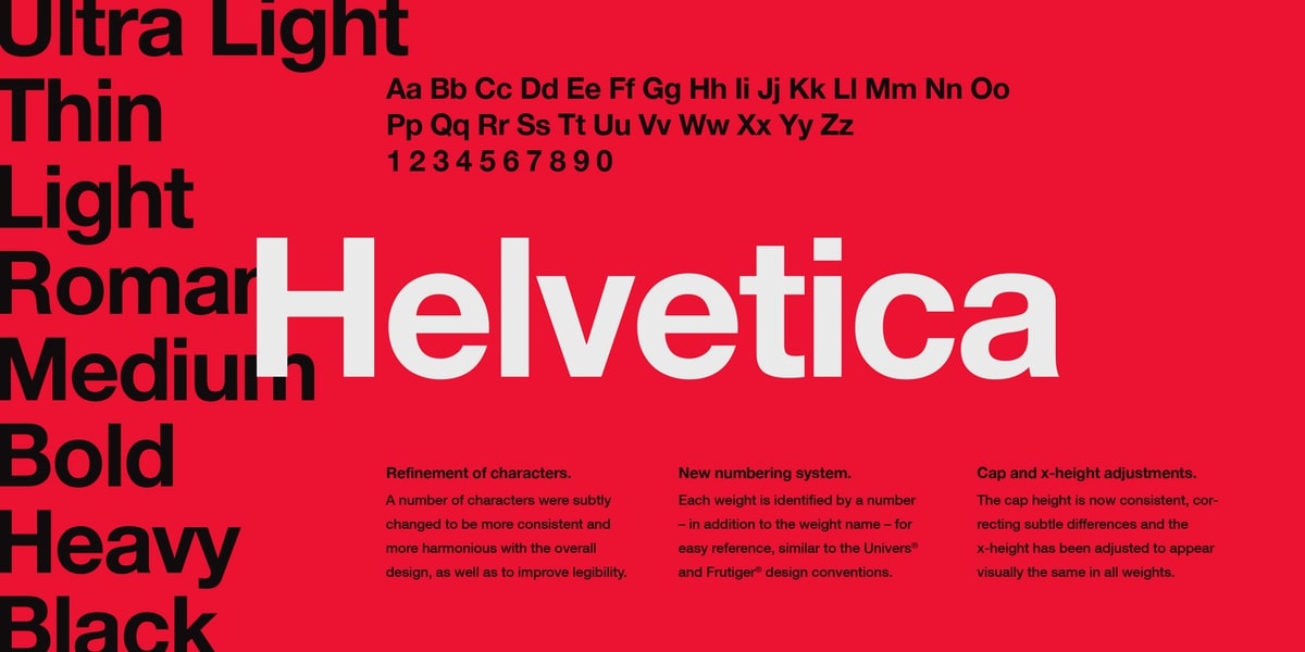
Helvetica is old; it has been around since 1957. It’s part of the sans-serif family, so the letters don’t have curves at the end of each stroke. It’s a classic font, and now it’s split into a variety of types, such as Helvetica light, rounded, and more. Helvetica is simple and commonly used by major companies for their logos and marketing materials.
Garamond
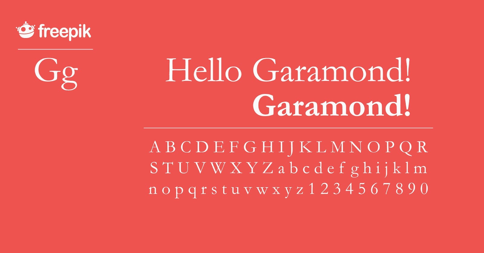
Garamond is old too, and it has a retro feeling to it. It’s perfect for body text in printed books, and it can also be read easily. With this font, your website will have a classic vibe, and each letter may look like an engraving to some people.
Arial

Arial is probably the safest font out there to use, and it’s pretty much the norm in the typography world. In certain machines or word processors, Arial is called Arial MT. They are identical without any noticeable changes.
There are many subtypes of this font, but they’re all easy to read. It belongs to the family of the sans-serif font. Sans serif means that there are no lines of any kind at the end of each letter. The positive thing about this font is that it is familiar, and all Microsoft devices provide it in the operating system. iOs and Android also have no problem recognizing this font.
Courier Family
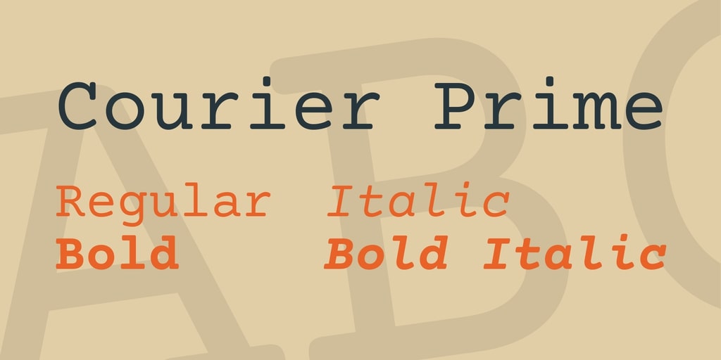
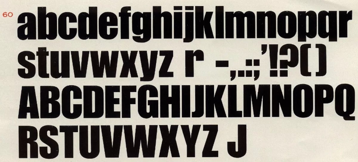
The courier family has two divisions — courier and courier new. Today, the widely popular version is the latter. The font is easy to read since all the letters are evenly spaced. Many fonts have wider widths, but not this one. This is how Howard Kettler designed it in 1955.
Both computers and browsers know the courier family, and no modifications will be made if they open a website using this typeface. It’s been around for decades. It was originally used in IBM typewriters, but later it was widely seen in the personal computer too.
Verdana
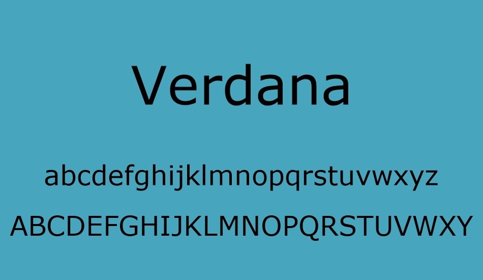
Verdana is considered as a true web font by many font experts. It’s a plain sans serif font, big enough for quick reading. If you look closely, the letters are a little elongated, making it easier to read from laptops, tablets, and smartphones. Verdana is now focusing on portable devices and computers. And rightly so, as it was developed for and by Microsoft.
Times New Roman
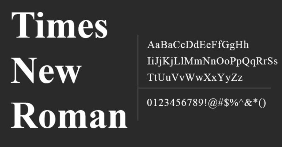
This font is a slight variation of the font of Times (one of the oldest fonts). It’s widely used in newspapers and magazines all over the world, and it’s easily recognizable. Many books are also written in this font, and people from all over the world won’t find it hard to read.
The reason it was named Times is that the company that had this font created was Time Magazine back in 1931. While it is no longer used by the journal, it is still commonly used as a body text in newspaper ad-book publications.
Bookman
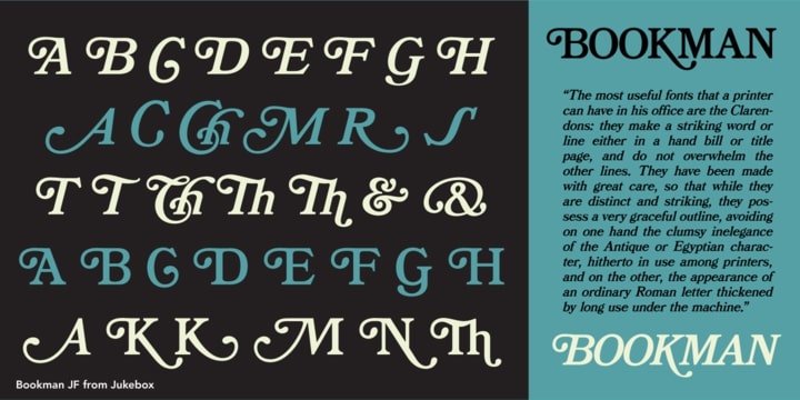
Bookman looks similar to Times New Roman. It is also known as the Old Style Bookman. It has been widely used for trade printing and display typography. It was very common in the 1960s, but its roots can be traced back to the 1850s. Bookman is perfect as a header, but you can also use a thinner version for body text.
Trebuchet MS
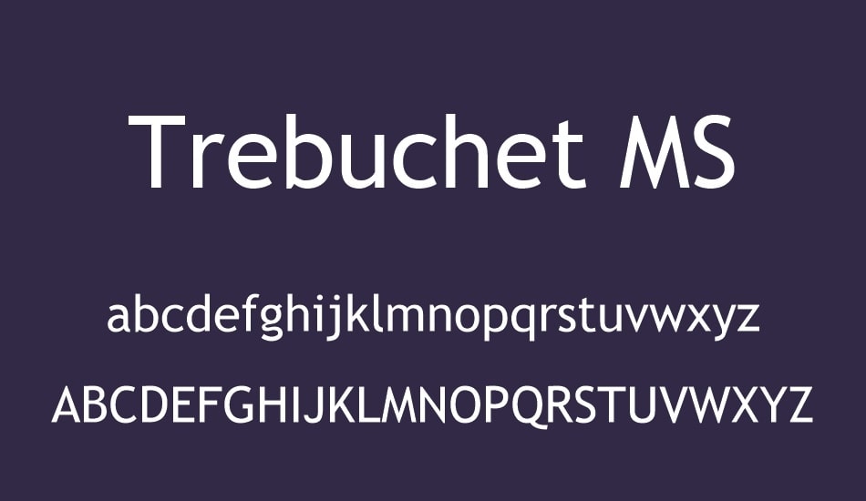
This font has a medieval feeling to it. Somehow, it gives the reader a feeling of old castles where wealthy people lived. It was developed by Microsoft and was first released in 1996. It was also developed for the internet, and that’s why it’s called a trebuchet. A trebuchet was a medieval siege engine that fired giant projectiles. And because it was going to be launched onto the internet, the font was named that.
Cambria
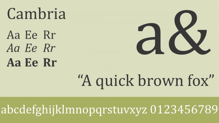
This one has several similarities with Trebuchet MS. It looks beautiful and is better used if you don’t want to use Calibri. It’s part of the serif family, which means there are a few lines at the tips of the letters. However, it is also known to be a simple type of font. Cambria is best used as a body document, as it is highly readable even when it is small.
Palatino Font

This font is very ancient, and we can trace its history back to the 14th century. It’s a broad style, so it’s readable. The Palatino font we know these days was first developed in 1949. When it was created, it was named after the master of Italian calligraphy, Giambattista Palatino. Traditionally, this font was used only for headers and print ads but is now often used for body text, particularly in eBooks.
Impact
This is a favorite font for headers. It’s dense, bold, quick to read, and it makes a major headline. The font is best for titles and subtitles, but not for the text itself. If used too much, the thickness of the font can make it hard to read. It’s better used to declare a deal or use it to grab viewers’ attention in your ads.
Calibri
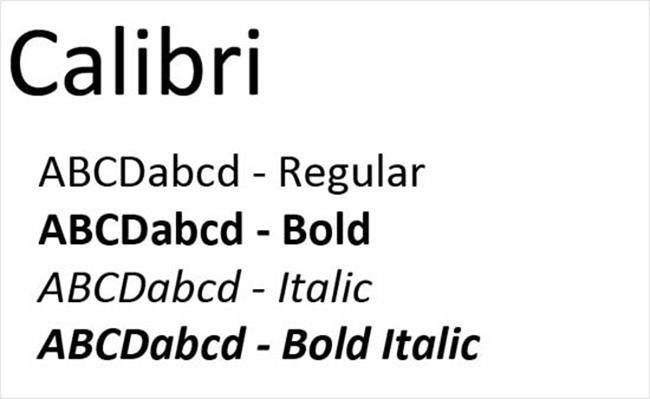
This one is very recent since it only came out in 2004 and was made available to the world in 2007. It was introduced to the world by Microsoft and replaced Times New Roman as the default font for Microsoft Word and other MS Office products. It’s rounded, so it’s easy for the eyes to read. While it’s rounded, it doesn’t look like a cartoon. It maintains a formal appearance and is considered to be a simple type of font.
Copperplate Gothic
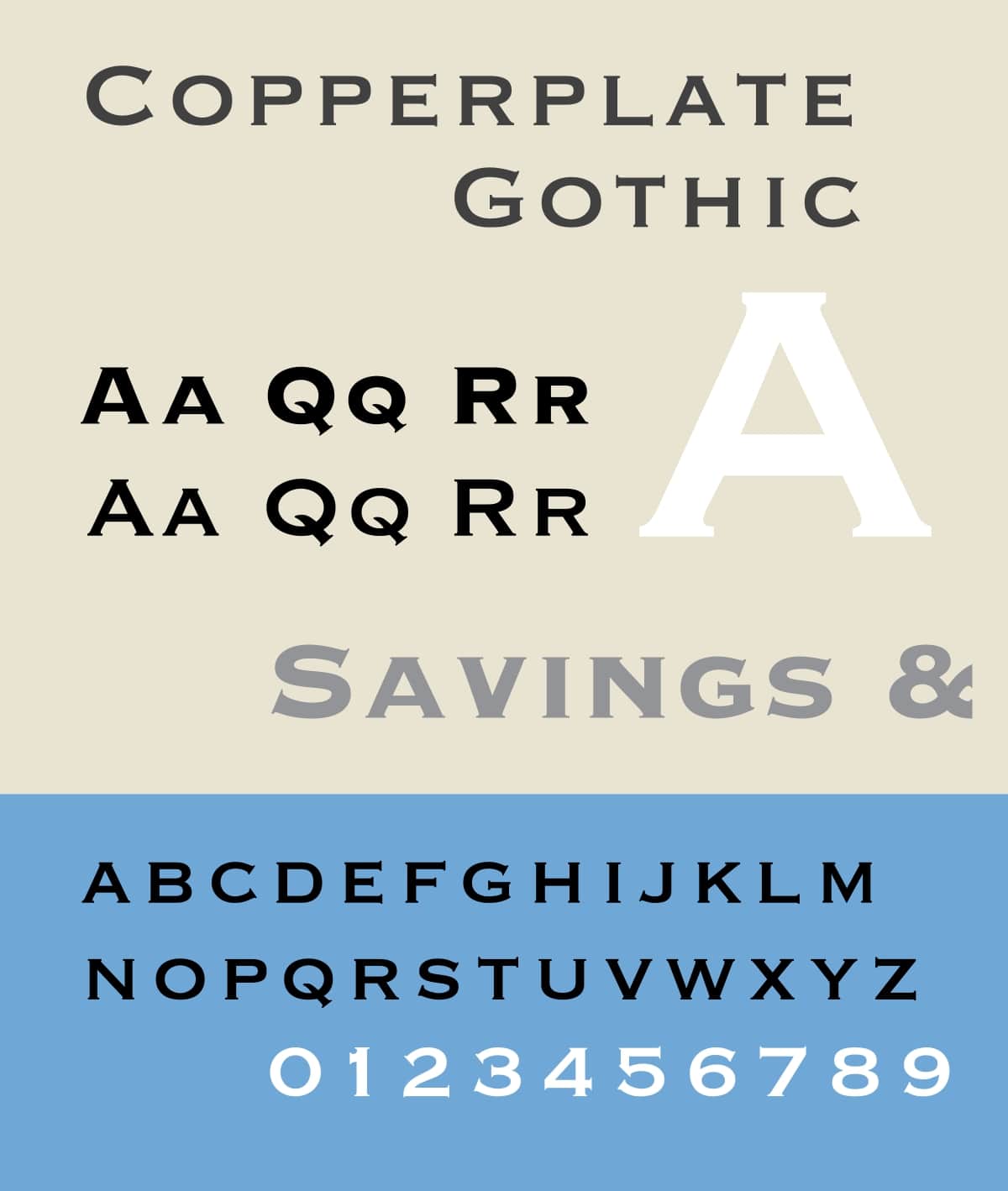
This font has large spaces between the characters. It was designed in 1901, and the artist used copperplate engravings as the basis for the design. Because of this, the font is easy to read and can also be used as a bold header for your blog or product names. This font is best for headers and is better paired with other bold fonts that have a large space like Verdana for body text.
Learn more:
Free 1:1 Shopify consultation & 30-day all-app trial FREE
- Shopify Plus Strategy and Consultation
- Personalized E-commerce Solutions
- Conversion Rate Boosting Techniques
- Inventory Management Hacks

Mistakes to avoid when selecting fonts for your Shopify store
Make sure you don’t get too complicated with your fonts. Mixing too many fonts and styles make your text hard to read. It often annoys the reader and distracts them from the message you’re trying to deliver. When it comes to choosing fonts, less is more. Here are what you should avoid:
Don’t mess with proportions
Anything that stretches, skews compresses, or otherwise manipulates the proportion of fonts is not a good idea. Just don’t even try.
Avoid using the Comic Sans or Papyrus font
Unfortunately, these two fonts have been massively overused and misused, so much so that they are now synonymous with unprofessionalism. The last thing you want to do is to make your brand look unsophisticated and ingenuine.
Final Words
Choosing the right fonts for your Shopify online store can be difficult, but the collection of fonts in this article will help you build the best font combination for your web. Using attributes such as color, height, weight and classification, you can build a duo that fits well together. Please feel free to leave comments below for further discussion on this topic. :-)


New Posts


