
What Are The Best Fonts For Email Marketing?
By Sam Nguyen

Drive 20-40% of your revenue with Avada
When you think of communicating with your customers or prospects online - be it through a website, email, or advertising, you basically have some tools for your service - word, images, colors, etc point. But one important tool that often doesn’t get the attention it deserves is the font you use or the typeface. Fonts carry a visual psychological significance and have a big impact on how readers perceive your content.
When it comes to email, it’s often up to marketers to choose the right fonts. That’s because it’s not just about what your email font is conveying, but also about font availability in the operating system and email applications. It’s about how your fonts, which you chose with deep understanding, show up and what your email subscribers eventually see or don’t see in their emails.
In this guide to email typography, we present you with the best email fonts you need to use for anybody to copy and display text, showing you how to polish shoes in any font style you like and tell you what size and font settings to use.
Why do fonts matter to email marketing?
Some people argue that font choice is unimportant or that the best option is to go with defaults. This is a mistake. Marketers trying to get the best result out of their email campaigns can’t afford to neglect formatting and font selection. They need to use email fonts to their advantage.
Fonts affect human psychology
Studies have shown that text font, typeface, and formatting can affect people’s psychological decisions.
In one study, a researcher had test subjects read a piece of text and then asked two questions to assess their feelings and opinions about the passage’s information. Researchers quietly used different typefaces for different test subjects. The fonts tested are Baskerville, Computer Modern, Comic Sans, Georgia, Helvetica, and Trebuchet. The result was those who viewed Baskerville font were more optimistic than people viewing other fonts by 2%. This may not sound like much, but it is significant for marketers, especially since the sample size was over 45,000 people.
In another study, two test groups received different versions of the same document. One was elegantly formatted, while the other was a poorly intentional example of font selection and formatting. The subjects were given poorly formatted material showing clear signs of dissatisfaction and negativity.
In marketing, it’s important to consider consumer emotions. Marketers always want to create a sense of optimism in their message. Buying decisions are based on trust, belief, and optimism.
Fonts affect reader responsiveness
Many marketers fear their copy won’t get read. People who have a positive feeling from the start would keep reading, while those who get bored or frustrated would leave in seconds. The choice of typeface and font size heavily influences whether or note your readers keep reading.
Larger font sizes mean that everyone can read more comfortably. This comfort is correlated with positive emotions that make the reader more willing to continue reading and converting. The rule applies to papers, computer screens, and mobile devices.
However, there is a limit to the advantage of larger fonts. If you publish your body text in a 36-point font, it’s like something mashed together by a kid. People will feel like the texts attack them, and scrolling through it will seem annoying. As a general rule of thumb, keep all body text below 18 points and all headline text below 36 points.
Fonts affect attentiveness
The importance of font selection and sizing seems simple enough, but line spacing also has a huge effect on people’s attention. People often scan emails instead of reading them directly, and line breaks make readers grasp the main points and read them more carefully. A text wall is often frustrating to read. By realizing the effect of line spacing on reader behavior, marketers use paragraph breaks more often than other writers.
However, there is another aspect of spacing that is important, and that is the actual text spacing between lines.
Depending on which email platform you’re using, leaving line spacing at default settings might mean you’re writing with single spaced lines. A big problem with single-spaced lines is that they act like large blocks of text. When the reader sees more than three lines separated, they tend to get annoyed and ignore them.
For this not to happen, we recommend changing your line spacing to 1.4 or 1.5 instead of 1.0. This will provide ample space for your sentences to breathe and allow people to understand your writing. If you have light text and a dark background, consider increasing this to around 1.7. However, don’t worry too much about line spacing. Some marketers seem to think that more space is always a good thing, but it’s not. If the line spacing is 2.0 or more your text will look disorganized. Such spacing interrupts the continuity of the image and makes it difficult for readers to follow the development of your idea.
Read more:
How to select the best fonts for email marketing?

Here is a complete list of fonts supported by most email service providers:
Arial, Arial Black, Courier New, Comic Sans, Georgia, Impact, Book Antiqua, Palatino, Tahoma, Geneva, Times, Times New Roman, Trebuchet MS, Charcoal, Lucida Console, Lucida Sans Unicode, Lucida Grande, Palatino Linotype, Helvetica, Verdana, Monaco.
As you may notice, there aren’t many options to use. For the main body copy of your email, you need compatible typefaces that are readable and complimentary. You don’t want to draw readers’ attention away from any visible text that could be included: your offer, your headline and title, and the words on your buttons.
We’ll give you the answer right away: there isn’t a proper font or typeface. That’s why the options exist. Just as with different colors, fonts and typefaces attract different emotions. The people you choose need to appeal to the specific demographic you’re targeting.
With that in mind, here is my selection for best email fonts to use for optimal readability and neutrality:
Georgia
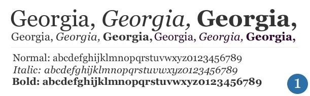
Georgia is a serif font (meaning it has a few curls or swifts at the end of letters). Designed in 1993 for Microsoft, it is inspired by the original Scotch-Roman typefaces used in print. It has a ‘classic’, authoritative aesthetic after being used in novels and newspapers. It’s one of the easiest to read, with even letter spacing and thick serifs serving as a guide to your eyes as you move across the page.
The intention of Georgia was to have a typeface that looks both elegant and friendly while displaying well on small or low-resolution screens. It’s a lot like Times New Roman, except that it feels bigger and more rounded.
Times New Roman
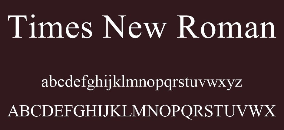
For a while, Times New Roman was the most widely used serif typeface in the world. A serif typeface is a winged typeface on the corners of letters. Times New Roman was created by the British newspaper The Times in 1931. A serif design is heavy and the weight of contrasting lines (for example, the short spacing at the bottom of the letter “T” is much thinner than the line leading down to it), which helps direct the reader’s gaze from letter to letter.
Its familiarity made Times New Roman really popular - until 2007, it was the default font for all versions of Microsoft Office and many other word processors. You can use it for a serious, classic, and prestigious tone consistent with official documents’ usual usage.
Arial
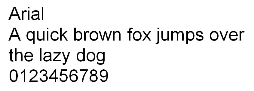
Arial was introduced in 1982 to serve as a free alternative to the popular Helvetica. Arial is the source of much debate around web copy and email. While many software manufacturers and email providers use it by default, some designers find it difficult to read, with the letters placed too close together, as with Helvetica.
Similar letters seem to have the same angles and lines, making it difficult to distinguish between them in large text paragraphs. However, many designers appreciate Arial as a great font to complement a non-invasive, humble, and recognizable tone from its popular use as a default software.
Verdana
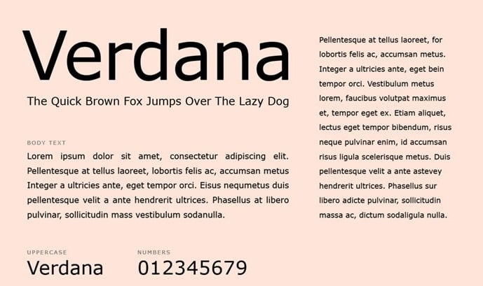
The Verdana font, named after the designer’s daughter, is a combination of the words “verdant” (something green) and “Ana” (her name). This is one of the easiest to read sans-serif, secure web fonts. Letters of a similar shape are designed to appear different, in particular, to increase overall legibility. Higher lowercase letters are typical of this type of font, so it can be a great font to ensure that your typeface copy is accessible to all ages and abilities.
The huge benefit of sans-serif typefaces is that they can convey a sense of playfulness and dignity. If that’s what you’re doing in your newsletter marketing, Verdana is probably the best choice for textual content.
Trebuchet MS
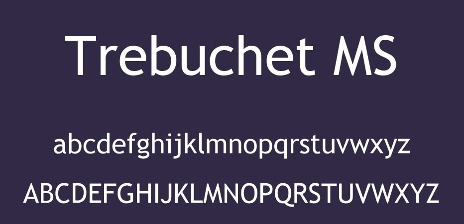
When Vincent Connare designed this font, he named it “Trebuchet” - a medieval catapult. He thought Trebuchet would be an excellent name for a font capable of introducing words on the Internet. And he wasn’t wrong. Trebuchet is currently one of the best fonts to use for email marketing.
It has small precise strokes at the beginning and end of difficult letters serving as an easy-to-read guide while not distracting too much from the main shape of letters, as with complete serifs correction.
Tahoma
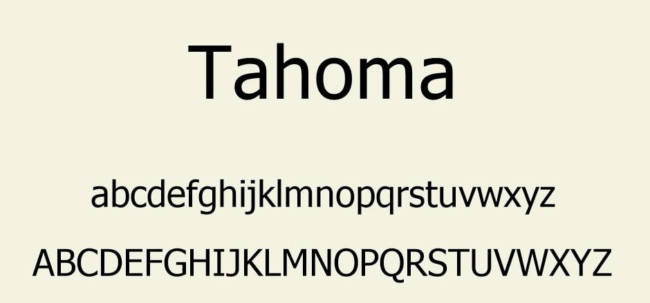
This widely used sans-serif font called Tahoma is perfect for marketers who need to write email newsletters in languages other than English. Unlike other widely used Internet fonts like Georgia and Verdana, it has a complete Unicode character set. This means that Tahoma is compatible with Asian and other non-Latin characters and Latin letters with accents.
However, one problem with Tahoma is that it’s not as widely supported as other popular Internet fonts like Georgia and Verdana. There can be a compatibility issue, with characters displayed as false.
Courier
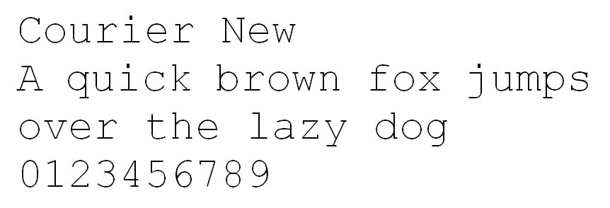
The Courier serif typeface is monospaced, which means each letter or punctuation takes up the same amount of horizontal space on the page. The Courier font is not easy on the eyes compared to other popular typefaces on this list. However, its main benefit lies in the fact that being monospaced, Courier easily arranged in neat horizontal columns.
While marketers often dislike Courier typefaces, there may be niche markets for it to match. If you’re marketing specifically to writers, they might be attracted to this font as it looks like a document typed on a typewriter. This can impart a rustic and friendly aesthetic.
No matter which web-safe fonts you use, be mindful of what they do. Cross-compatible typefaces are set up to the point where they’re considered more obvious than most. They can sink to the page and go unnoticed. This means your readers can focus more on your content than on how you present it, which is especially essential with longer copies.
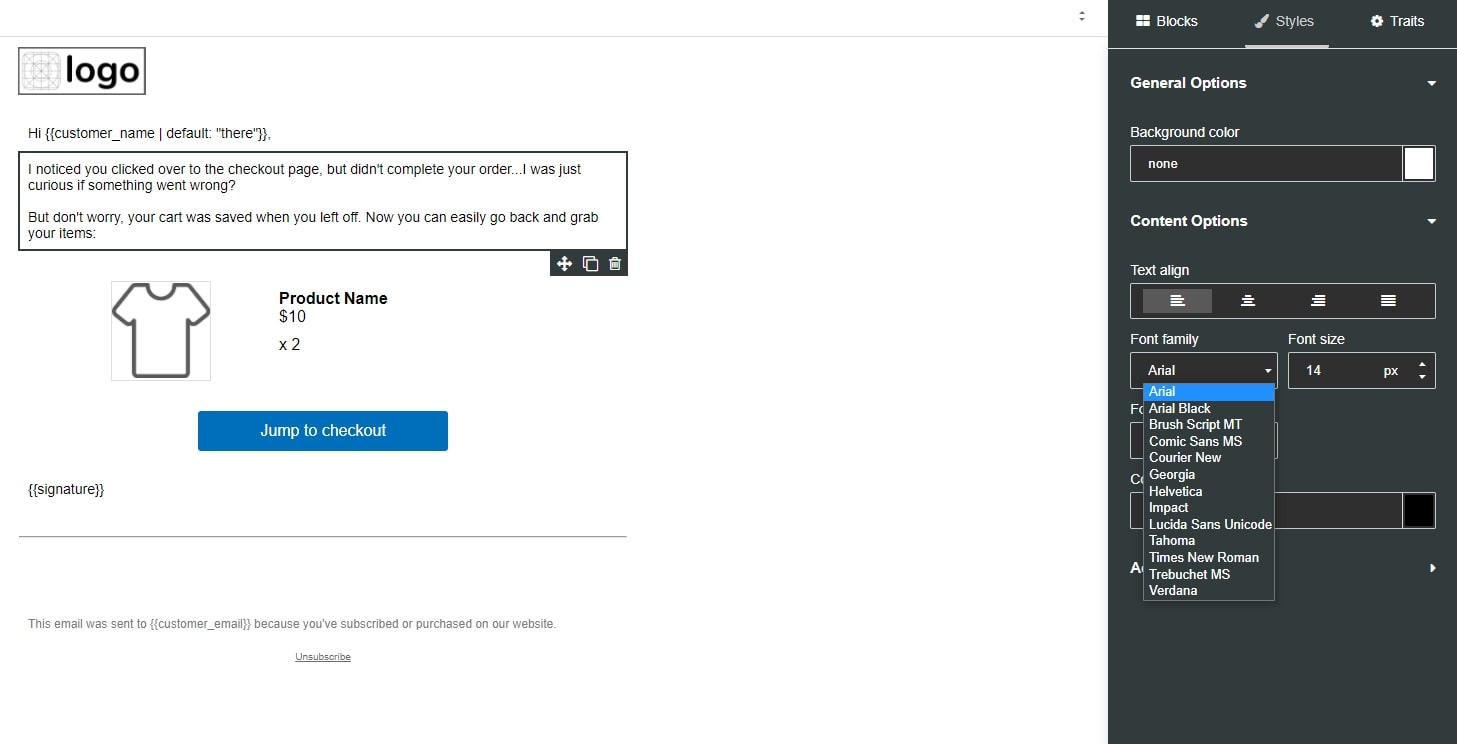
Fortunately, you can find all of the 7 fonts above in our Email Marketing App dashboard. You can edit fonts for both your title and body copy for the best influence on recipients.
Extra tips on email marketing fonts
Some designers have one thing for custom fonts. They also need redundancy to show up in all email systems and applications. Always check your emails to check font display as well as redundancy. Here are some extra tips to help you select and use the best fonts for email marketing.
Font colors
Text color helps to make your message stand out. However, restricting the use of color is the best option. Three is the limit - one for the headline, one for the rest of the text and one for highlighting the links.
Additionally, the color you choose must have a high enough contrast with the background color to increase readability.
Font sizes
After working hard to pick the best fonts, it’s a tragedy if your text appears too little or too big to read. But it can be difficult to know how the live HTML text size will appear to different recipients. Here’s a helpful guide to font sizes and line heights to use for the easiest cross-platform text to read.
Title: 22 - 28 pixels
Content text: 14 - 18 pixels
Line height: 1.4 - 1.5
Your text size will be different depending on which font you use, so try with the values in this recommended range and see what works best for you. Always send yourself test versions of your email to check for variations and consistency as desired. Test and double-check to make sure your text is clear across all devices and all email apps.
Mix typefaces
Recognizing the fact that different typefaces have advantages and disadvantages, some marketers may consider using a mixture of them in their email marketing. However, this is not recommended. At a maximum, you should use two typefaces: one for headline and headline text and one for body text.
One problem with using too many typefaces in email marketing is that it annoys the reader. The result that appears is cacophonous. Every reader is heartbroken - they want to get rid of it as soon as possible. The same effect when marketers create a rainbow with different colors in their text - this is also a bad choice. Another problem that arises when using three or more different typefaces is that email service providers might flag messages as spam.
A / B testing
If you’re unsure of the best font to use for your target market, one thing you can do is use your email marketing provider to do A / B testing.
To implement A / B testing, create two versions of your newsletter where everything is identical except for the font. Then measure recipients’ responses based on the font you chose. You can use this information to make better future font decisions.
Rare typefaces
So you found the perfect font. Not too fast! It can be not easy to use the typeface of your choice in your email in many cases. In Gmail, you can only use between Sans Serif (like Helvetica), Fixed Width (like Courier), Serif (like Times New Roman), Garamond, Georgia, Tahoma, Trebuchet MS, Wide Narrow, Comic Sans MS, and Verdana. So make sure your fonts are good for the recipients’ platforms.
Final advice
Choosing the right font can elevate your email marketing effort. By tying the chosen fonts with your brand and legibility, you can ensure readers will keep wanting more from each of the emails sent. If you use the AVADA Email Marketing app, you can make sure every piece of the email design is on point, we have all the most popular fonts and a simple drag & drop system to use.
If you have any questions or would like to have a demo of the app, contact us! Our customer support team is always available to help!


New Posts


