
How to Create Great Email Marketing Designs?
By Sam Nguyen

Drive 20-40% of your revenue with Avada
It is no difference what you do or what industry you work in—if you own a business, you need to spread words about it. Perhaps you have an impending sale and want to publicize it. Maybe you just want to say hello to your consumers and thank them for their business. Sending newsletters is one of the best methods to share information about yourself or your business.
However, not all newsletters are the same. To maximize the efficacy of your email marketing, you need more than just having great content. You will also need an excellent email design. Beautifully designed newsletters will ensure that your audience enjoys opening your emails—and may even look forward to getting them! Not only that, but it also ensures all of your information is presented in an easy-to-understand manner.
In this article, I will share with you the best practices you can use to create email marketing designs that your email audience would love to receive and read. Let’s jump right into the details!
What is email design?
Email design is the process of designing an email that will grab the attention of and resonate with your company’s target audience, specifically your present email subscribers and customers.
Why is great email design important?
With email marketing’s enormous potential comes strong competition. With more than 70% of businesses utilizing email newsletters to communicate with their customers, it is more crucial than ever to make your emails stand out.
While your email subject line will, of course, get your email opened in the first place, a well-designed newsletter will help you hold the reader’s interest. If they like what they see, they will most likely return again and again.
Your email design should be eye-catching, aesthetically beautiful, and on-brand, among other things as it is an opportunity to promote your brand’s personality and value. Unlike a social media post, there is a lot of flexibility to experiment with different typography, colors, and visuals.
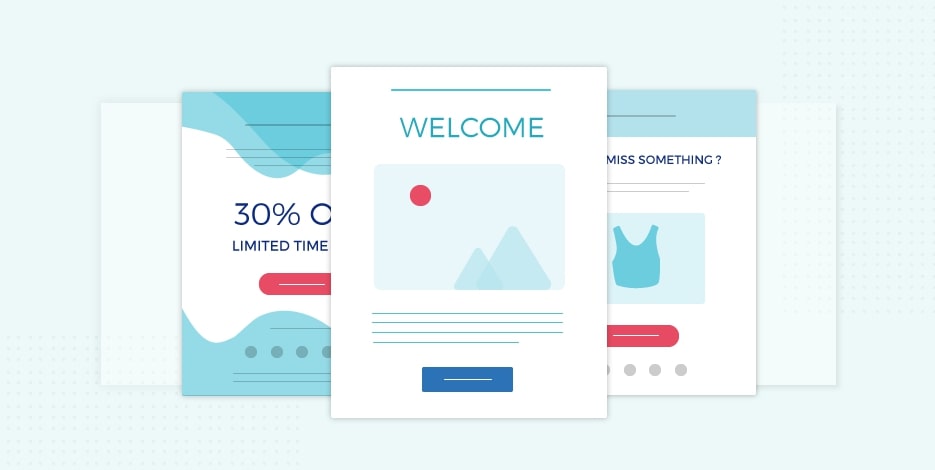
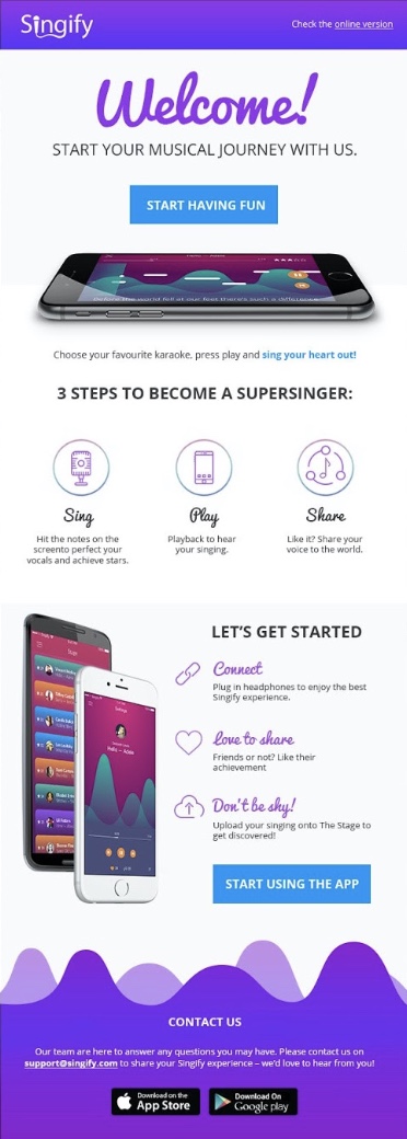
7 Essential Elements of Email Design
1. Header
The header portion of your email is similar to the envelope field in that, while it isn’t normally thought of as a design element, it is the first thing your reader sees in their inbox. And, much like with a piece of postal mail, who it is from influences your decision to open it. You should pick a “From Name” that your contacts will remember and associate with your company.
A catchy subject line also helps the reader to decide whether or not to open the email. With more than half of emails opened on a mobile device, you should build your subject line with mobile devices in mind.
2. Preheader
On a mobile device, the preheader functions similarly to the second subject line; use it to attract them to read your email. Take use of the first 5–8 words. The following is how preheader appears in a subscriber’s mobile inbox:
3. Logo and colors
When a subscriber opens your email, the first thing that they will notice is your logo and colors. Make use of these design components on a regular basis so that your email contacts can quickly recognize your brand. They will identify your email in their inbox over time and will be more inclined to open it each time.
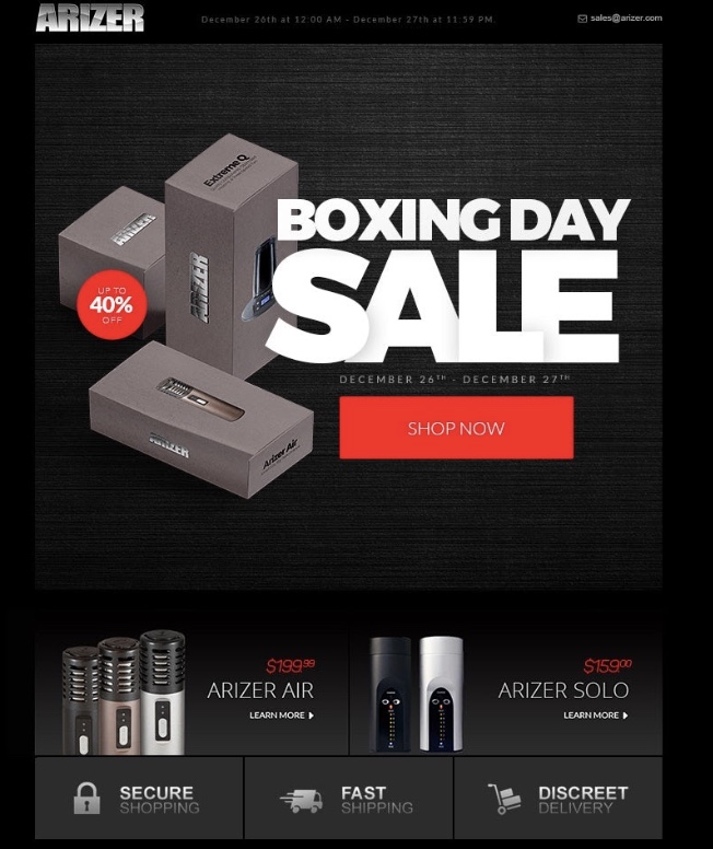
4. Image
Use a photo that complements the theme of your email message. Use an image of the product to support your message if you’re sending a message about a sale on that product.
5. Text
People who read online or on mobile devices generally skim the content before reading it. Design your text so that it grabs the reader’s attention. For your headlines, choose a font size of 22pt and a complementary color that fits your brand colors.
The message body should be at least 14pt in size and include 3-5 words explaining why they should click on your call-to-action button.
6. Call-to-action
Make it a point to tell your readers what they should do next. You might want your readers to go to a certain page on your website, phone your store, or use a coupon. Use a button to draw attention to your call to action and make it easy to click.
7. Footer
The footer portion of your email design is consistent from email to email and contains crucial contact information for your company. In the footer section, share your address, phone number, website, and hours of operation.
Also Include links to your social channels as well, so people know how to interact with you on their preferred social networks. Before you send your email, make sure you test those links
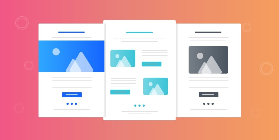
How to create beautiful email marketing designs
Step 1: Structure your email content
Obviously, you understand the significance of sending compelling content in your marketing emails. What you may not realize is that how you design your content is just as crucial as the material itself. The most effective email content is written in a way that invites your reader to interact with it.
1. Make the main message the focus
It’s hard enough to get people to open your email, but if they have to scroll for a mile to get to the point, it’s very unlikely that they will get to that point. Nobody has that much patience.
People will form an opinion about your email based on the first thing they see or read. That is what helps them decide whether or not to continue. Begin your email design with the most crucial information, whether it’s a great offer or information about an upcoming event. This manner, even if your viewer only reads the first sentence, your vital message is conveyed.
2. Have a singular focus
Choose one focus and use visual hierarchy to draw attention to it as the focus point of your email. If you have too many contradictory messages or areas of concentration, your reader will become perplexed as to what your email is all about.
3. Keep it short and simple
The adage “the longer the better” just does not apply to email design. If someone looks at your email and notices that it goes on for days, they are unlikely to read it.
Get down to the point, and get it done swiftly. Start with the most vital information. Because you don’t know how long people will read your email, start with the most vital message. You’ll capture their attention, and your message won’t get lost in the shuffle of too-long emails.
4. Make it scannable
So, here’s the deal: people don’t read your emails. They scan them to see if there are any important nuggets of information, then continue with their lives.
It’s not your fault. It’s simply the way people consume information these days (thank you, internet!). You must make your emails scannable if you want them to provide the results you desire.
To accentuate your content, use headers and bullet points in your email design. Short paragraphs are preferable over long blocks of text.
5. Make your link noticeable
A cardinal law of email design is that everything in your email should be connected, from your photos to your header to your text.
If the link in your email is the word “here” hidden somewhere in paragraph three, your email-driven traffic will be close to nothing. Wherever consumers click on your email should take them—for example, to a landing page, product page, or special offer. Bottom line: connect everything and make it clickable.
6. Drive results with your CTA
Email marketing, in the end, is all about results. And how do you get your desired results? You ask for them.
Make your call to action (CTA) as clear as possible so that your readers understand exactly what you want them to do. Use graphic elements such as arrows or boxes to direct the viewer’s attention to the CTA. Make sure your audience does hear you loud and clear, and then watch your conversions skyrocket.
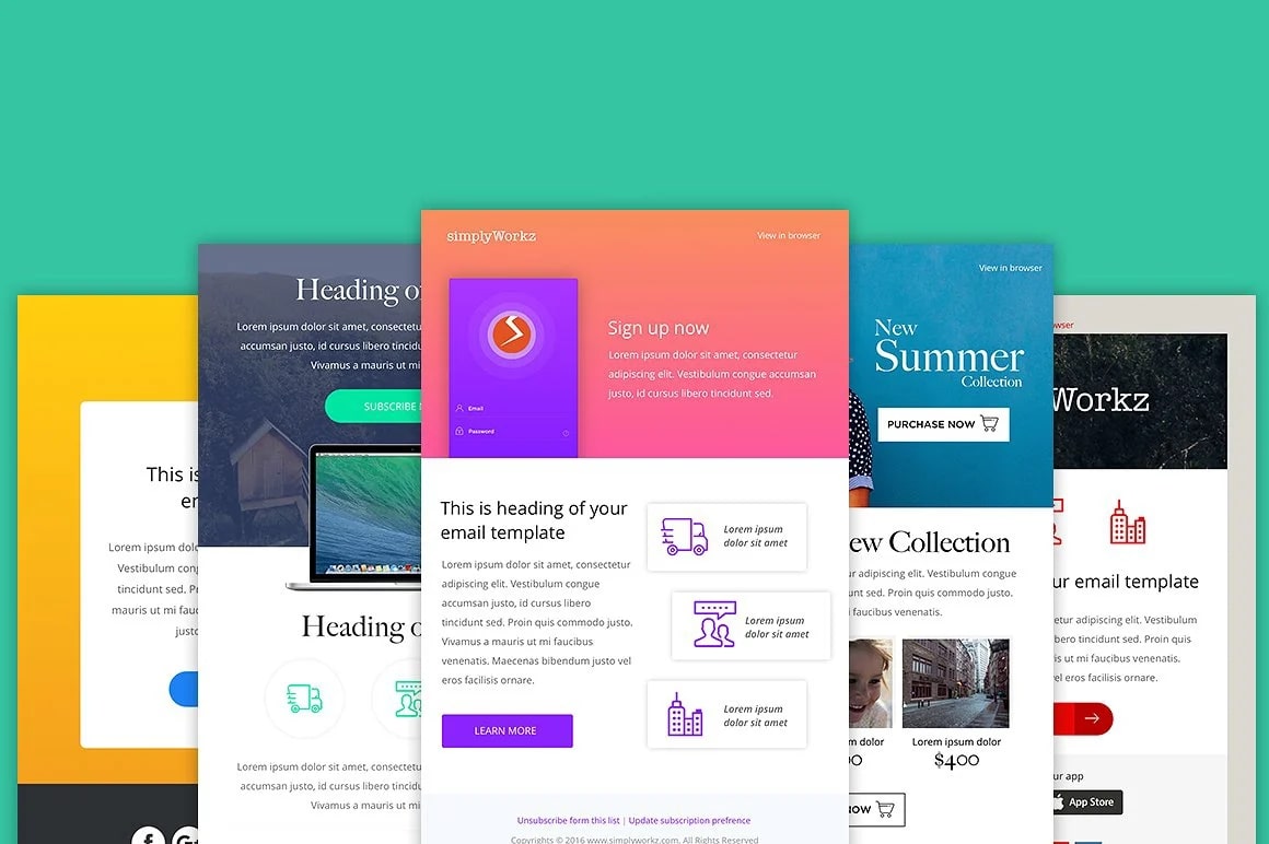
Step 2: Structure your design’s layout
If content is king, layout is then queen. It’s just as crucial how you organize and display your email design as what’s within.
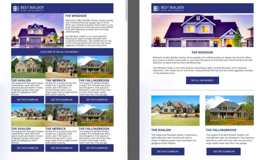
1. Use the right width
When it comes to designing visually appealing emails, layout is everything. Don’t drag it out! An email that is too wide simply does not work. If your subscribers have to scroll from side to side to see the text of your email, they’ll unsubscribe faster than you can say “unsubscribe”.
Keep your width within 600 pixels to ensure that all your content displays on the screen and no scrolling required.
2. Don’t use too many columns
If you’re delivering a newsletter or have numerous content pieces to promote, you may be tempted to divide your content into several columns, but don’t. More than two or three columns feel far too crowded with the 600px width constraint.
3. Establish a hierarchy
Nobody enjoys staring at large blocks of text. It’s visually jarring and will make folks think of a textbook (and the last thing you want your reader thinking of when they read your email is homework).
To structure your information and visually highlight significant points, use text hierarchy like as sub-headers, quotes, and font styles such as bold and italics.
4. Don’t forget about mobile responsiveness
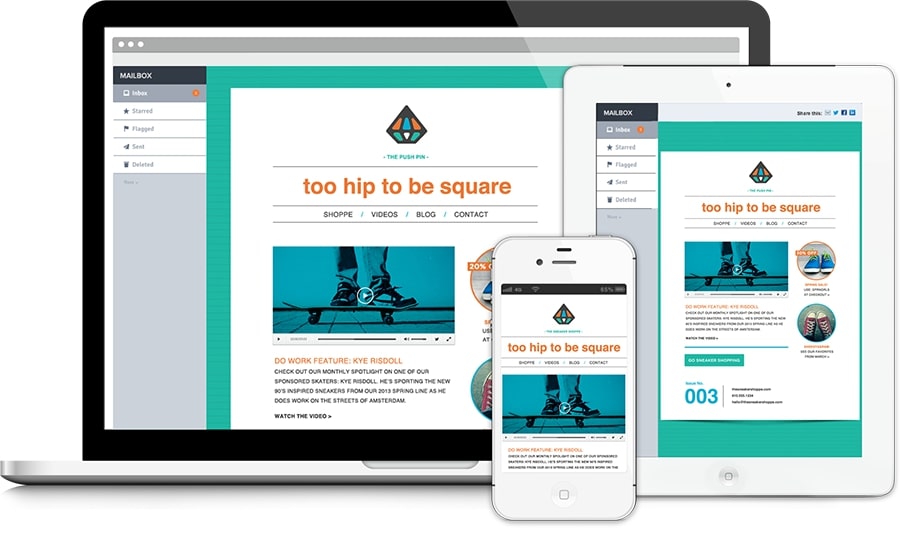
If your email can only display properly on a desktop computer, you’re passing on a huge opportunity. Many people check their emails on their phones, and if your email isn’t mobile-friendly, all they’ll see is a hot, jumbled mess.
Make certain that your email design is entirely responsive. Your subscribers should have a nice, well-designed email experience regardless of the device they are using. Test your email on every email client and device to get a sense of overall user experience.
And, just to be safe, include a “view in browser” link. That way, even if everything else fails and your email still looks weird on their device or email client, they can still read your information.
Step 3: Use the right format
1. Use the right size
The font that you use is just as important as the content you write.
It doesn’t matter if your email content is Pulitzer-worthy if no one can read it. Make sure the typeface in your body copy is legible, and a size 14 to 16 point is a decent starting point.
2. Use the right fonts
One font: great. Two fonts: okay, but more than two fonts? Visual overabundance. Select one font for the headlines and another for the body material.
And, as much as you want to compose the body of your email in a sophisticated font, resist the urge. Web-embedded typefaces will not appear in your marketing emails, so your content will not look exactly the way you want it to. Stick to the basics for body copy, such as Arial, Times New Roman, Tahoma, Verdana, Courier, and Georgia.
Step 4: Color up your email design
Even if your content is fantastic, consumers will not read your email if it seems like an artistically inept grade-schooler wrote all over the screen. You need to make your email visually appealing if you want to see results.
1. Make use of color psychology
The colors you’ve chosen are more than just lovely. They, too, have the potential to be powerful. Make smart use of the rainbow and use color psychology to your advantage. This is especially true for your call to action. To increase conversions, choose action-oriented colors such as red or orange.
2. Use images
Images are a great way to deliver your message, but there is such a thing as too much of a good thing. If you use too many photos, your content may become lost. Unless it’s your logo, never start with a picture. Include some information first to let your readers know who you are and what your email is about. Keep the remainder of your design simple if you’re utilizing a lot of photographs or photos, and let them take center stage.
3. Find a suitable palette
Color is one of the first things readers notice when they open your email, so use it wisely. To avoid visual problems, use complementary colors and limit your palette to two or three colors.
You may also use color to divide your email into sections. Separate the email’s header and footer with different colors.
4. Leave some white space
Color is essential. However, so is a lack of color. White space aids in visually breaking up your content and making it more digestible. It can also help you emphasize essential topics and divide your email into sections.
Use white space to create a feeling that your email is spacious, draw attention to crucial messages, help your content and pictures stand out, and generally make it easier on the eyes for your audience.
5. Format your images
No matter how many photos you choose, be sure they are properly sized for your email template! Nobody wants to receive a distorted or out-of-shape graphic in their email. You can also apply CSS styles to photos to ensure that they display properly in clients that accept alt tags.
Final words
That’s it! I hope that this article has provided you with valuable information about how to design great marketing emails. Please feel free to leave comments below for further discussion on this topic!


New Posts


