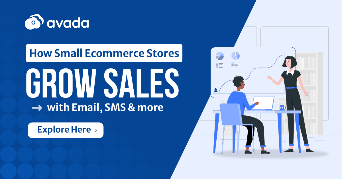
25 Webinar Landing Page Best Practices: Expert Insights + Tutorials
By Sam Nguyen
In this blog, we’ll dive deep into 25 captivating landing page webinar examples, followed by a straightforward 4-step tutorial to help you craft the perfect page for your audience.
Key Takeaways
25 Best Webinar Landing Page Examples belong to these companies:
- 01. Slack
- 02. Google
- 03. Salesforce
- 04. Shopify
- 05. Facebook
- 06. P&G
- 07. Hubspot
- 08. Alibaba
- 09. LinkedIn
- 10. US Bank
- 11. Zoom
- 12. British Council
- 13. Schneider Electric
- 14. Forbes
- 15. World Economic Forum
- 16. AirBnB
- 17. Bosch
- 18. Shopee
- 19. Cisco
- 20. Trello
- 21. PwC
- 22. Adobe
- 23. Grab
- 24. Prudential
- 25. Oracle
13 Attributes of a Good Webinar Landing Pages

Webinar landing pages determine whether a potential attendee clicks that all-important “Register” button or not. A well-designed landing page can significantly boost your webinar’s attendance rate, while a sub-par one can see those potential attendees slip away.
Let’s delve into the critical components that make a webinar landing page effective:
- Clear and Engaging Headline: The first thing visitors notice is the headline. It should be clear, concise, and compelling. The headline needs to convey the main benefit or topic of the webinar to instantly grab attention.
- High-Quality Imagery: Visuals can significantly influence a person’s decision. Use high-resolution images or graphics that resonate with the webinar’s theme. Consider including an image of the presenter, as this can establish trust and familiarity.
- Compelling Call to Action (CTA): The CTA is where the conversion happens. Ensure that the CTA button stands out in terms of color and size, and the wording prompts immediate action. Phrases like “Reserve Your Spot” or “Join Us Now” can be more enticing than a simple “Register”.
- Detailed Description: Go beyond the title. Provide a brief description of what attendees can expect from the webinar, including the main topics or takeaways. This gives potential attendees a clearer idea of the value they’ll receive.
- Presenter Bios: Highlighting the expertise and credentials of the presenters can be a draw for many potential attendees. It establishes credibility and can be the difference between someone registering or not.
- Testimonials and Social Proof: If you’ve hosted webinars before, including testimonials or feedback can instill confidence in attendees. Display logos of companies that have attended in the past or showcase positive comments from previous participants.
- Countdown Timer: A sense of urgency can prompt immediate action. Including a countdown timer to the webinar’s start time can push visitors to register before it’s too late.
- Mobile Optimization: A significant portion of users might visit your landing page from a mobile device. Ensure your landing page is responsive and offers a seamless experience on smartphones and tablets.
- Easy Registration Process: Limit the number of fields in the registration form. Ask only for essential information to make the sign-up process quick and straightforward.
- Relevant Content: Offer a sneak peek or relevant content related to the webinar topic, such as blog posts or videos. This not only provides value upfront but also establishes your authority on the subject.
- No Distractions: Your webinar landing pages should have a singular focus – getting registrations. Avoid unnecessary navigation menus, sidebar content, or any other elements that could distract a visitor from the main action.
- Social Sharing Buttons: Make it easy for visitors to share your webinar with their network. Include social sharing buttons so they can spread the word with just a click.
- FAQ Section: Address common questions or concerns that potential attendees might have. This can include details about the platform you’re using, time zones, how they’ll receive the webinar link, etc.
25 Best Webinar Landing Page Examples
01. Slack

What’s special about this webinar landing page?
Slack, known for its modern approach to team communication, hosted a webinar titled “Achieving hybrid-work success with team collaboration.” With the rise of remote and hybrid work models, this webinar sought to educate businesses on leveraging Slack’s platform to foster seamless collaboration regardless of employees’ physical location.
Slack’s webinar landing page is one of excellent webinar landing page examples designed to appeal to professionals seeking insights into optimizing hybrid-work setups. Marrying minimalist aesthetics with functionality, the page encourages users to register while soaking up its rich content.
Key Features
- Minimalist Header Banner: The landing page starts strong with a clean header, where the powerful headline dominates and is complemented by a thematically aligned image. This imagery, combined with the bold headline, instantly sets the webinar’s tone.
- Intuitive Layout: The landing page design promotes user action, with a strategically positioned registration form on the left, allowing potential attendees to register while browsing the main content on the right.
- Targeted Content: The wording and tone throughout the page are tailored for professionals, ensuring the content resonates with Slack’s primary audience.
- Effortless Social Sharing: Positioned on the top right, the social media sharing buttons allow visitors to effortlessly share the event. One click is all it takes, reflecting a user-centric design approach.
- Detailed Content Breakdown: An information box meticulously lists what attendees can expect from the webinar, ensuring clarity. This is supplemented by details about the high-profile speakers, adding a layer of credibility.
Pros and Cons
Pros
- User-Centric Design: The registration form’s strategic positioning acknowledges the possibility of users wanting to sign up at any point while engaging with the content.
- Immediate Social Sharing: The easy-to-use social media buttons encourage organic promotion, potentially increasing the webinar’s reach.
- Engagement Metrics: The inclusion of a quick vote poll is an innovative touch, serving a dual purpose. It captures instant feedback while indicating that the organizers value attendees’ opinions.
- Additional Resources: By placing related educational materials at the footer, Slack provides added value, potentially increasing the time visitors spend on the page.
Cons
- Missed Connection Opportunity: While the list of high-profile speakers is a great touch, not linking their social media profiles is a missed opportunity. This could have fostered deeper connections between the audience and speakers or even potential collaborations.
- Clarity on Speakers: Providing a bit more detail or a short bio about each speaker would have further enriched the page, giving potential attendees a clearer picture of the expertise they’d be tapping into.
02. Google

What’s special about this webinar landing page?
Google’s webinar promises to enlighten businesses on the critical steps to increase their visibility on the world’s most popular search engine. Recognizing the importance of search visibility for businesses, this webinar seems to cater to both novices and those seeking to refine their existing knowledge.
Key Features
- Clear Headline: The title of the webinar itself is straightforward and to the point, immediately informing visitors of one of the benefits of a landing page: increased visibility on Google.
- Structured Agenda: Given Google’s penchant for orderliness, it’s likely that the landing page presents a detailed breakdown of the webinar’s content, ensuring participants know what to expect.
- Interactive Elements: Knowing Google, there might be interactive snippets or previews, giving users a taste of the content and teaching style.
- Accessible Design: True to Google’s design philosophy, the landing page likely prioritizes accessibility, ensuring users of all abilities can navigate and comprehend the content without hindrance. It’s also the same with Youtube landing page.
Pros and Cons
Pros
- Inherent Trust: Google’s name itself brings a lot of weight, and attendees would naturally expect quality, up-to-date content from the tech giant.
- Comprehensive Coverage: Given the vast array of tools and strategies to enhance visibility on Google, attendees can likely expect a deep dive into both foundational knowledge and advanced tactics.
- Usability Focus: Google’s products and tutorials often prioritize user-friendliness, so the landing page and webinar content might lean towards actionable, step-by-step guidelines rather than mere theory.
Cons
- Potential Overwhelm: Google’s vast ecosystem can sometimes be a double-edged sword. Attendees might be presented with a plethora of tools and strategies, risking information overload unless the content is well-segmented.
- One-sided Perspective: Since the webinar is from Google, it might primarily focus on Google’s tools and solutions, possibly overlooking other industry strategies or third-party tools that can also boost visibility.
03. Salesforce

What’s special about this webinar landing page?
Salesforce’s landing page for their Marketing Cloud feature update takes a pared-down approach in webinar landing page examples. Prioritizing clarity and support, the design emphasizes the main topic of the event while ensuring attendees know help is just a call away.
Key Features
- Bold Typography: The headline stands out with significant bold text, ensuring that visitors immediately recognize the event’s theme.
- Highlighting Support: The hotline is prominently displayed in large text. It’s a subtle yet effective assurance to attendees that Salesforce support is readily accessible.
- Social Proof via Logo: Placing the Salesforce logo at the bottom right is a strategic touch. For those in the tech and marketing sectors, the Salesforce logo carries weight, serving as an implicit stamp of credibility and quality.
Pros and Cons
Pros
- Immediate Clarity: The use of bold texts for both the event’s theme and the hotline ensures visitors quickly grasp the core offering and the availability of support.
- Trust-building Element: The addition of the Salesforce logo acts as a silent testimonial, assuring visitors of the authenticity and quality of the event.
- Simplified Design: The minimalistic approach means there are no distractions. Visitors can focus solely on the event’s theme and the available support, enhancing user experience.
Cons
- Lack of Detailed Information: While simplicity has its merits, some potential attendees might desire more comprehensive details about the webinar’s content, speakers, or benefits before deciding to attend.
- Missed Engagement Opportunities: Engaging elements such as interactive agendas, speaker profiles, or multimedia teasers could further pique visitor interest and increase registration rates.
04. Shopify

What’s special about this webinar landing page?
Shopify’s offering centers around free, on-demand webinars tailored for budding entrepreneurs and existing business owners. The landing page’s core aim is to equip users with the knowledge and tools to launch or scale their e-commerce ventures.
Key Features
- Clear Value Proposition: The title itself – “Free on-demand webinars to help you start and grow a business” – immediately conveys the value attendees will receive, addressing both newcomers and established business owners.
- On-demand Accessibility: Emphasizing that these webinars are “on-demand” indicates flexibility and convenience for users, allowing them to learn at their own pace.
- Credibility through Branding: Shopify’s reputable brand name lends immediate credibility to the quality of the webinars.
- Easy Navigation: Presumably, the courses are categorized or tagged for ease of search, allowing users to quickly find webinars that align with their specific needs or challenges.
- Call to Action (CTA): There’s likely a prominent CTA guiding visitors to start viewing or registering for the webinars of their choice.
Pros and Cons
Pros
- Immediate Clarity: The clear value proposition – “Free on-demand webinars to help you start and grow a business” – ensures that visitors immediately understand the core offering and the target audience (both new and established business owners).
- Convenience and Flexibility: Highlighting the webinars as “on-demand” caters to a global audience, letting users access content according to their schedules. This aspect can be particularly appealing in our busy, modern world.
- Branding and Trust: The presence of the Shopify name, a giant in the e-commerce industry, instantly lends credibility and trust to the quality of the webinars.
Cons
- Possible Lack of Immediate Support: If users have questions or face issues while accessing the webinars, the absence of a live support option might be felt more acutely due to the on-demand nature of the content.
05. Facebook

What’s special about this webinar landing page?
The CEE Webinars from Facebook are the perfect answer for the question “What is a landing page on Facebook?”, designed to target the Central and Eastern European market, with a focus on business strategies, digital trends, and platform utilization. Hosted on Facebook’s own platform, these webinars leverage the vast user base of the platform, aiming to provide valuable insights to businesses operating within the CEE region.
They are one of the best Facebook landing page examples.
Key Features
- Platform Familiarity: Being on Facebook, the platform is user-friendly and recognizable to a broad audience.
- Archived Webinars: The link suggests there’s a section that allows visitors to view past webinars, an excellent resource for continuous learning.
- Webinar Synopsis: Each webinar likely features a succinct description, giving visitors an idea of the topic and its relevance.
- Speaker Details: Information about the presenter, including their professional background and image.
- Social Interactivity: Features such as comments, likes, or shares associated with each webinar, promoting engagement and feedback.
- Search & Filter Options: Potential features to allow users to find specific webinars based on topics, dates, or speakers.
- Visual Elements: Graphical representations or images pertaining to the webinar topic, aiding visual appeal and context.
Pros and Cons
Pros
- Intuitive Navigation: The familiarity of Facebook’s UI ensures that visitors can easily navigate the page.
- Direct Social Engagement: Being on Facebook allows for immediate interactions like comments or shares, enhancing reach and feedback.
- Resourceful Archive: With past webinars accessible, it serves as an ongoing resource hub for users.
- Mobile Optimization: Facebook’s pages are optimized for mobile use, ensuring a good user experience across devices.
Cons
- Distractions: Given it’s on Facebook, users might get distracted by notifications or other platform features.
- Limited Customization: The design and layout are restricted by Facebook’s standard interface, which may not cater to specific branding or unique design requirements.
- Over-reliance on Platform: If there are any issues with Facebook (e.g., outages or changes in algorithms), it could impact the visibility and access to the webinars.
06. P&G

What’s special about this webinar landing page?
P&G’s webinar: “March 8th with Isabel Hochgesand, Chief Procurement Officer, Beiersdorf AG” provides a unique opportunity for attendees to gain insights from Isabel Hochgesand, the Chief Procurement Officer of Beiersdorf AG – another heavyweight in the personal care sector. This webinar is poised to delve deep into procurement strategies, market trends, and leadership insights, reflecting both P&G and Beiersdorf AG’s shared ethos of excellence.
Key Features
- Speaker Spotlight: The title prominently features the key speaker, showcasing her authoritative position, which can draw attendees who are familiar with the industry.
- Date & Time Details: The date is included in the title, ensuring that potential attendees immediately see when the webinar will take place.
- Company Affiliation: Both Beiersdorf AG and P&G are mentioned, which can increase credibility and attract those familiar with or interested in these companies.
- Detailed Description: Further down the page, one might expect a more detailed description of what the webinar entails, the topics to be covered, and what attendees can expect to gain.
- Call-to-Action (CTA): A clear registration or sign-up button that urges visitors to commit and reserve their spot.
- Visual Elements: Imagery related to the webinar topic or the speaker’s portrait to create a more engaging experience.
- Testimonials or Past Webinar Snippets: This can give an insight into the quality and relevance of the content.
- Mobile Responsiveness: Ensuring the page looks good and is functional on mobile devices.
Pros and Cons
Pros
- Clear Speaker Highlight: By placing the speaker’s name and position up front, the page immediately conveys the value and expertise she brings.
- Immediate Date Recognition: By integrating the date in the title, users instantly know if they’re available.
- Trust Through Association: Leveraging recognized company names like P&G and Beiersdorf AG provides added trust and credibility.
- Simple Design: Assuming the rest of the page follows a clean and clutter-free design, this could make for a user-friendly experience.
Cons
- Possibly Over-Targeted: The specificity of the topic and speaker might exclude a broader audience.
- Lack of Direct CTA in Title: If the main CTA isn’t quickly visible, users might have to scroll or search, potentially leading to drop-offs.
07. Hubspot

What’s special about this webinar landing page?
HubSpot’s “Q3 Product Roundup Webinar” is likely an informative session where the company introduces, discusses, or reviews the products they have launched or updated during the third quarter. Being on HubSpot’s community page suggests the content is tailored for existing users or those deeply interested in HubSpot’s ecosystem.
Key Features
- Clear CTA in the Title: The word “[Register]” suggests an immediate action for the user.
- Product-Centric Approach: The theme revolves around the products introduced or updated in Q3.
- Community Engagement: As it’s on the community page, there might be sections for comments, discussions, or user feedback.
- Detailed Synopsis: An outline or agenda of what the webinar will cover concerning the products.
- Speaker Profiles: Information about who will be presenting, their roles at HubSpot, and their expertise.
- Time & Date: Clear details on when the webinar will occur to allow users to plan.
- User-Friendly Registration Process: A simple and intuitive registration form or link.
Pros and Cons
Pros
- Targeted Content: Tailored for HubSpot users, ensuring content relevance.
- Interactive Community Platform: Encourages user engagement and discussions.
- Transparency: Offering a product roundup suggests a transparent approach to product updates and launches.
- Clear CTA: Directs users immediately to the registration, simplifying the user journey.
- Trust Factor: Hosting on HubSpot’s own community page adds a layer of trust and security.
Cons
- Potential Over-specificity: New users or those not familiar with HubSpot’s Q3 products might feel it’s too niche for them.
- Community Page Distractions: Other discussions or topics on the community page might divert user attention.
08. Alibaba

What’s special about this webinar landing page?
Alibaba, a global leader in e-commerce, presented a webinar “Speed up your e-commerce business, with certainty”. The emphasis seems to be on helping businesses accelerate their operations with confidence and clarity. Given Alibaba’s stature, the webinar is likely targeted at both existing Alibaba sellers and potential ones looking to leverage the platform’s capabilities.
Key Features
- Distinct Headline: The title immediately captures the essence of the webinar, focusing on Alibaba’s upgraded services.
- Detailed Description: An elaboration on what the upgrades entail, and how they can benefit sellers and businesses.
- Speaker Profiles: Information about the presenters, their roles at Alibaba, and their areas of expertise.
- Time, Date, & Duration: Essential details for attendees to schedule their participation.
- Clear Call-to-Action (CTA): A prominent registration or sign-up button.
- Technical Requirements: Details on how to join the webinar, any software needed, and technical advice for smooth participation.
Pros and Cons
Pros
- Clear Value Proposition: The title suggests that attendees will learn how to expedite their business operations using Alibaba’s services.
- Focused Content: The page likely concentrates solely on the webinar details, minimizing distractions.
- Mobile Optimization: Given Alibaba’s digital prowess, the page is likely optimized for a seamless mobile experience.
Cons
- Barrier for Non-English Speakers: If not provided in multiple languages, some potential attendees might face language barriers.
09. LinkedIn

What’s special about this webinar landing page?
LinkedIn, the world’s largest professional network, offered a webinar “Fundamentals of advertising on LinkedIn” on its platform. The content seems geared towards both businesses unfamiliar with LinkedIn advertising and current advertisers looking to solidify their foundational knowledge.
Key Features
- Banner Information: The banner prominently displays the essential details – title, date, and time of the webinar.
- Skimmable Content: The use of bullet points in the website description allows users to quickly identify key details.
- Webinar Registration Form: The form focuses on gathering career-related details of the registrants.
- AutoFill with LinkedIn: A unique feature that leverages LinkedIn’s user database for a faster registration process.
- LinkedIn Social Media Button: A button that directs visitors to LinkedIn’s official profile.
- Speaker Profiles: Information on the experts who will be sharing insights during the webinar.
Pros and Cons
Pros
- Efficient Registration Process: The AutoFill with LinkedIn feature streamlines the registration process, making it user-friendly.
- Clear and Concise Information: The use of bullet points ensures that visitors can get the gist of the webinar’s content quickly.
- Brand Consistency: By including a direct link to their LinkedIn profile, there’s a seamless transition between the webinar page and their main platform.
- Relevant Data Collection: By focusing on career background questions, LinkedIn can gather data relevant to the webinar’s context.
Cons
- Layout Concerns: The placement of speaker profiles, for instance, might not maximize user engagement if they’re not centrally located.
- Lack of Visual Elements: While not explicitly mentioned, the inclusion of dynamic visuals or infographics could further enhance user experience and engagement.
10. US Bank

What’s special about this webinar landing page?
US Bank presented a timely and relevant webinar for those considering home buying in 2022 named “Buying a home in 2022 — What to expect“. The landing page’s design, while simple, provides necessary information about the webinar and encourages further interactions with the bank, indicating a B2B approach to home buying consultations. It plays one of the best webinar landing page examples.
Key Features
- Prominent Banner: A large visual greets visitors, immediately drawing attention with a conscious theme.
- Webinar Details: The main content area presents the webinar information in a straightforward layout – headline, chapeau (intro), and body text.
- Footer Engagement Tools: The page’s bottom section contains actionable instructions, encouraging visitors to book a consultancy session and explore additional webinars.
Pros and Cons
Pros
- Direct Engagement: By offering consultancy booking options, US Bank portrays its proactive approach towards customer interactions.
- Footer’s Dual Action: In addition to consultancy, the invitation to explore other webinars keeps visitors engaged and offers more value.
- Simplicity: The layout, though basic, ensures that visitors can easily grasp the key details without being overwhelmed.
Cons
- Banner’s Scale and Relevance: The large size of the banner might be overpowering and slightly off-putting, especially if it doesn’t clearly indicate the content’s focus on a webinar.
- Lack of Clear CTA: Given the layout’s simplicity, the page might benefit from a more evident call-to-action related to webinar registration.
- Missed Opportunities for Engagement: The basic layout means potential missed opportunities for engaging visuals, testimonials, or speaker profiles that could enrich the user experience.
11. Zoom

What’s special about this webinar landing page?
Zoom, a renowned platform for video communications, has crafted a dedicated landing page for its webinars and events called “Zoom Event”. Not only does it highlight a featured webinar, but it’s also user-centric, focusing on providing attendees worldwide with a seamless registration and exploration experience.
Key Features
- Featured Webinar Banner: A highlighted section showcasing the primary or upcoming webinar.
- Thematic Header Image: A visual representation to convey the theme or topic of the webinar.
- Information Box: A concise area providing key details about the webinar.
- Multiple Calls to Action (CTAs): Three prominent CTAs in an eye-catching orange, including a ‘Request a Demo’ button.
- Webinar Search Bar: Allows users to explore and discover other webinars tailored to their interests.
- Change Time Zone Feature: A user-friendly addition to cater to a global audience, ensuring they can synchronize the webinar time with their local time zone.
- Straightforward Registration Form: An easy-to-understand form enabling users to register without complications.
Pros and Cons
Pros
- User Engagement: Multiple CTAs, especially the ‘Request a Demo’ button, can enhance visitor interaction and engagement.
- Global Audience Consideration: The ‘Change time zone’ feature demonstrates inclusivity for users from different regions.
- Ease of Navigation: A search bar for webinars lets users find topics of their choice efficiently.
- Clear Visual Representation: The header image effectively communicates the webinar’s theme, setting the context right from the start.
- Clarity in Registration: The form’s straightforward wording ensures users can easily complete the registration process without confusion.
Cons
- Potential Overload of Information: With multiple CTAs and features, there could be a risk of overwhelming some visitors.
- Lack of Testimonials or Reviews: Including feedback from previous webinar attendees might enhance the credibility and appeal of the events.
12. British Council

What’s special about this webinar landing page?
The British Council, known for its contributions to educational sectors, presented a webinar “Using picture book video read-alouds in primary ELT”. The landing page adopts a classic design that might seem dated to some, but it’s structured with simplicity in mind for its primary audience – children and their parents.
Key Features
- Retro/Traditional Design: An aesthetic choice that is reminiscent of older web designs.
- Drill-Down Information Display: A methodical way of presenting in-depth information compactly and systematically.
- Audience-Centric Design: The design caters explicitly to children and parents, ensuring ease of navigation.
- Well-Organized Layout: Despite the potential abundance of content, the design efficiently organizes and displays the information.
Pros and Cons
Pros
- Ease of Navigation for Target Audience: The design, which might seem outdated to some, is straightforward for the intended users – children and parents.
- Effective Information Presentation: The drill-down method allows a substantial amount of data to be presented without overwhelming the page or its visitors.
- Consistency with Branding: The British Council’s reputation for quality in education is mirrored in the page’s organized and structured presentation.
- Less is More: By keeping the design and layout simple, users can quickly identify and access the information they need.
Cons
- Perceived Outdatedness: For some visitors, especially those accustomed to modern web designs, the page might seem old-fashioned.
- Potential Missed Engagement Opportunities: The traditional design might lack modern engagement tools such as interactive videos, dynamic animations, or interactive CTAs.
13. Schneider Electric

What’s special about this webinar landing page?
Schneider Electric, a global leader in electrical solutions, presents a webinar “Schneider Learning Series: Essential Power Equipment Learning Series“. This particular installment focuses on essential power equipment. The landing page appears to be meticulously designed, emphasizing the main theme and the interconnected ethos of Schneider Electric.
Key Features
- Customized Banner: A banner that is not only thematic but also represents Schneider Electric’s spirit of connectedness.
- Session Choices: An integral form allowing visitors to choose from multiple sessions, each listed with its topic and date.
- User-friendly Registration Form: Clear, concise, and designed to help visitors quickly decide which session they would like to attend.
- Shareability: Features social media buttons that enable users to share the webinar details easily.
Pros and Cons
Pros
- Thematic Consistency: The customized banner aligns perfectly with the subject matter and the broader brand image of Schneider Electric.
- Flexibility in Choices: By offering multiple sessions with distinct topics and dates, the webinar landing pages cater to a broader audience with varying availability and interests.
- Enhanced User Experience: The ability to quickly decide and sign up for a preferred session simplifies the user’s journey.
- Promotion and Shareability: Including social media buttons promotes sharing, increasing the webinar’s potential reach and audience size.
Cons
- Missed Visual Engagement: Depending on the actual design, the page might benefit from incorporating images or short videos related to the webinar topics for more dynamic engagement.
- Limited Interactivity: Modern webinar landing pages often include chatbots, FAQs, or interactive CTAs, which might be missing here.
14. Forbes

What’s special about this webinar landing page?
Forbes, a renowned publishing agency, has utilized its platform to create thought leadership forums, with webinars being an essential tool. Their webinar, titled “Forbes Asia CEO Webinar” showcases this effort, with webinar landing pages that exude professionalism and structure, embodying the high standards associated with the Forbes brand.
Key Features
- Centered Header: The event’s name is prominently displayed in the center of the header.
- Organized Site Menu: Different categories provide all essential information about the event, facilitating navigation. It plays an important role for webinar landing page templates.
- Single Screen Information Sections: Each section is designed to fit one screen, making it easy for visitors to absorb key details without excessive scrolling.
- Slide-Show for Speakers: A dynamic display of speaker information aids organization and navigation.
- Nested Pages: A call to action leading to an in-depth speaker profile page, ensuring the main page remains uncluttered.
- Clear Drill-Down Instructions: Guidance on how to access and navigate deeper layers of content.
- Social Trust Elements: Sections that showcase partners, media highlights, and contact information, fostering trust and credibility.
Pros and Cons
Pros
- Easy Navigation: The site menu allows for quick access to different categories, enhancing user experience.
- Efficient Content Display: Single-screen sections ensure that visitors grasp the main points about the event easily.
- Dynamic Speaker Showcase: The slide-show format for speaker profiles keeps the layout interactive and engaging.
- Credibility and Trust: Showcasing partners and media highlights bolsters the event’s credibility.
- Clear Directions: Visitors are not left guessing thanks to the explicit instructions for deeper dives into content.
Cons
- Potential Over-Reliance on Drill-Downs: Some visitors might prefer a more comprehensive What’s special about this webinar landing page? on the main page rather than diving deeper.
- Possible Overwhelm with Categories: If not well-organized, a plethora of categories might confuse some visitors.
- Missed Multimedia Opportunities: The page might benefit from incorporating relevant videos or infographics to break the textual monotony and provide varied content.
15. World Economic Forum

What’s special about this webinar landing page?
The World Economic Forum’s landing page for the “Annual Meeting of the New Champions” is a sophisticated combination of details, visuals, and calls to action. Designed for global stakeholders, it exudes the gravitas befitting an international assembly of leaders.
Key Features
- Professional Aesthetics: The page’s design aligns with the branding of the World Economic Forum, ensuring consistency and trustworthiness.
- Comprehensive Details: The event’s agenda, speaker profiles, and related documents are neatly organized and easily accessible.
- Engaging Visuals: High-quality images and videos capture the essence of the event, encouraging visitors to learn more.
- Clear Call-to-Action: Multiple CTA buttons guide attendees on how to participate or get more information.
- Mobile Responsiveness: The page adjusts seamlessly to various screen sizes, ensuring a smooth user experience across devices.
Pros and Cons
Pros
- User-Friendly Design: Even with the plethora of information, navigation remains intuitive.
- Trust Building Elements: By showcasing influential speakers and important topics, the webinar landing pages establish its credibility.
- Engagement Boosters: The use of multimedia elements, like videos, keeps visitors engaged and intrigued about the event.
Cons
- Minimal Personalization: While the page targets a broad audience, more personalized engagement elements could further improve conversion rates.
16. AirBnB

What’s special about this webinar landing page?
Airbnb, the globally renowned accommodation platform, has ingeniously hosted their webinar “Intro to Hosting on Airbnb Webinar” directly on their primary website. This ingenious approach not only emphasizes the brand’s authenticity but also provides a seamless user experience by blending the webinar’s introduction with the platform’s familiar interface.
Key Features
- Photo Album Hero Banners: Instead of traditional hero banners, Airbnb uses a photo album that showcases the event’s speakers and highlights. This creative tweak offers a more interactive and engaging visual experience.
- In-Depth Event Details: As users scroll, they’re presented with a comprehensive event description, which provides a clear understanding of the webinar’s content and objectives.
- Pricing, Dates, and Times: Critical information is easily accessible, ensuring potential attendees can quickly ascertain if they can join the event.
- Casual Host Introduction: A personalized note from the host, designed to foster an immediate connection and rapport with the visitors.
- Authentic Testimonials: Real reviews with star ratings offer a social proof element, vouching for the webinar’s quality and relevance.
- Multiple Calls to Action (CTAs): A repetitive CTA at the bottom is complemented by a sticky one at the header, ensuring that the registration option is always within the visitor’s reach.
Pros and Cons
Pros
- Familiar Airbnb Layout: Leveraging the well-known platform design helps visitors feel at home and reduces the friction in navigation.
- Engaging Visual Experience: The use of a photo album instead of traditional banners adds depth and interactivity to the page.
- Clear and Comprehensive Information: All necessary details about the event are well-laid out, minimizing visitor confusion.
- Personal Touch: The casual introduction by the host humanizes the event and makes it more relatable.
- Social Proof: Testimonials and star ratings boost credibility and help undecided visitors take the plunge.
Cons
- Risk of Overloading with Information: With so many details packed in, some visitors might find the page a bit overwhelming.
17. Bosch

What’s special about this webinar landing page?
Bosch’s webinar landing page for their “Learning Webinar” champions simplicity and straightforwardness. Prioritizing a lead-generating registration form at the beginning, the page wastes no time in capturing visitor interest.
As users delve deeper, they encounter recorded webinars organized neatly into three categories, allowing for easy navigation. With a clear call-to-action placed both at the beginning and end, and an additional section highlighting upcoming events, the page successfully nudges visitors towards more engaging content.
Key Features
- Immediate Registration Form: By presenting the registration form upfront, the page instantly captures the attention and commitment of the visitor.
- Concise Copy: A short and direct introduction, highlighting the benefits of a landing page of the webinar, quickly informs visitors about what they stand to gain.
- Organized Recorded Webinars: By categorizing previous webinars under three main umbrellas, the page offers easy navigation and choice to visitors, enhancing user experience.
- Multiple Calls to Action (CTAs): By offering the CTA both at the beginning and end of the page, Bosch ensures that the option to engage is always within the user’s reach.
- Upcoming Events Section: This section stokes curiosity and encourages visitors to explore more content, thereby increasing their stay on the platform.
Pros and Cons
Pros
- Straightforward Design: By placing the registration form at the forefront, the page immediately drives conversions.
- Clear Communication: The concise copy ensures that visitors instantly understand the value proposition of the webinar.
- User-Friendly Layout: Categorized recorded webinars make for easy navigation, enhancing the user experience.
- Consistent Engagement: With CTAs placed at strategic points and an upcoming events section, the page continuously prompts users to take action.
Cons
- Limited Visual Engagement: There seems to be a lack of engaging visuals or graphics, which might make the page less appealing to visual-oriented visitors.
18. Shopee

What’s special about this webinar landing page?
Shopee, a leader in e-commerce, has designed a webinar landing page for “Listing Violations” that quickly captures visitor interest through a countdown timer and a prominently displayed registration box.
As visitors delve deeper into the page, they find a simple, seller-friendly layout that offers a succinct “About Event” section, guest speaker profiles, and company information, enhancing the event’s credibility. The aim is clear – provide visitors with all necessary details in a digestible manner while continuously nudging them to register.
Key Features
- Countdown Timer: Instills a sense of urgency, prompting visitors to take action quickly.
- Prominent Registration Box: A well-placed registration box captures visitor emails effectively, making lead generation a breeze.
- Engaging Copy: With statements like “Email Marketing is not dead” and “Learn the art of sending emails that convert”, the copy grabs attention and highlights the value proposition of the webinar.
- Clear CTAs: Multiple “Get A Free Ticket” buttons ensure that the user is always within reach of the primary action.
- Credibility Boosters: The inclusion of guest speaker profiles and company information lends credibility to the event.
Pros and Cons
Pros
- Immediate Engagement: With a countdown timer and registration box upfront, the page is optimized for instant user engagement.
- Effective Copywriting: The copy is both catchy and informative, appealing to sellers who want actionable insights.
- Simplified Layout: By breaking down event details, guest speaker info, and company data into separate sections, the page offers an easy-to-digest format.
- Trust Building: Providing details about guest speakers and the company boosts trust and legitimacy in the eyes of potential attendees.
Cons
- Limited Visual Engagement: It may lack engaging visuals, infographics, or interactive elements, which might make the page seem less dynamic.
19. Cisco

What’s special about this webinar landing page?
Cisco’s Webinars landing page stands as a reflection of the tech giant’s dedication to education and user engagement. The layout, design, and content of the page demonstrate a robust commitment to providing visitors with easy access to a wealth of knowledge.
Key Features
- Structured Categorization: The webinars are segmented according to topic areas, ensuring users can navigate to areas of their interest swiftly.
- Detailed Descriptions: Every listed webinar has a concise description, allowing users to understand the core of the content at a glance.
- Upcoming and On-demand Segmentation: The page differentiates between upcoming webinars and on-demand, helping visitors decide if they want to register for a future event or view a recorded one immediately.
- Consistent Branding: The design elements, color schemes, and fonts align seamlessly with Cisco’s branding.
Pros and Cons
Pros
- Ease of Navigation: The structured format ensures users can quickly find webinars that pique their interest.
- Wide Range of Topics: The plethora of webinars on various subjects means a broader audience reach.
- User-Focused Design: The inclusion of both upcoming and on-demand webinars caters to the preferences of different users.
Cons
- Search Functionality: Given the vast number of webinars, a more prominent search bar or filter feature could enhance user experience.
20. Trello

What’s special about this webinar landing page?
Trello, known for its productivity management tools, embraces webinars as a key asset to make task management easy and approachable for everyone. Their webinar “HR Made Easy with Trello” reflects this commitment with a header that boldly reinforces their mission. This landing page is a blend of simplicity and user-friendly design, offering multiple webinar episodes to choose from and straightforward CTAs to enhance the user experience.
Key Features
- Purposeful Header: Starts with a statement that echoes Trello’s mission, setting the tone for the entire page.
- Sticky Header with CTAs: The ever-present ‘Log in’ and ‘Sign up’ buttons ensure users always have an immediate next step, increasing chances of conversion.
- Post-Sign-Up Video: A video that plays after users sign up, likely providing more information or a teaser about the webinar content.
Pros and Cons
Pros
- Clear Mission Statement: The header effectively communicates Trello’s commitment to making productivity management accessible.
- Effective CTAs: Sticky CTAs make sure that the actions Trello wants users to take are always in sight, increasing the probability of user engagement.
Cons
- Limited Details on Video: There’s no clarity on what the post-sign-up video covers. A brief description or title could make it more effective.
21. PwC

What’s special about this webinar landing page?
PwC’s landing page for the webinar is tailored to deliver information with efficiency and clarity. Titled “Navigating Singapore as a Japanese expat,” the page is designed keeping in mind the needs and queries of its target audience. While providing all necessary details about the event, it also offers options to explore more such relevant events.
Key Features
- Information-Driven Design: The landing page is comprehensive, making sure attendees have all the information they need.
- Bold Text: The use of bold text provides a clear distinction between sections and makes skimming through the content easier.
- Embedded Videos: The page uses videos to provide richer content and potentially offer more insights about the webinar’s content.
- Event Schedule: Users can easily view the entire event schedule, helping them plan and prioritize the sessions they’d like to attend.
- Easy Signup: A direct sign-up option is incorporated within the event schedule, making the registration process seamless.
- Search Bar & Path: These features let attendees explore more events or find additional information relevant to their interests.
Pros and Cons
Pros
- User-Friendly Layout: The bold text, search bar, and path provide a structured and intuitive navigation experience.
- Multimedia Inclusion: Videos can significantly enhance user engagement and offer a deeper dive into the webinar’s content.
- Efficient Registration: By integrating the sign-up option within the event schedule, PwC reduces friction in the registration process.
- Flexibility: The search bar and path allow attendees to personalize their journey, finding events and information that specifically cater to their interests.
Cons
- Risk of Diversion: While the search bar and path are great for exploration, they might divert a visitor’s attention away from the primary webinar.
- Lack of Testimonials or Reviews: Including feedback from past attendees could have added an extra layer of trust and credibility.
22. Adobe

What’s special about this webinar landing page?
Adobe’s landing page for their “eLearning for All: Creating Accessible Courses with the all-new Adobe Captivate by Adobe” webinar embodies the company’s dedication to inclusivity and cutting-edge design. Reflecting their emphasis on accessible eLearning, the landing page merges functionality with intuitive design to provide a seamless user experience.
Key Features
- Striking Imagery: High-resolution, thematic graphics captivate the visitors as they land on the page.
- Clear Headline: A concise, compelling headline elucidates the primary focus of the webinar.
- Event Details at a Glance: Key details like the date, time, and duration are prominently displayed, making it easy for visitors to quickly decide on their participation.
- Speaker Profiles: The page showcases the experts who’ll be presenting, providing credibility and a personal touch.
- Register Now CTA: A clearly defined Call-To-Action (CTA) invites users to register for the webinar.
- Accessible Design Features: Emphasizing the topic of the webinar, the design incorporates accessible elements such as alt-text for images and keyboard-friendly navigation.
Pros and Cons
Pros
- Engaging User Interface: The combination of visuals and concise text ensures that visitors are immediately engaged.
- Relevance: By incorporating accessibility features into the design, Adobe effectively practices what they’re preaching in this webinar.
- Mobile Optimization: The page is seamlessly viewable on various devices, ensuring no potential attendee is excluded.
Cons
- Limited Navigation Options: Users might find it hard to explore other related events or webinars due to a lack of clear navigational cues.
- Potential Over-reliance on Graphics: While the imagery is striking, users with slower internet connections might face slightly extended loading times.
23. Grab

What’s special about this webinar landing page?
Grab, the Southeast Asian technology giant, offers a deep dive into the evolving landscape of fraud in the region through “The State of Fraud in Southeast Asia 2022: Insights to Protect Your Business “webinar. The landing page, mirroring Grab’s signature simplicity and user-centric design, meticulously curates every element to enlighten and appeal to risk professionals.
Key Features
- Brand Consistency: The design embodies Grab’s brand colors and design philosophy, ensuring instant brand recognition.
- Direct Headline: A no-nonsense headline immediately communicates the webinar’s key focus.
- Detailed Description: A concise yet comprehensive What’s special about this webinar landing page? gives potential attendees insights into what they can expect.
- Data-Driven Teasers: The use of landing page stats and figures grabs attention and adds a layer of credibility.
- Speaker Highlights: Profiles of industry-expert speakers, adding an authoritative tone to the webinar.
- CTA & Registration: A clear and easily accessible Call-To-Action for registration ensures smooth user transition to the next step.
- Interactive Graphics: Relevant graphics and icons enhance the user experience and make the page visually engaging.
Pros and Cons
Pros
- Structured Layout: A well-organized flow ensures users can easily digest information and understand the webinar’s value.
- Relevant Imagery: The use of industry-specific visuals reinforces the webinar’s theme and enhances engagement.
- Mobile-Optimized: Designed for various devices, ensuring accessibility for all potential attendees regardless of their browsing tool.
Cons
- Potential Information Overload: For some users, the depth of detail might seem overwhelming, especially if they’re in a hurry.
- Static Engagement Points: Interactive elements such as a teaser video or an infographics section could boost engagement.
24. Prudential

What’s special about this webinar landing page?
Prudential, a renowned financial and insurance institution, hosts a series of upcoming webinars for its clients and stakeholders. The landing page reflects Prudential’s commitment to providing robust financial insights, emphasizing clarity, detail, and professionalism.
Key Features
- Clean Layout: A streamlined and well-organized design makes navigation straightforward and user-friendly.
- Segmented Offerings: Webinars are segmented clearly, allowing visitors to choose topics that pique their interest.
- Event Details: Every webinar comes with a concise description, helping visitors gauge the content and its relevance to them.
- Prominent CTAs: Each webinar section is accompanied by a distinct Call-To-Action button, encouraging quick and easy registration.
- Expert Speakers: Detailed profiles of industry experts provide authenticity and raise anticipation for the webinars.
- Interactive Search Bar: Helps attendees quickly find webinars of their interest.
Pros and Cons
Pros
- Professional Aesthetics: The design reflects Prudential’s brand, exuding trust and reliability.
- User-Centricity: Detailed webinar descriptions and expert profiles cater to users’ needs for information and assurance.
- Seamless Integration: The integrated calendar ensures that users can schedule without exiting the platform, enhancing user experience.
Cons
- Potential Density: Some users may find the list format dense, especially if there are multiple webinars scheduled close together.
- Static Visuals: The addition of dynamic visuals, such as teaser videos for each webinar, could make the page more engaging.
25. Oracle

What’s special about this webinar landing page?
Oracle’s “How Oracle Transformed Its Employee Experience with Oracle Guided Learning” landing page dives into the transformation of its employee experience, leveraging their own tool, Oracle Guided Learning. The page is specifically tailored for decision-makers and staff members from large corporations, potentially future clients for Oracle.
Key Features
- Effective Header: The page starts off with a concise and informative header, ensuring that visitors immediately understand the webinar’s theme.
- Simplified Registration: A prominently placed registration button leads to a straightforward sign-up form.
- Metric-Driven Copy: Oracle employs copies that focus on metrics, emphasizing efficiency and the measurable benefits of their guided learning tool.
- Expert Speaker Profiles: The webinar features highly experienced professionals, adding credibility and attracting a quality audience.
- Direct Communication Channels: The inclusion of call and chat buttons offers instant communication pathways, making it easier for potential leads to reach out.
Pros and Cons
Pros
- Clarity: The header immediately sets the tone and provides key details about the webinar.
- Engagement: The metric-driven copy can capture the interest of corporate decision-makers looking for tangible benefits of a landing page.
- Credibility: The inclusion of seasoned experts as guest speakers enhances the webinar’s appeal.
- Lead Generation: With direct call and chat options, Oracle increases the chance of converting a visitor into a potential lead.
- Targeted Sign-Up Form: By tailoring the form for staff members from large corporations, Oracle ensures that they attract the right audience.
Cons
- Missed Visual Opportunities: Engaging visuals, graphics, or infographics illustrating the transformation could enhance user engagement.
III. How To Build A Webinar Landing Page With Shopify & PageFly
Step 1: Create a Shopify Account and Install PageFly
- Register on Shopify: Begin by visiting Shopify’s official website. Follow the on-screen instructions to create your online store.
- Install PageFly: Navigate to the Shopify App Store from your Shopify dashboard. Search for PageFly and once located, click on the ‘Add App’ button. Enter your store’s URL to integrate PageFly with your Shopify account.
Tip: Always ensure your apps are regularly updated for optimum performance.
Step 2: Initiate your Webinar Landing Page
- Access PageFly Dashboard: Once you have PageFly installed, access its dashboard within your Shopify account.
- Create a New Page: Locate and click the ‘Create a page’ button or the (+) icon on the left menu. Opt for ‘Regular Page’ when prompted.
Tip: If you’re planning multiple webinars or events, considering upgrading to PageFly’s paid plans can be beneficial.
- Template Selection: Post the Page Settings configuration, you’ll be navigated to PageFly’s webinar landing page templates library. Choose a layout that aligns with your webinar’s theme and style.
Step 3: Design your Webinar Landing Page
Header
- Layout Selection: On the elements menu, select ‘Add element’. Navigate to the ‘Layout element’ and drag the ‘Full Section’ option to your page.
- Styling: In the Styling tab, find the ‘BACKGROUND’ parameter. Choose a suitable image for the background and overlay it with bold, legible text announcing your webinar.
Copy
- Brand Reflection: Ensure your copy represents your brand’s voice. Use the paragraph element in PageFly to format and style the text.
- Template Use: Explore PageFly’s expansive webinar landing page templates range to find text layouts that resonate with your brand and the webinar’s theme.
Media
- Incorporate Videos: Using PageFly’s media tools, embed videos that provide additional insights or teasers about your webinar.
- Social Proof: Enhance trust by integrating testimonials or brand logos, evidencing endorsements or partnerships.
Call to action
- Button Integration: In the elements menu, select ‘Add element’ and then ‘Button element’. Drag your chosen button variant to a prominent position on the page, ideally atop the banner. Modify the button text and hyperlink it to your webinar registration/sign-up.
- FOMO Effects: Consider using countdown timers or limited availability tags to evoke urgency and increase registrations.
Tip: For more CTA strategies with PageFly, refer to their detailed best practices section.
Step 4: Preview and Go Live
- Preview: Before publishing, always preview your page. PageFly allows for previews across various devices. Ensure your page is mobile-responsive given the significant mobile user base.
- Go Live: Once you’re satisfied with every element of your page, hit the ‘Publish’ button. Monitor your page’s performance analytics to gather insights and optimize further if needed.
Landing Page Webinar: FAQs
The primary purpose of a landing page is to drive targeted traffic towards a specific action or outcome. This could be anything from capturing email addresses for a newsletter, prompting event registrations, promoting a new product launch, or driving sales. Unlike general websites that offer various paths for a visitor to take, webinar landing pages are designed with a singular focus or goal, known as a Call to Action (CTA).
Landing pages are effective because of their simplicity and directness. They are specifically designed to convert visitors into leads or customers by eliminating any distractions. This focused approach means visitors are presented only with the information they need to take action, making it more likely for them to complete the desired action.
The success of landing pages varies depending on various factors such as the clarity of the offer, design, relevance to the target audience, and the effectiveness of the CTA. Generally, a well-optimized landing page can significantly increase conversions compared to other web pages. However, it’s essential to continuously test and optimize landing pages to achieve and maintain high conversion rates.
A landing page isn’t necessarily “better” than a website, but it serves a different purpose. While a website provides comprehensive information about a business, covering various aspects and offering multiple navigation paths, a landing page is designed with a singular focus. This focus allows for targeted marketing efforts, making it easier to guide visitors towards a specific action without distractions. For specific campaigns or objectives, landing pages can often be more effective than a general website.
The most crucial element of a landing page is its Call to Action (CTA). The CTA guides visitors on the primary action you want them to take. Whether it’s signing up, buying, registering, or any other action, the CTA should be clear, compelling, and prominently placed. Every other component on the landing page, from the headline to the images and copy, should support and lead the visitor towards this CTA.
Conclusion
In conclusion, effective landing pages webinars are pivotal in driving success, serving as the primary gateway to capture audience interest and convert visitors into participants.
Follow us on social media:
Codepen
Codecademy
Spreaker
Musicbrainz