12 Pages On Your eCommerce Site That Need The Most Attention
By Sam Nguyen

Good design and the right ambiance can turn prospects into customers and have a great influence on how much a consumer spends on your store.
Studies have shown that 75% of users make judgments about a company’s credibility based on its website design.
In fact, it’s funny how many people have actually lost their money by getting scammed at online stores that were untrustworthy but designed well.
This just brings into limelight how important the design and layout of your store is. Suffice it to say, if you want to win your buyers’ trust, you must pay attention to the layout of your store.
While a good website design involves a lot of factors, it always starts with the basics – what pages your site is going to have?
Here, we’ll talk about some essential site pages that are a must-have for your eCommerce store and some designing tips about what to include on those pages.
1. The Homepage
The homepage serves as the front door of your business and for most of your customers, it will be the first page they visit.
Hence, it’s the perfect opportunity to make a good impression on the visitor, lure him inside and guide him through the rest of the store, and finally convert that visit into a sale.
Here are some tips when designing your homepage:
Visual Appeal Matters
When designing your homepage, think of it as the window display of your store. If your store sells physical goods, visual appeal matters here. Include high-quality images, featured products, and promotions to catch your visitor’s attention.
Use Relevant Images
Make sure the images you include are in context with your customer’s lifestyle and goals so your customers can better relate to your brand’s messaging and understand your products.
Make it Simple to Navigate
Besides the visual appeal, your homepage should also be simple to navigate. The call to action should be clear and prominent and the customer should find it easy to figure out what he’s supposed to do next.
Apart from the main menu, you should use the space on your homepage to include links to category pages or product pages wherever possible.
All in all, this is the page where it should instantly become clear what your site is about, what products you sell, and how your products fit into your visitor’s life.
Here is an example of the homepage of Sephora.<p class="center">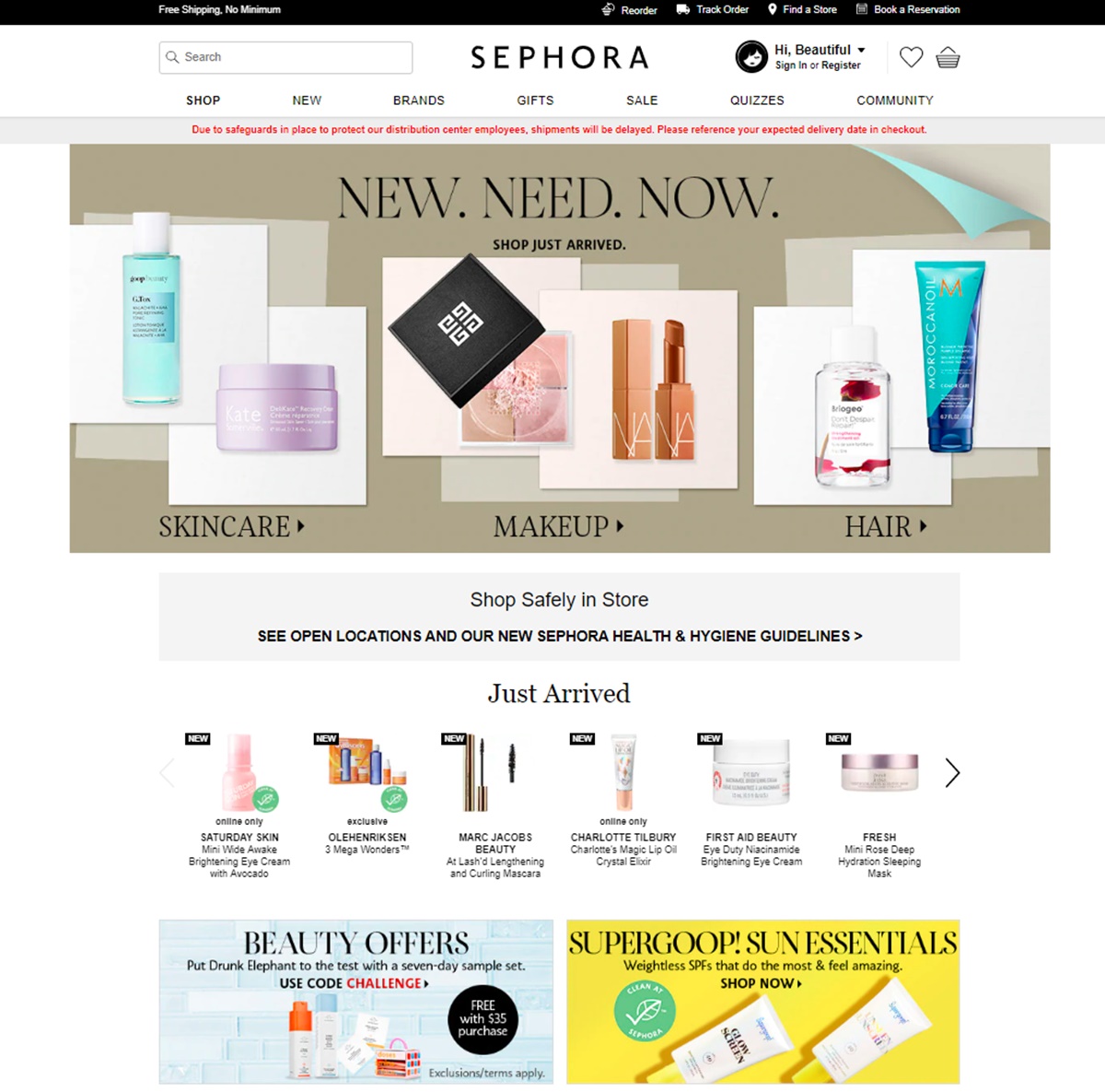 </p>
</p>
Their page is simple and minimalist but is easy to navigate. They have added banner links to the Category pages, which makes it easy for customers to navigate and quickly find what they want. The Selling Fast and Just Arrived sections underneath help the customer find the most popular products and the new arrivals in one glance.
2. The Category Overview Page
Creating a category overview page for your top-level category will give your prospect an idea of what products are included in it.
A category overview page makes it easy for the user to find what he wants without spending a lot of time searching through extensive product catalogs.
For example, if your store sells Pet Care products, you can create a category overview page to link to the sub-categories in that department like Pet Accessories, Pet Toys, Pet Food, etc.
Some stores skip this page entirely. Instead of a Category Overview page, they go for a nested dropdown menu, which helps the user navigate through the categories.
If you are using a nested menu, make sure it’s mobile friendly and works well on touch screens.
A category overview page, however, has an added advantage. You can use this as a landing page when placing ads and building links for referral traffic.
Best Buy chooses to have both - a category overview page and nested menu.<p class="center">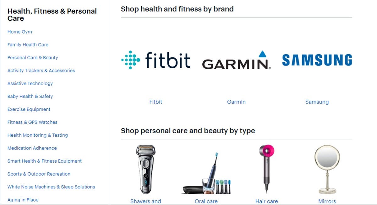 </p>
</p>
3. The Category Page
The category page is like the supermarket aisle where you stack all the goods on display that fall within a certain category.
This page typically lists all your products that are included in that category – usually in a grid format – and include filters and search bars so the user can drill down and find what he needs.
While the previous two pages we talked about were more about navigation and visual appeal, this page is all about selling.
The customer that lands on this page wants to compare products before they decide which one they’ll buy. And so, giving enough information and including high-quality images here makes it easy for them to make up their mind.
The typical buyer’s journey involves clicking through the product links on this page and landing on the Product Page where the buyer can add the product to cart. But this is an unnecessary step and one more click added to the sales funnel.
The idea is to make it simple and quick for customers to buy from you. If they want to go and check out the information on the individual product page, they should be able to do so. But if they want to go ahead and just add the product to cart without navigating to the individual product page, the interface should be able to accommodate that as well.
Keep in mind that the customers that land on this page are of different kinds.
Some won’t buy until they inspect the product from all angles and get as much information as they can.
Some are in a hurry and already know what they want to buy - they’ll just prefer to add the product to their cart without looking at all the product images and reading lengthy product descriptions.
There are others that are not even ready to buy anything and are just window shopping or comparing - they might just want to add products to their wishlist.
And so, your category page should be designed in a way that accommodates all the different kinds of customers that land here.
Here are some features you can include on the category page:
Product Table
With Product Tables, you can display your products in a table format instead of the grid layout. Tables can accommodate more information than tiles in a grid, they help in product comparison, and they can be used to remove the unnecessary step by allowing buyers to cart multiple products right here. You can even add a dropdown menu for variations so the customer can select the variations from the table and add the product to cart. Product Tables are usually popular for products that are non-visual like grocery items, pet care, stationery, office supplies, downloadable products, or anything for which images aren’t such a big deal.
Quick Buy Button
A Quick Buy button usually opens up a modal window where the user can get more product information and select variations and add the product to cart without leaving the category page.
Add to Wishlist Button
Accommodate those window shoppers by giving them an Add to Wishlist button with every product displayed on this page.
Compare Button
A compare button allows customers to select the products they want to compare. You need to install product comparison functionality in your store to enable this button. With this functionality, customers can select the products to compare and then move on to the compare page where they can compare products based on attributes and price.
4. The Product Page
The product page should be packed with information about the product. When the customer lands here, he should get all the information needed to make up his mind.
Here are some features you can include here on this page:
360 Degree Product Images
High quality product images from different angles are crucial for products that are more physical like fashion products. Showcasing a 360 degree view of your product will, however, take that experience to the next level.
Well-written Product Description
Write copy that answers your buyer’s questions and sells your product. Good copywriting are critical for this page.
Question/ Answers
Allow customers to ask questions about your product from this page and display all the questions and answers posted earlier by other customers.
Customer Reviews
You can’t ignore this particular feature of the product page. Allow customers to upload pictures with their reviews and display them here with their reviews.
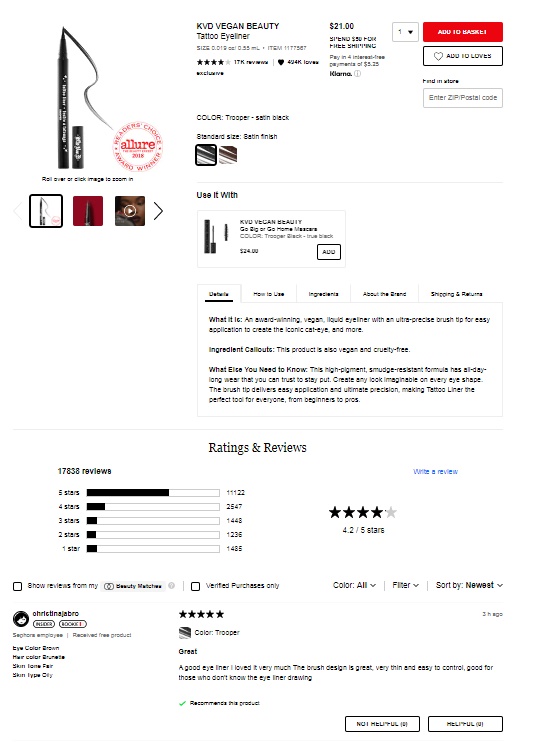
Here is a product page example of Sephora’s online store. See how the vital information is displayed neatly without cluttering the page.
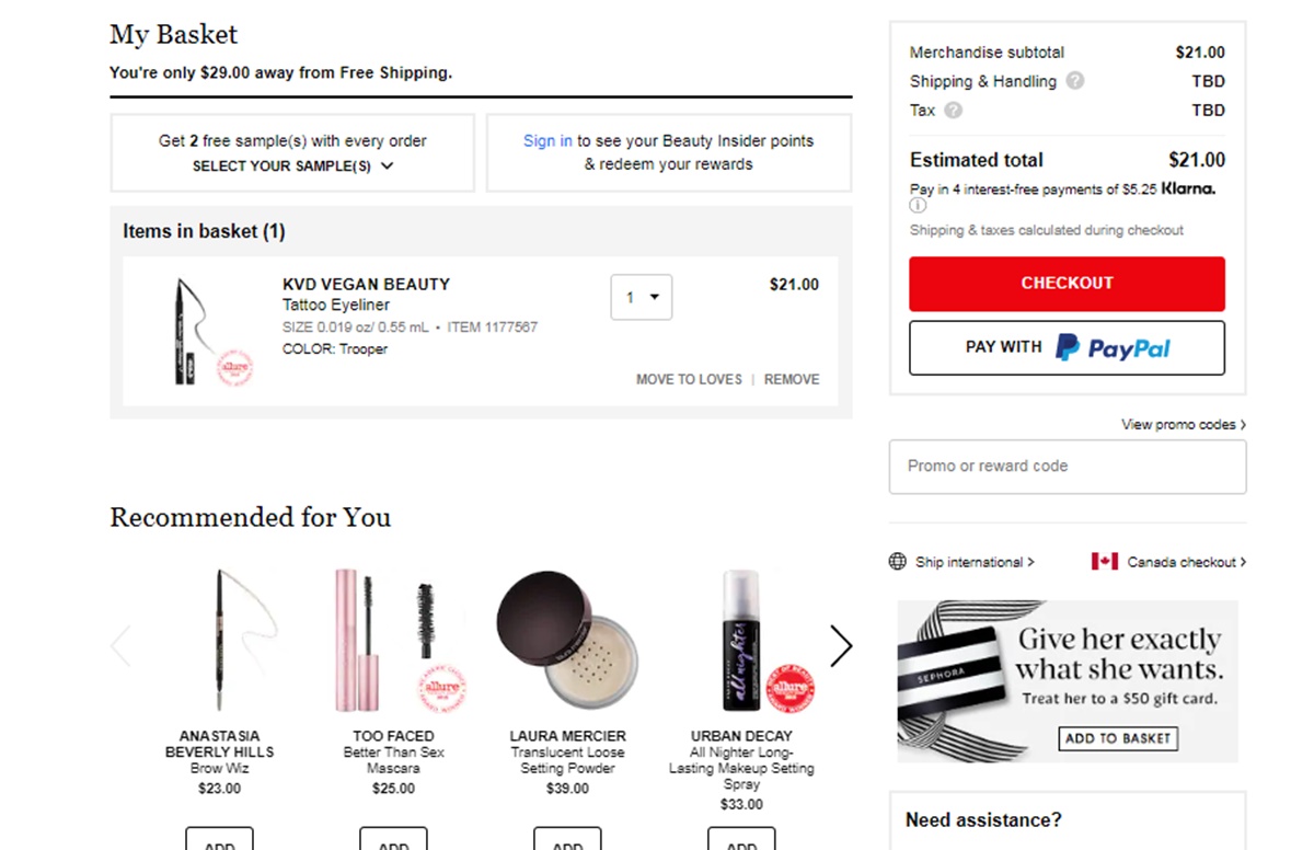
5. The Cart Page
The next essential page for your eCommerce site is the cart page. This page gives a chance to customers to review the products in their carts, remove items if they want and also have an option to continue shopping to add more to the cart. It’s also an opportunity to upsell and cross-sell.
See how beautifully Sephora does it. Their Cart page gives an overview of the items in the cart, allows the customer to increase or decrease the quantity, check validity of a coupon, remove the item and even move it to the wishlist. And below the cart overview, they conveniently upsell with more product suggestions.
6. The Log-In Page
Nobody likes to log in with usernames and passwords that are so hard to remember. It’s just one big hurdle that comes in between you and your customer.
While Guest Checkout is a common way to overcome this obstacle, it often causes friction for repeat customers who would rather prefer to have their information saved for a speedier checkout.
A technique here is to add a Social Log-in functionality that allows customers to log in using their social accounts. It lets users avail the benefits of having an account without having to remember another username and password.
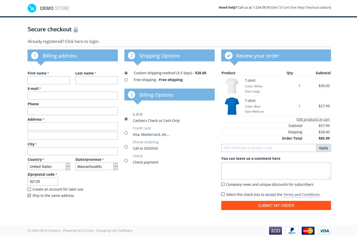
7. The Checkout Page
The checkout flow needs to be as simple and quick as can be. Your customer is in the last stages of the sales funnel and losing him now would be a great disappointment. Just make it quick and get it done with.
Many eCommerce stores create a one-page checkout experience by including everything – account log-in, shipping, payment, and order review on one single page.
Here is an example of a one-page checkout.
8. Order Confirmation Page
This is a page often ignored by store owners. What we usually see here is a plain, old thank-you message that gives no idea about when the order will be delivered, how to reach out for help in case of any problem and how to track the order.
It certainly deserves a little bit more attention than that. Your customer just finished making a purchase and you need to assure them that they have made the right choice by shopping from your store.
Here are some points that need attention:
- Information on how to get help and where to contact with queries
- How to make changes to the order if needed
- How to track their order deliveries
- Benefits of creating an account in case the customer checked out as guest
9. My Account Page
My Account page lists all current and previous orders as well as personal information like addresses, phone numbers, and payment methods that the customer can easily update.
Some extra features you can include here:
A reorder button that allows customers to place the same order with the click of a button
A link to the order tracking system that makes it easy for customers to track their deliveries
Floship integrates seamlessly with all major eCommerce platforms like Magento, Shopify and WooCommerce so your customers can easily keep track of their deliveries.
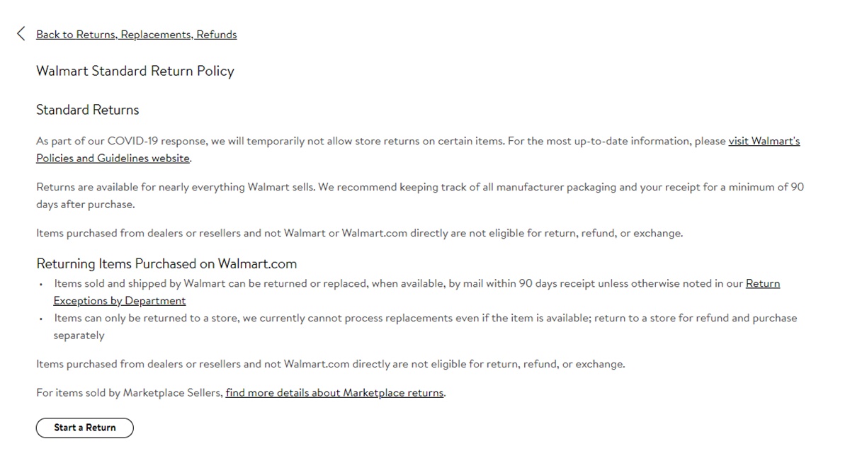
10. Returns Policy
Having a clear return policy is a solid way to gain your customers’ confidence and trust and reduce cart abandonment. Make sure the Returns Policy is laid out well with important information highlighted so that everything is transparent at first glance.
Here is an example of a well-designed Returns Policy page by Walmart. After stating their returns policies, they give a neat Start a Return button to help customers return the product if needed.
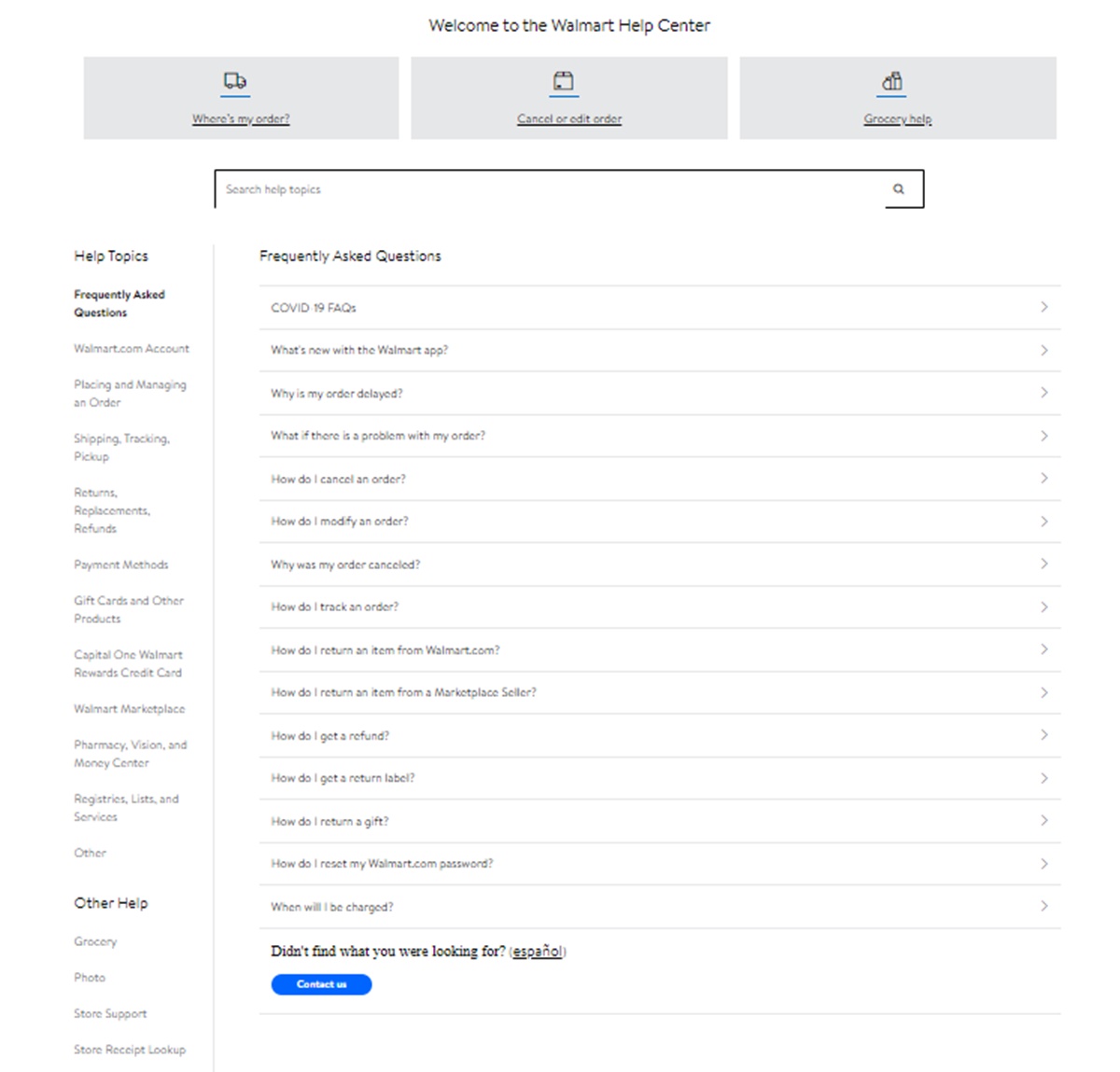
11. Help Page
Make it easy for customers to find help if anything goes wrong. Your help page should include a FAQ section and clear cut instructions on how to reach out with help queries.
See how Walmart does it with a well laid-out FAQs section and then a Contact Us button at the bottom that connects the customer with their chat bot.
12. Blog Page
This is one page most eCommerce sites skip entirely and even when they do have it, they don’t give it as much attention as it deserves.
While creating optimized and targeted blog content on a regular schedule can take a lot of time and effort, the benefits are well worth it.
Interesting, informative, and targeted blogs can help drive traffic, boost SEO rankings, grow your audience, and build email lists.
What to include here:
- Valuable content that drives traffic
- A freebie that helps you get email subscribers
- Links to your product pages and category pages wherever they fit naturally
Hopefully the above list will help you design an awesome store that’s optimized for selling.