How to Create a Custom WooCommerce Product Page With Divi Theme

With the remarkable brand new Divi Theme Builder, Divi 4.0 is a true game-changer. The Divi Builder’s functionality is extended to all sections of the Divi Theme by the Theme Builder, enabling you to create custom headers, footers, category pages, product templates, blog post templates, and so on.
And in today’s article, we will show you how to create a custom WooCommerce product page with Divi Theme.
Let’s get started!
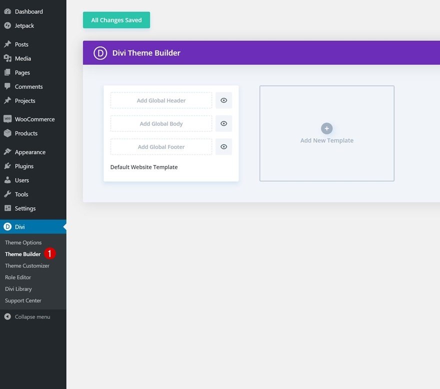
Divi theme builder overview
The Divi Theme Builder is a full-featured website templating system that lets you change any aspect of the Divi Theme, including headers, footers, post templates, category templates, and more. Each Theme Builder template has its own unique layout for the Header, Footer, and Body sections. The Divi Builder and its entire collection of modules, as well as Dynamic Content, can be used to create and personalize these three sections.
You can also use the Theme Builder to build custom product pages that modify the standard structure of your product pages. As a result, rather than updating each product page manually, you can construct a site-wide template using the Theme Builder.
Therefore, in this article, we are going to show you how to create a site-wide WooCommerce product page template with Divi’s Theme Builder and also how to create a minimal WooCommerce product page with Divi’s Modules.
How to Create a Site-Wide WooCommerce Product Page Template With Divi’s Theme Builder?
There are four main steps you need to follow in order to create a site-wide WooCommerce product page template with Divi’s Theme Builder.
A product page template can be created in two ways. You can begin changing the global body inside your product page template, or you can start by designing an individual product page. However, we’ll choose the second technique in this article since creating the design on an individual product page enables you to publish it and view the live outcome before applying it to all of your product pages at once.
Hence, to begin, we’ll style the basic WooCommerce product page of one specific product to fit the Screen Printing Layout Pack. Then we’ll save the layout to our Divi Library and utilize it as the global body on a new template we make.
Step 1. Enable Divi Builder on Existing Product
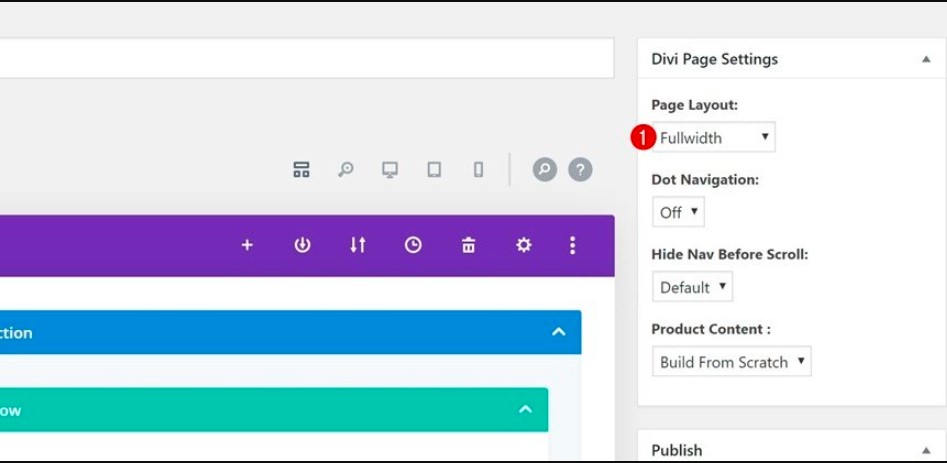
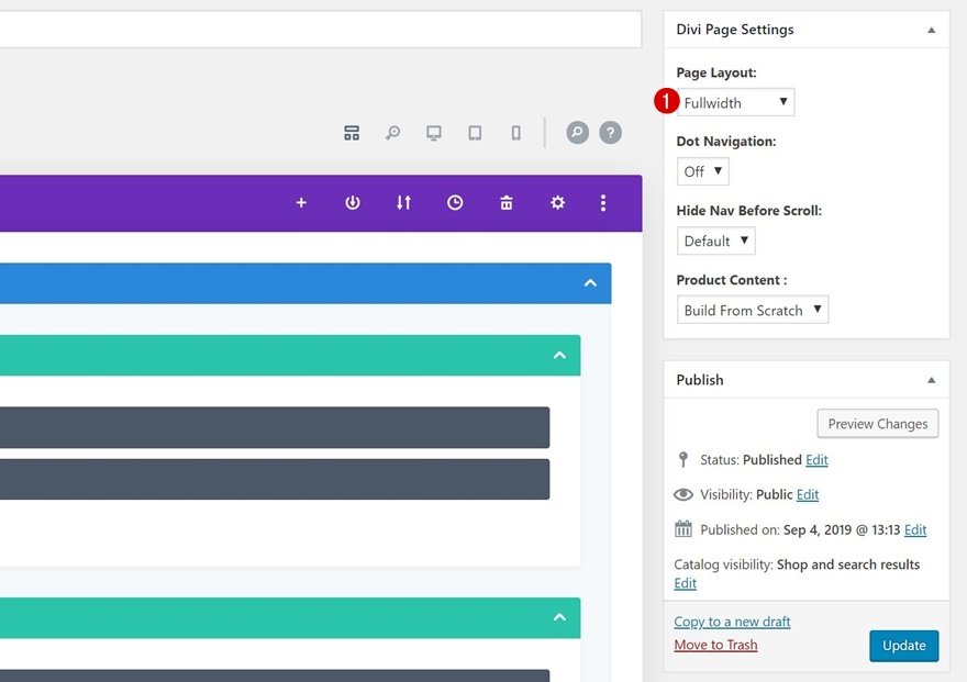
1. Enable Divi & Modify Page Settings
Open one of your existing product pages and change the page layout in the Divi Page Settings window to fullwidth.
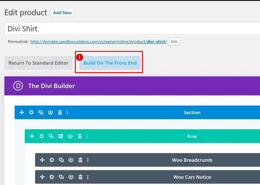
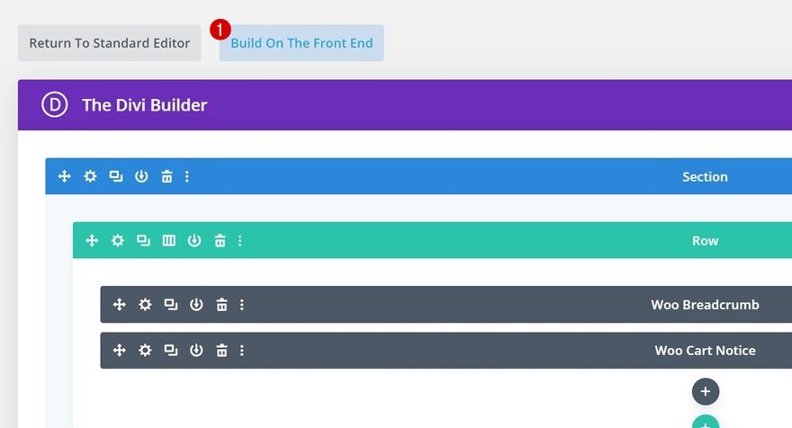
2. Switch Over to Visual Builder
You can start working on the front end once you’ve changed the page layout in the page settings.
Simply click on Build on the front end.
Step 2. Customize Layout to Match Website or Layout Pack’s Style
1. Background colors
All of the woo elements you’ll need are visible inside the Visual Builder. We’ll adjust the settings of a few of these modules to match the Screen Printing Layout Pack. The modifications we’re making are minor and are only intended to assist you in applying a certain design style to your product page. If you’re working on a personal project, feel free to go as far as you like with the modification, but we’ll try to keep it basic for this lesson.
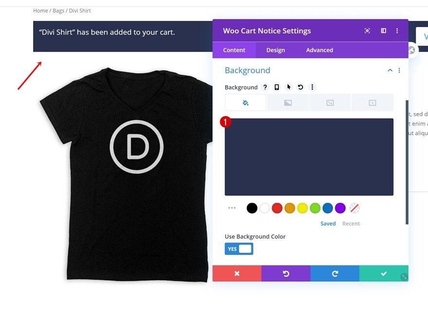
1.1. WooCommerce Cart Notice Module: Background Color
Start by opening the Woo Cart Notice Module and change its background color.
This is the background color we use: #29314f
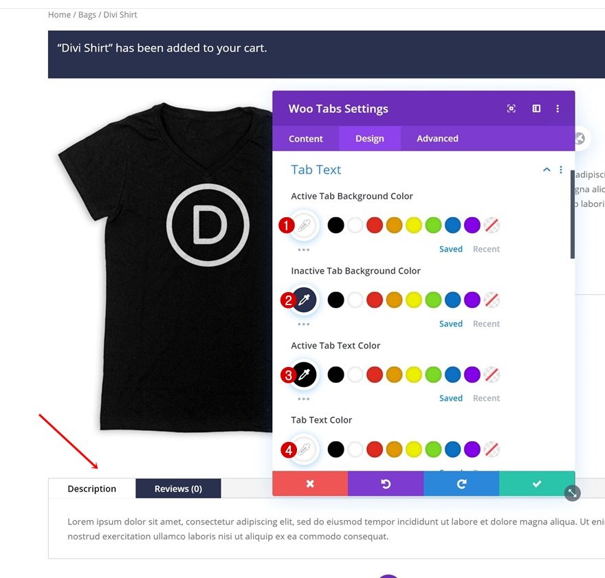
1.2. Woo Tabs Module: Tabs Text/Background Colors
Continue by opening the Woo Tabs Module and then change the tab text and background colors next.
Here are the color codes that we use in this example:
- Active Tab Background Color: #ffffff
- Inactive Tab Background Color: #29314f
- Active Tab Text Color: #000000
- Tab Text Color: #ffffff
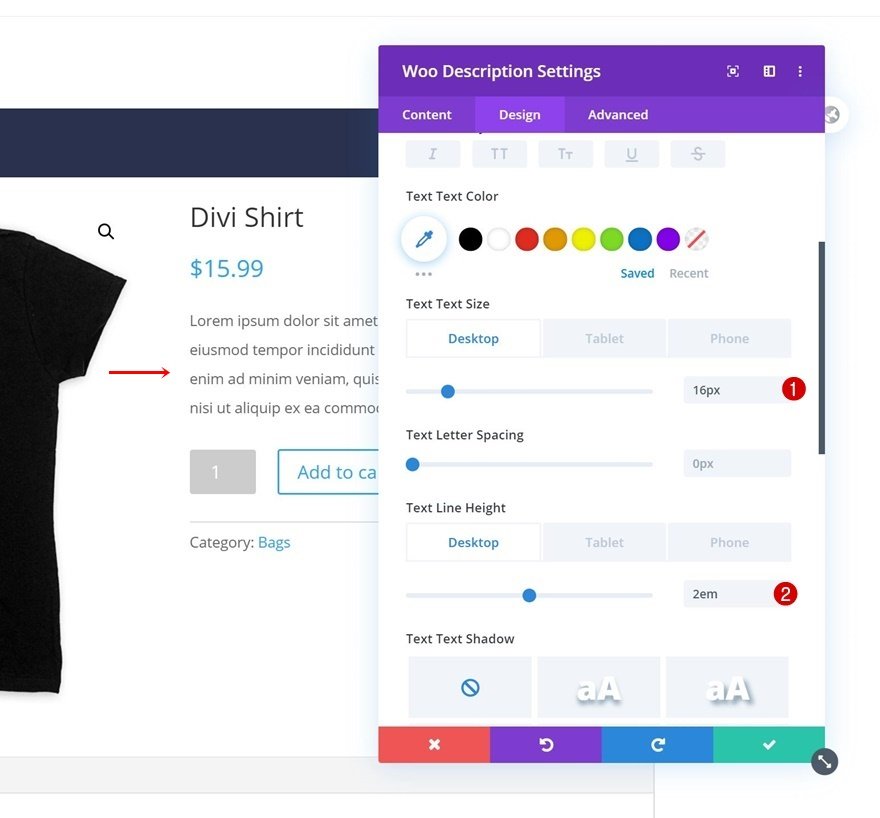
2. Body Text Settings
We also want to make some modifications to the body text of the following modules:
- Woo Breadcrumb Module: Text Settings
- Woo Add To Cart Module: Text Settings
- Woo Description Module: Text Settings
- Woo Meta Module: Text Settings
- Woo Tabs Module: Text Settings
- Woo Tabs Module: Tabs Text Settings
To do so, open each of the modules listed above and modify the font size and text line height. Below are just examples from us:
- Text Size: 16px (Desktop & Tablet), 14px (Phone)
- Text Line Height: 2em (Desktop & Tablet), 1.7em (Phone)
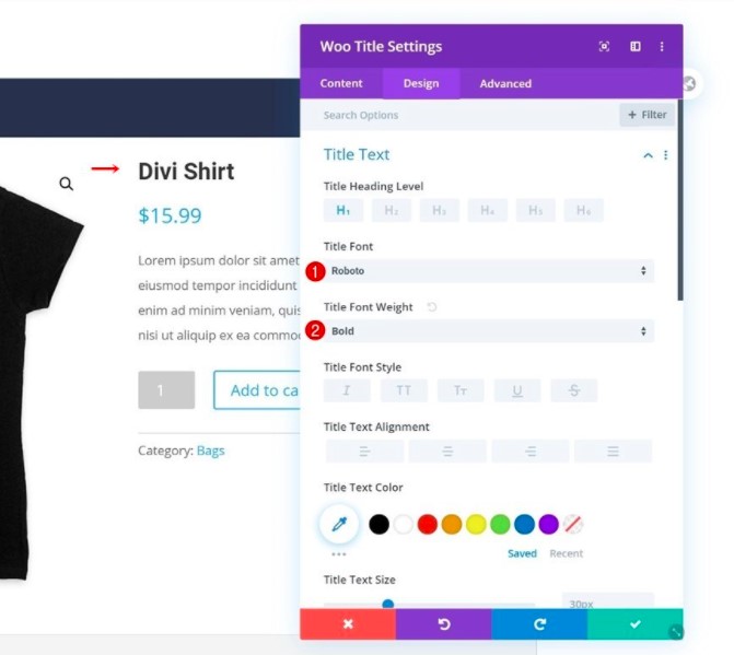
3. Title Text Settings
Next up, we’ll change the style of the titles. Let’s make changes to each one of these modules.
- Woo Title Module: Title Text Settings
- Woo Related Products Module: Title Text Settings
- Woo Related Products Module: Product Title Text Settings
Here we just change the title font and title font weight.
- Title Font: Roboto
- Title Font Weight: Bold
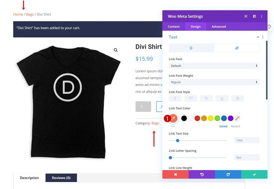
4. Link colors
The next thing we’re going to do is to highlight the clickable items. We’ll change the link text color of the following two modules:
- Woo Breadcrumb Module: Link Text Color
- Woo Meta Module: Link Text Color
Here is the color code that we use for link text color: #ff7145. Do change it to suit your preferences.
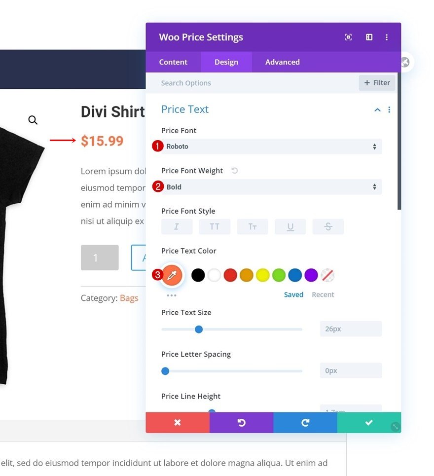
5. Price Text Settings
Now we will style the price text. Let’s start with the Woo Price Module first.
Here is how we change the price text settings:
- Price Font: Roboto
- Price Font Weight: Bold
- Price Text Color: #ff7145
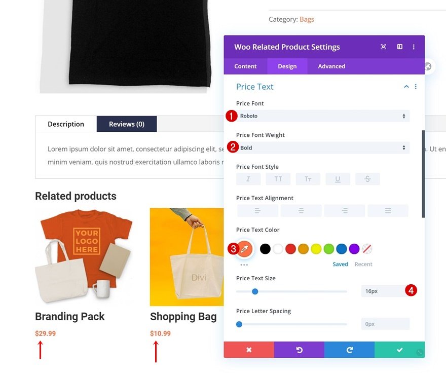
Then open the Woo Related Product Module to make some changes to the price text settings.
- Price Font: Roboto
- Price Font Weight: Bold
- Price Text Color: #ff7145
- Price Text Size: 16px
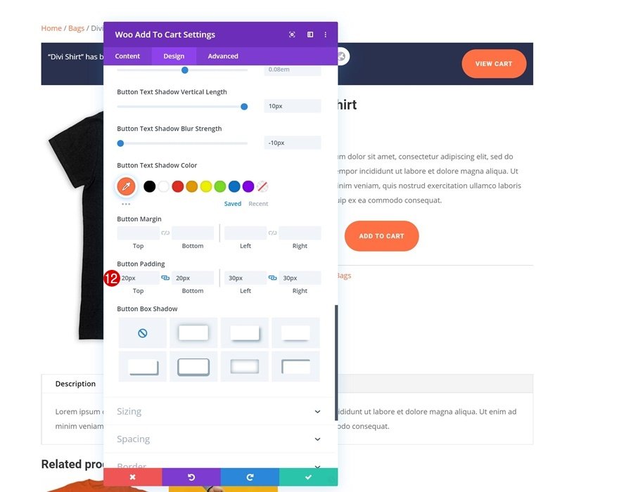
6. Button Settings
The next thing that needs to be styled is two buttons on the product page:
- Woo Cart Notice Module: Button Settings
- Woo Add To Cart Module: Button Settings
Below is how we adjust the button settings. Do change to suit your preferences.
- Use Custom Styles For Button: Yes
- Button Text Size: 14px
- Button Text Color: #ffffff
- Button Background Color: #ff7145
- Button Border Width: 2px
- Button Border Color: #ff7145
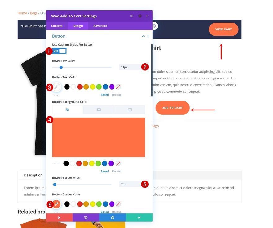
- Button Border Radius: 100px
- Button Letter Spacing: 1px
- Button Font: Roboto
- Button Font Weight: Bold
- Button Font Style: Uppercase
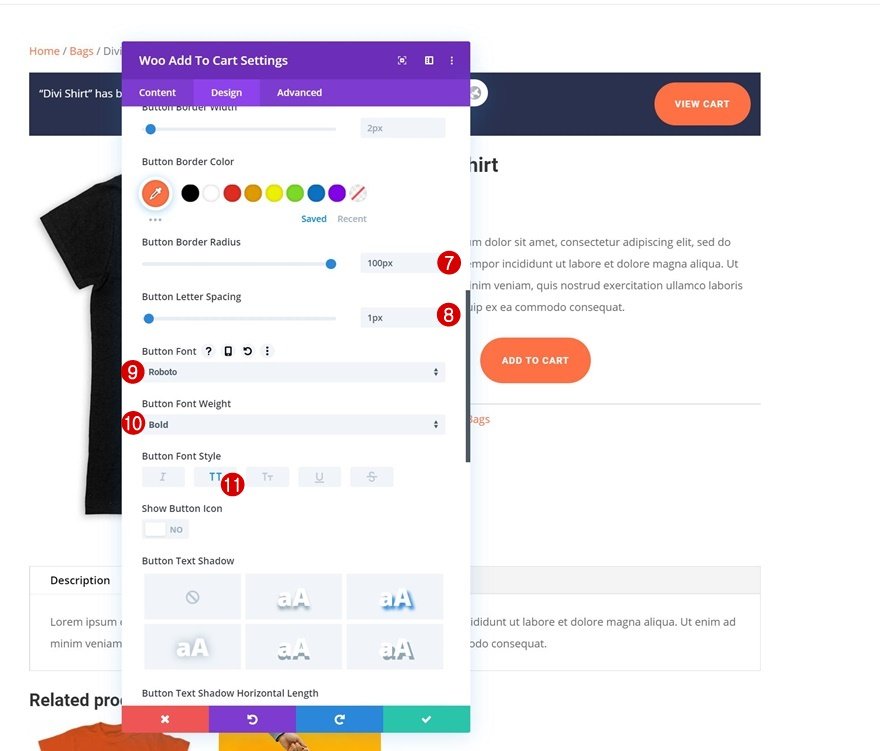
- Top Padding: 20px
- Bottom Padding: 20px
- Left Padding: 30px
- Right Padding: 30px
7. Additional details
Apart from the above 6 main sections, we would also want to make some more modifications to the product page design.
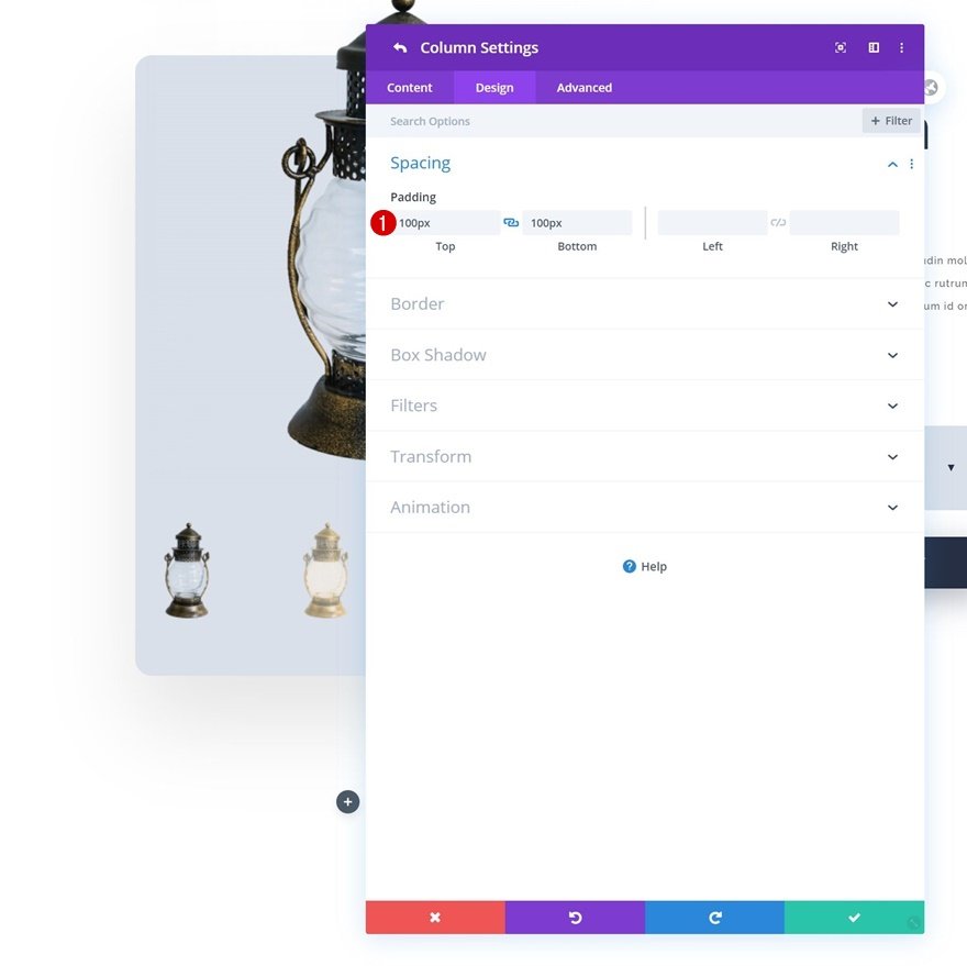
7.1. Column 2 of the second row
- Column 2: Background Color In the “Column Settings” window, we choose this color code we use for the background: #efefef.
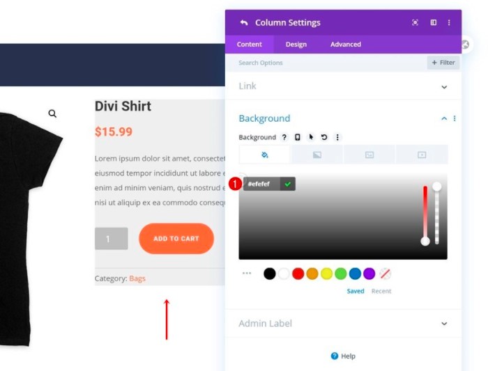
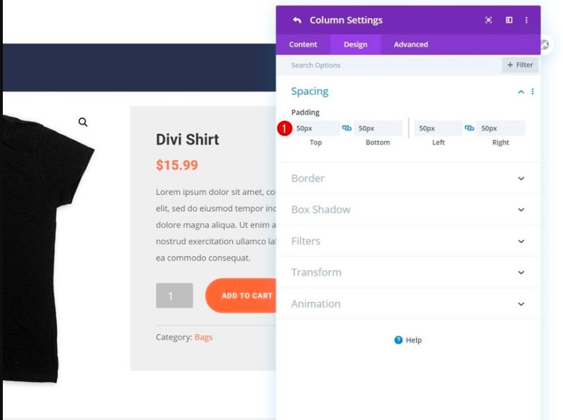
- Column 2: Spacing Here are the spacing values that we use:
Top Padding: 50px; Bottom Padding: 50px; Left Padding: 50px; Right Padding: 50px
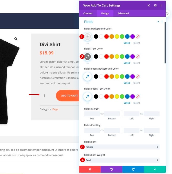
7.2. Woo Add To Cart Module: Fields Settings
Here are some changes we make with the Woo Add To Cart Settings:
- Fields Background Color: #efefef
- Fields Text Color: #7f7f7f
- Fields Font: Roboto
- Fields Font Weight: Bold
Step 3. Create New Template for Products and Import Product Page Layout in Body Area
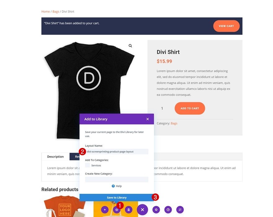
1. Save Product Page Layout to Divi Library
Once you’ve finished designing the product page, you can save the entire layout to your Divi Library.
2. Go to Divi Theme Builder
Navigate to the Theme Builder in your Divi Settings to turn the layout that you’ve just created into a product page template.
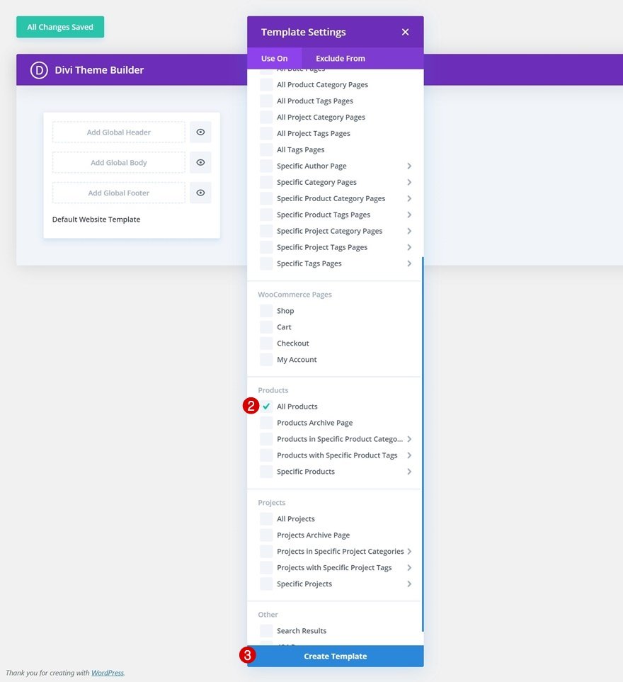
3. Add new template
Click on the button Add New Template.

To have the template apply to all of your products at once, select ‘All Products’ in the ‘Use On’ tab of your template settings.
4. Add custom body from library
Select Add Global Body from the drop-down menu. Instead of starting from scratch, we’ll use the layout we recently saved to our Divi Library.
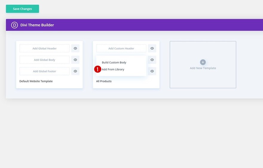
After that, select your saved layout by going to the Your Saved Layouts tab.
Step 4. Save Theme Builder Options and View Template on Existing Products
When you’ve completed the body of your template, you just need to save the changes. After you save your new template, you can preview each of your products in the same body template that you have created in step 2.
How to Create a Minimal WooCommerce Product Page with Divi’s Modules?
In this part, we’ll show you how to create a minimal product page with Divi’s built-in options and the new WooCommerce Modules, which you can reuse for all of your product pages.
Step 1: Add or Open WooCommerce Product
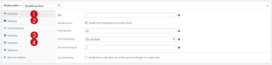
Create a new product page or open an existing one. Below are product details that you need to fill in for your product page.
-
Product Title and Category
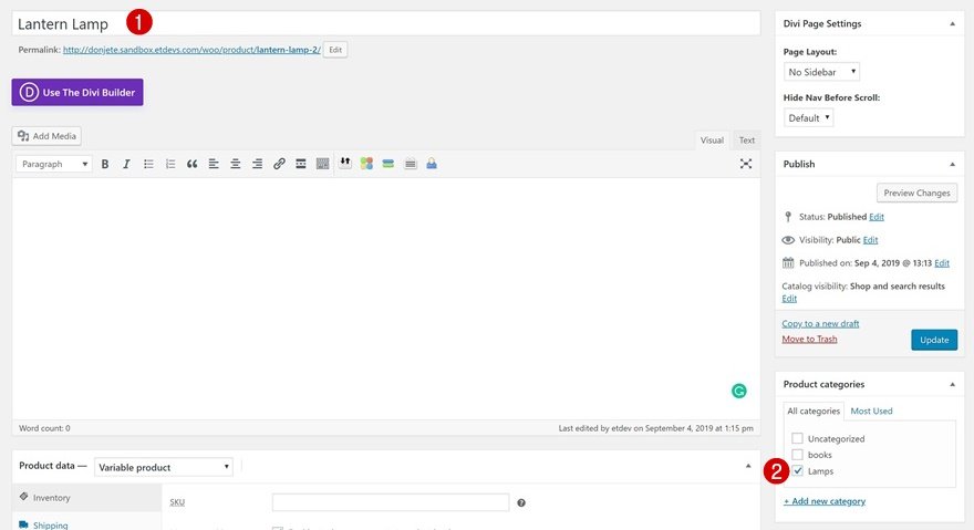
-
Product Short and Long Description
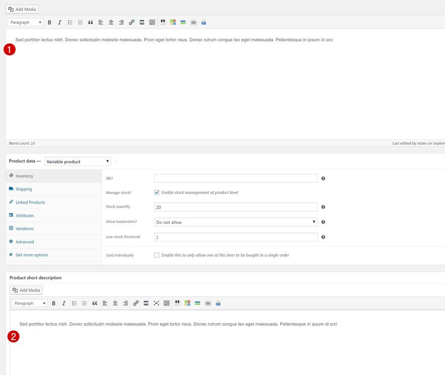
-
Product Image and Gallery
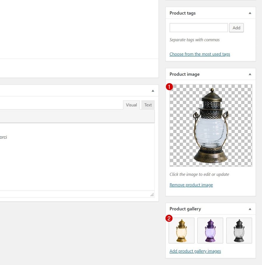
-
Product Data Product Data: Variable Product; Inventory; Shipping; Attributes; Variations
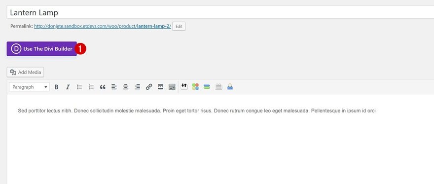
Step 2: Enable Divi Builder and Modify Product Page Settings
When you’re done adding the product details, you can start to enable the Divi Builder by clicking on the button Use the Divi Builder. Then you need to change the page layout to Fullwidth in the Divi page settings.
Step 3: Switch Over to Visual Builder
Once you’ve enabled Divi Builder and modified product page settings, you need to switch over to Visual Builder by clicking on Build on the Front End.
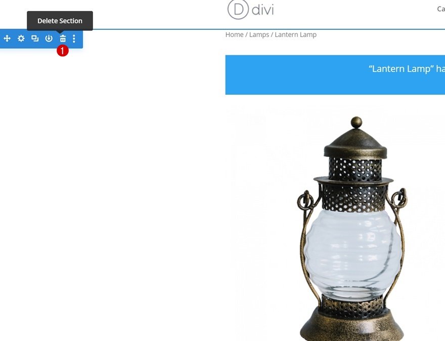
Step 4: Remove Original Product Section on Page
The original WooCommerce product information is included in an area within the Visual Builder. We’ll be starting from scratch in the next few steps of this tutorial, so simply remove the entire section of the original product.
Step 5: Create Minimal Product Page Using Divi’s Visual Builder
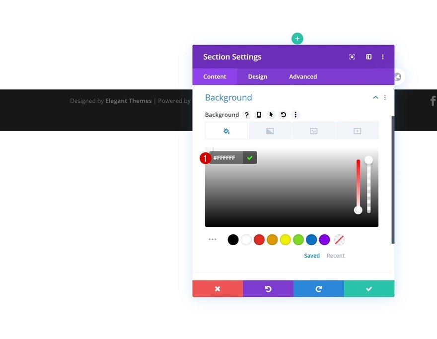
1. Add new section
- Background color
Now let’s add a new section and change the section’s background color.
The background color code we use here is #FFFFFF.
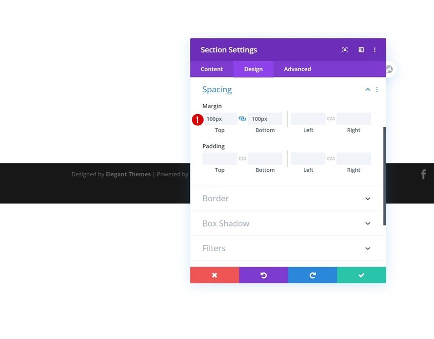
- Spacing
You also need to add some custom margin values:
Top Margin: 100px; Bottom Margin: 100px
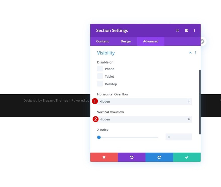
- Overflows We’ll hide the overflows in the visibility settings to ensure that nothing surpasses the section container.
Horizontal Overflow: Hidden; Vertical Overflow: Hidden
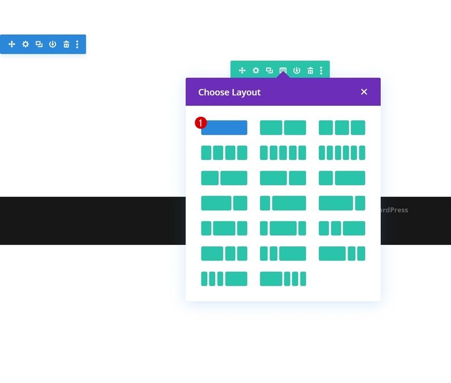
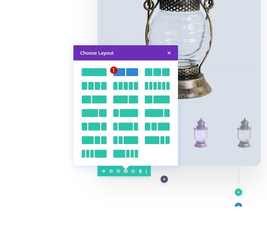
2. Add Row 1
- Column Structure
Add the first row to your section using the column structure shown below:
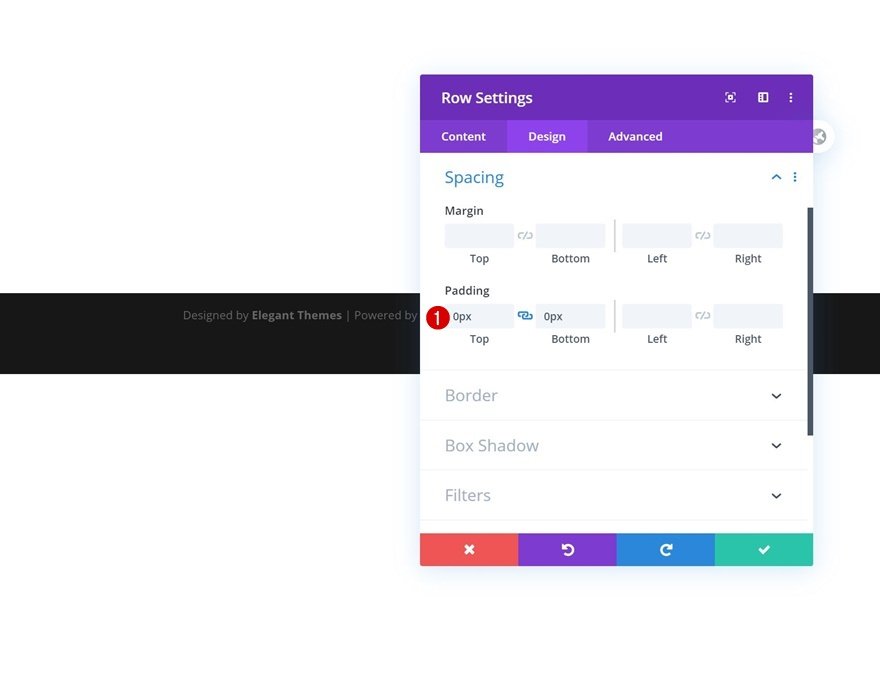
- Spacing
Open the row settings, remove the default top and bottom padding before adding any modules:
Top Padding: 0px; Bottom Padding: 0px
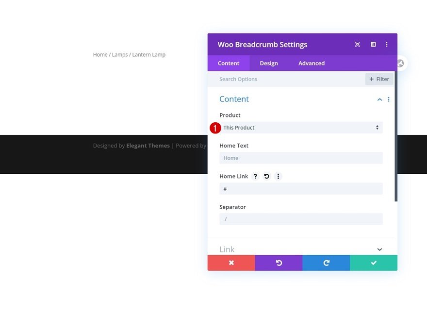
3. Add Woo Breadcrumb Module to Column
- Dynamic Content
The Woo Breadcrumb Module is the only module we want in this row. Ensure that the module is connected to the product you’re developing by choosing This product under the Product drop-down menu.
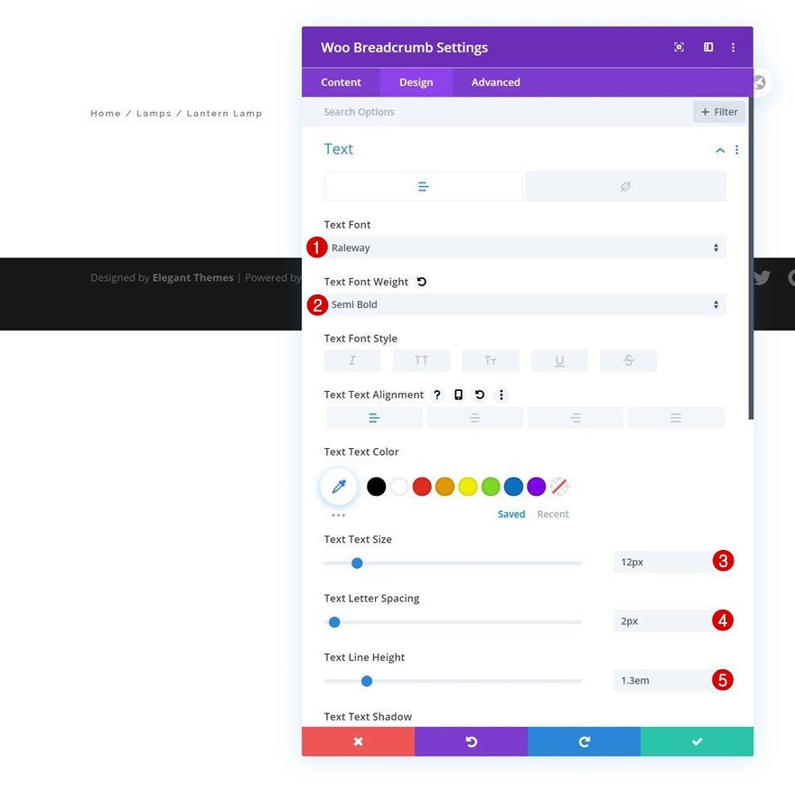
- Text settings The next thing to style is text. Navigate to the design tab and style the text settings accordingly.
Text Font: Raleway; Text Font Weight: Semi Bold; Text Size: 12px; Text Letter Spacing: 2px; Text Line Height: 1.3em
- Link text settings
Next, make a few changes to the link text settings. Link Text Color: #fc7b52; Link Text Size: 13px

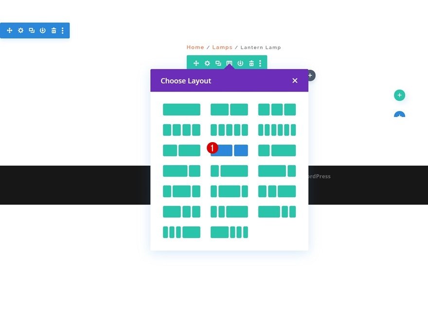
4. Add Row 2
- Column Structure
Continue by adding the second row using the column structure shown below:
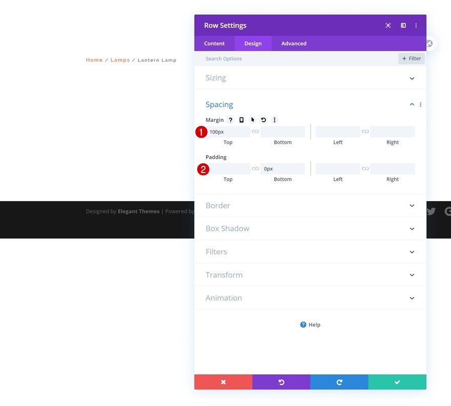
- Spacing
Open the row settings without adding any modules and make the following changes to the margin and padding values:
Top Margin: 100px; Bottom Padding: 0px
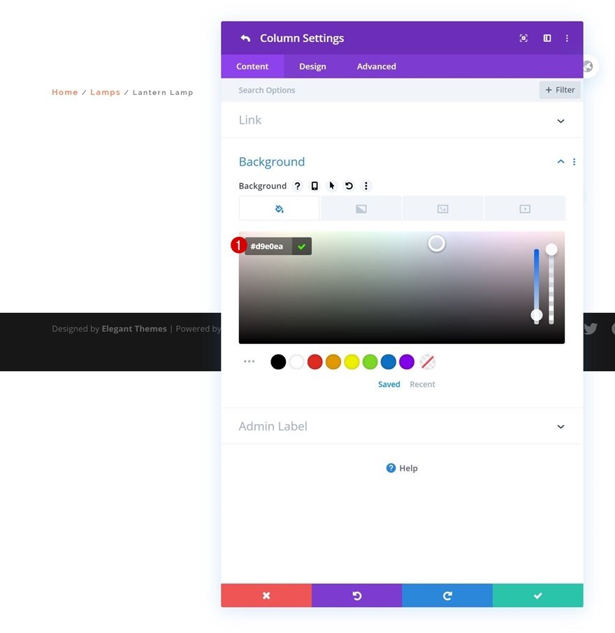
5. Column 1 settings
- Background color
Next you need to open the column 1 settings and add a background color.
The background color we use here is #d9e0ea.
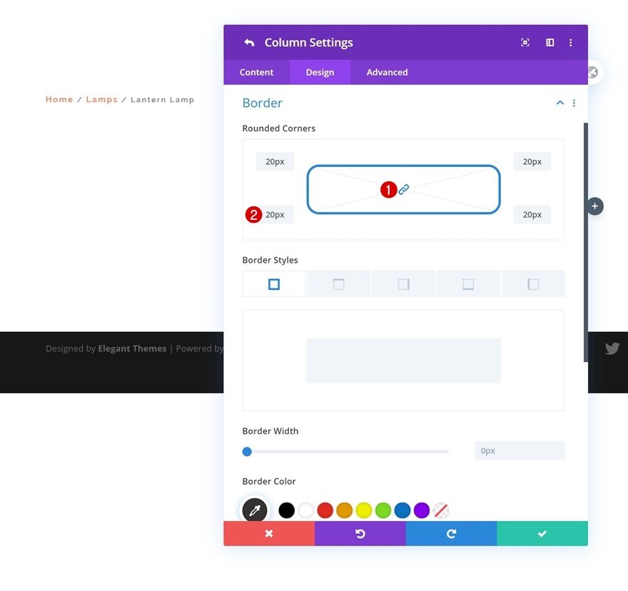
- Border
Then we’ll add 20px border radius to the column’s corners.
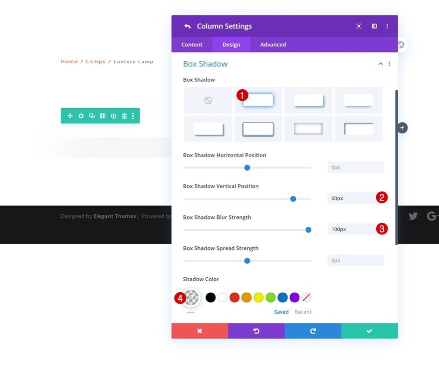
- Box shadow
Next we’ll create a subtle box shadow.
Box Shadow Vertical Position: 60px; Box Shadow Blur Strength: 100px; Shadow Color: rgba(0,0,0,0.1)
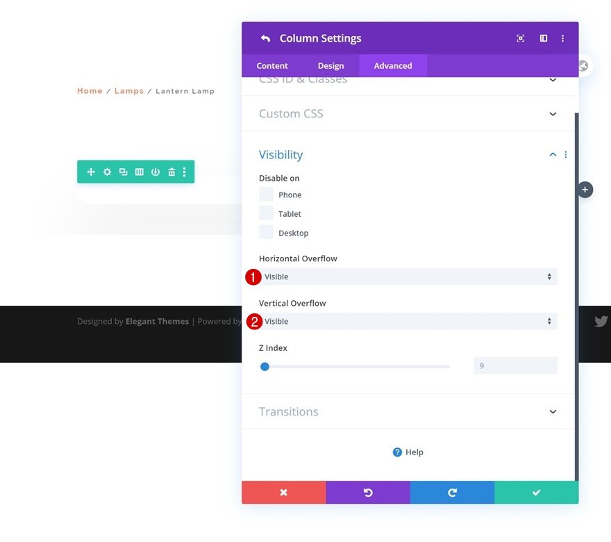
- Overflows
Finally, set the column’s overflows to visible.
Horizontal Overflow: Visible; Vertical Overflow: Visible
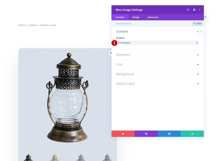
6. Add Woo Image Module to Column 1
- Dynamic content
Now we will add modules. The Woo Image Module is the first and only module we need in column 1.
Choose This product from the Product drop-down menu.
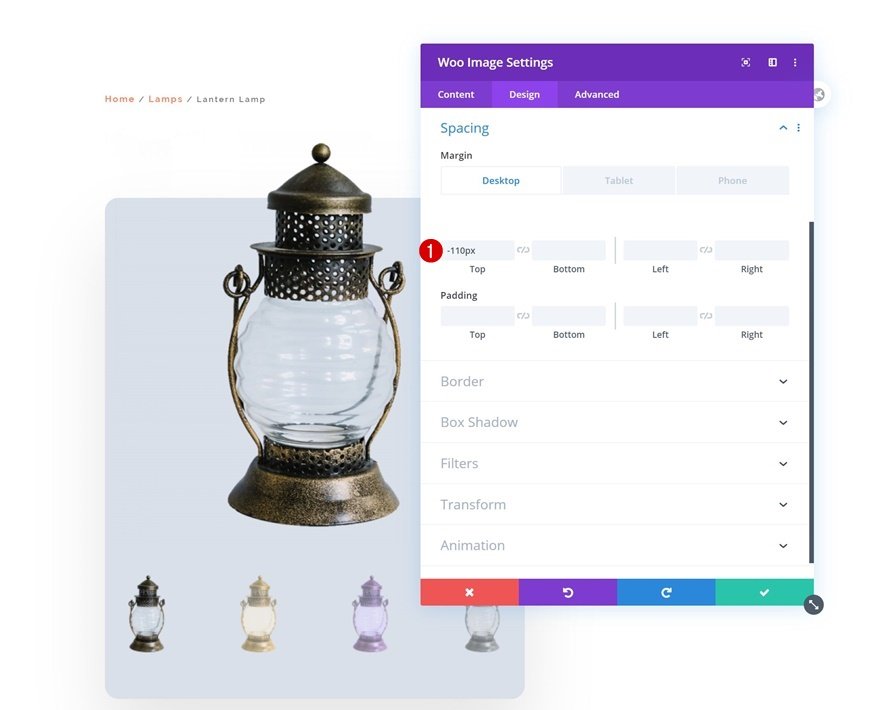
- Spacing
Add a negative top margin to the module’s spacing parameters to create some top overlap.
Top Margin: -110px (Desktop & Tablet), 0px (Phone)
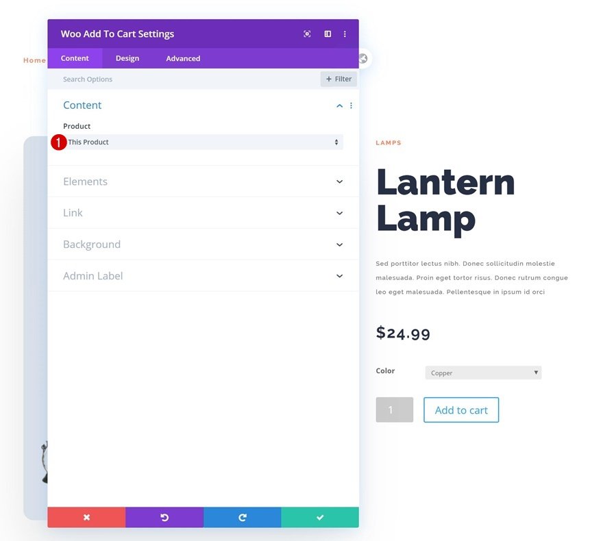
7. Add Text Module to Column 2
- Dynamic Content
The Woo Add To Cart Module is the final module we require in column 2.
Also make sure to choose This product from the Product drop-down menu.
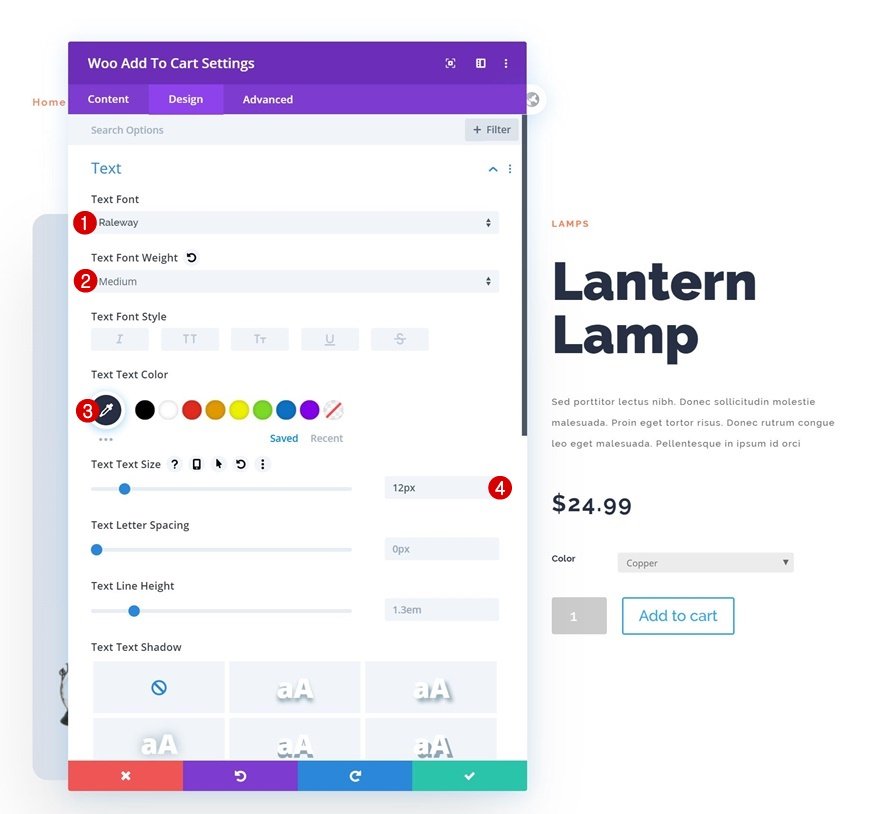
- Text settings
Modify the module’s text settings.
Text Font: Raleway; Text Font Weight: Medium; Text Color: #262f44; Text Size: 12px
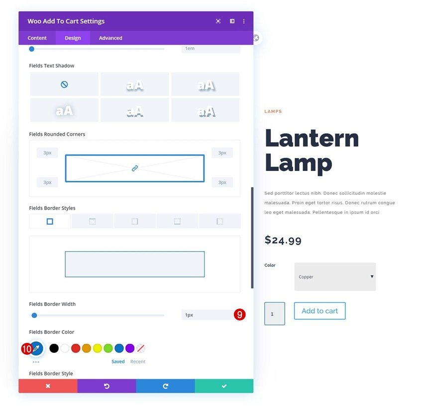
- Field settings
Next change the fields settings.
Fields Background Color: rgba(38,47,68,0.08); Field Text Color: #262f44; Fields Focus Background Color: rgba(0,0,0,0); Fields Focus Text Color: #262f44; Right Margin: 6px; Top Padding: 32px; Bottom Padding: 32px; Fields Font: Raleway; Fields Text Size: 16px
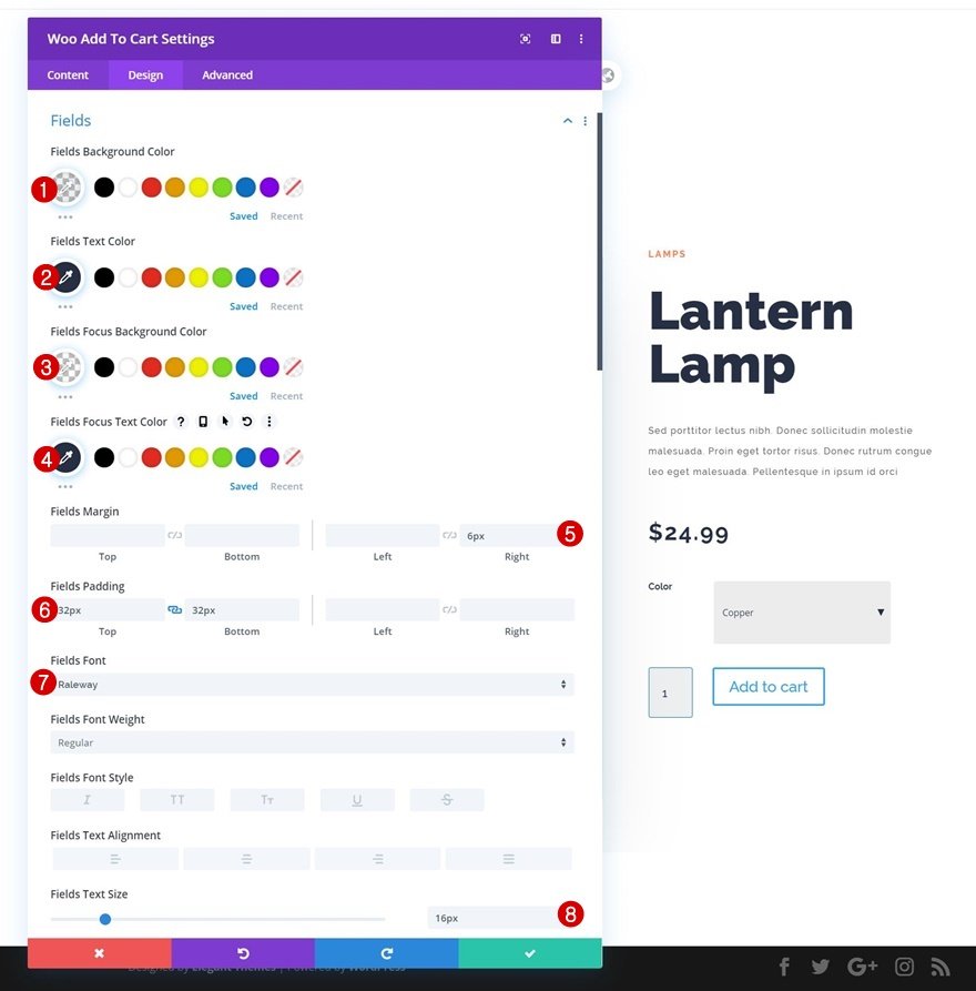
Fields Border Width: 1px Fields Border Color: #0c71c3
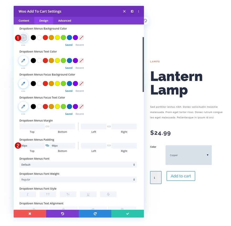
- Drop-down menus settings
Change the settings for the drop-down menus as well.
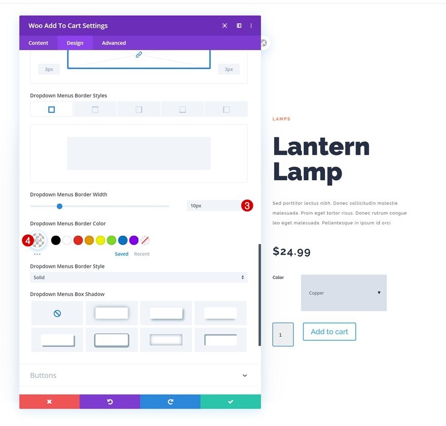
Dropdown Menus Background Color: #d9e0ea; Top Padding: 90px; Bottom Padding: 90px
Dropdown Menus Border Width: 10px; Dropdown Menus Border Color: rgba(0,0,0,0)
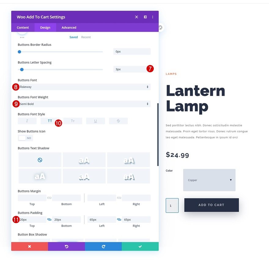
- Button settings
Now let’s style the button to finish the look for the module’s design.
Use Custom Styles for Button: Yes; Button Text Size: 13px; Button Text Color: rgba(255,255,255,0.8); Button Background Color: #262f44; Button Border Width: 0px; Button Border Radius: 0px
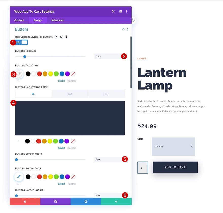
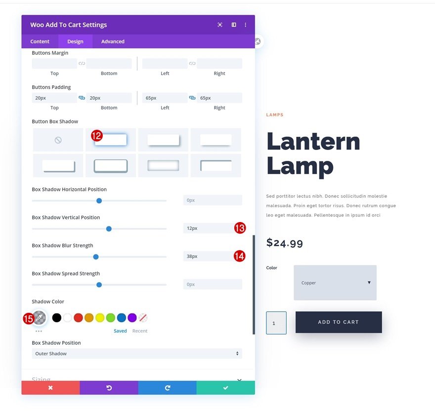
Button Letter Spacing: 3px; Button Font: Raleway; Button Font Weight: Semi Bold; Button Font Style: Uppercase; Top Padding: 20px; Bottom Padding: 20px; Left Padding: 65px; Right Padding: 65px
Box Shadow Vertical Position: 12px; Box Shadow Blur Strength: 38px; Shadow Color: rgba(38,47,68,0.36)
8. Add Row 3
- Column structure
This is the last row we need. Choose the column structure shown below.
9. Column 1 settings
- Spacing
Enter some custom top and bottom padding in the column 1 settings. Top Padding: 100px; Bottom Padding: 100px
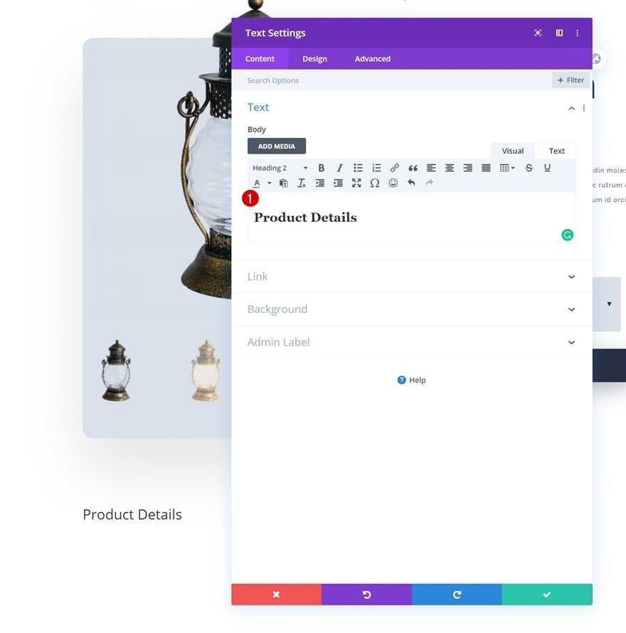
10. Add Text Module to Column 1
- Add H2 content
Continue by inserting a normal Text Module into column 1 with your preferred H2 content.
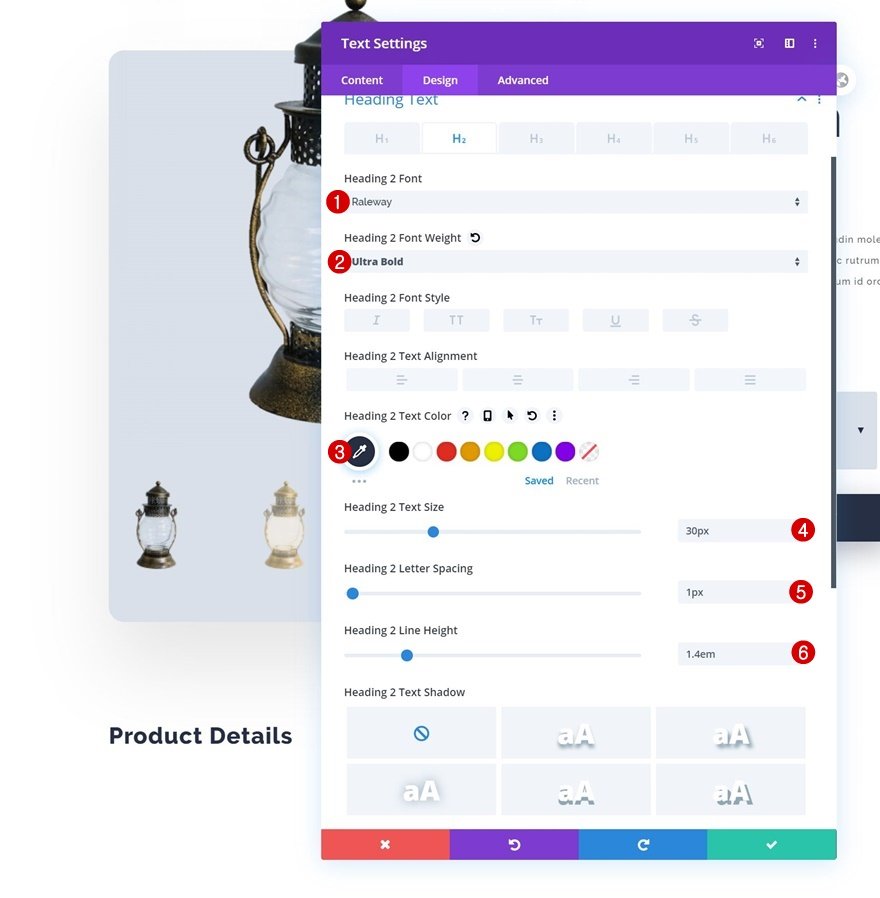
- H2 Text settings
Next, go to the design tab and modify the H2 text settings.
Heading 2 Font: Raleway; Heading 2 Font Weight: Ultra Bold; Heading 2 Text Color: #262f44; Heading 2 Text Size: 30px; Heading 2 Letter Spacing: 1px; Heading 2 Line Height: 1.4em
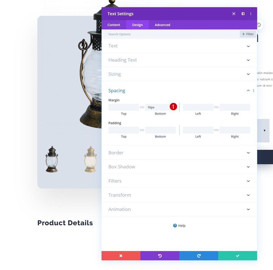
- Spacing
We’ll also need to add some bottom margin to the Text Module.
Here we change margin like this, Bottom Margin: 10px.
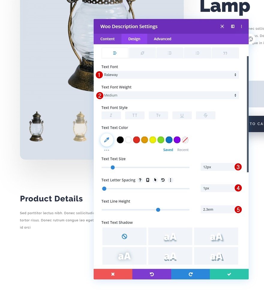
10. Add Woo Description Module to Column 1
- Dynamic content
In column 1, place the Woo Description Module directly below the Text Module.
Product: This Product; Description Type: Description
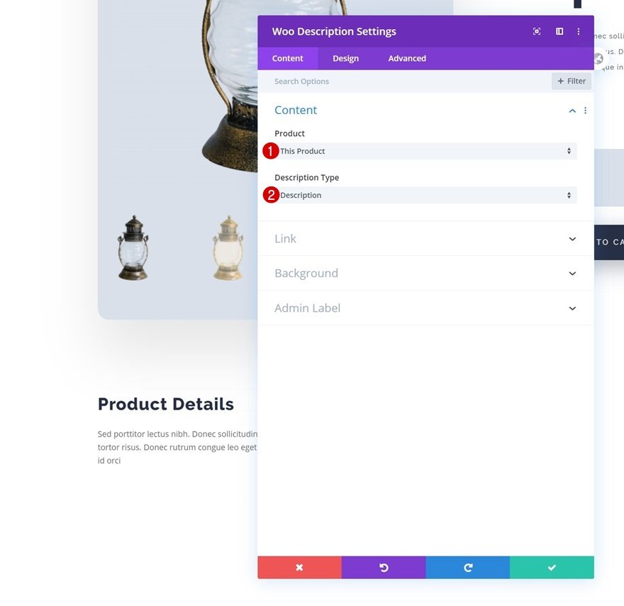
- Text settings
Adjust the text parameters as follows:
Text Font: Raleway; Text Font Weight: Medium; Text Size: 12px; Text Letter Spacing: 1px; Text Line Height: 2.3em.
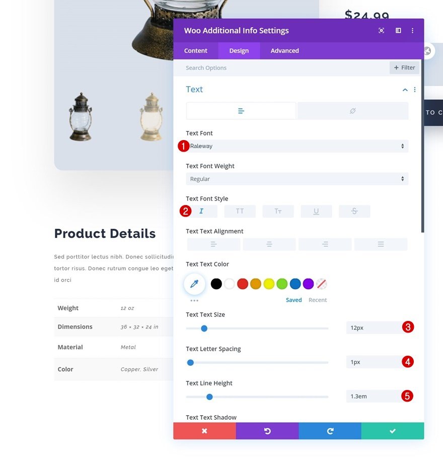
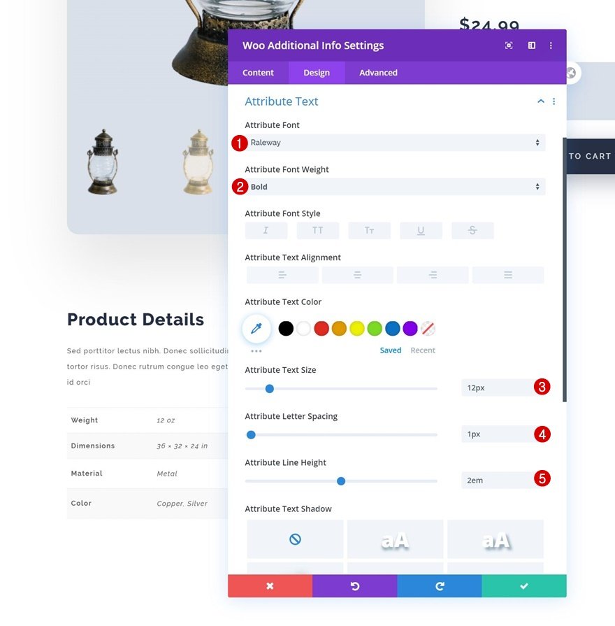
11. Add Woo Additional Info Module to Column 1
- Elements
We’ve also included the Woo Additional Information Module. Turn off the title in the element settings.
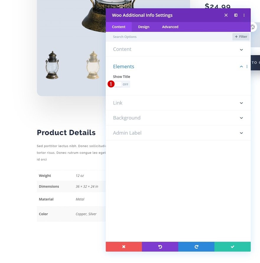
- Text settings Here is how we change the text settings. Text Font: Raleway; Text Font Style: Italic; Text Size: 12px; Text Letter Spacing: 1px; Text Line Height: 1.3em
- Attribute Text Settings
Let’s change the attribute text settings as well. Attribute Font: Raleway; Attribute Font Weight: Bold; Attribute Text Size: 12px; Attribute Letter Spacing: 1px; Attribute Line Height: 2em
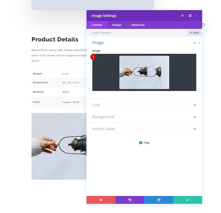
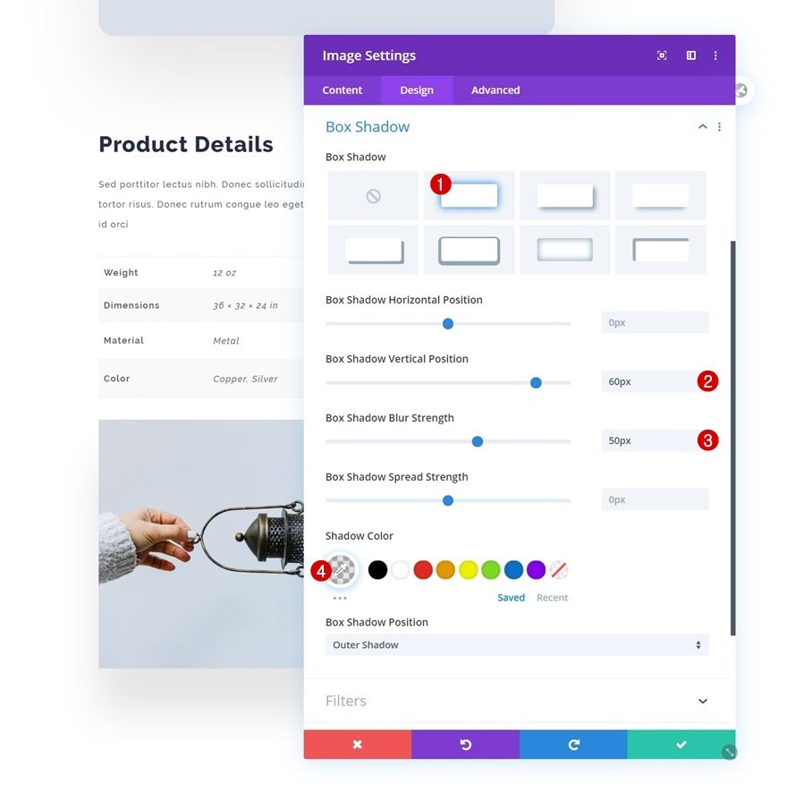
12. Add Image Module to Column 1
- Upload Image A regular Image Module is the next and last module in column 1. Choose a suitable image to upload.
- Box shadow Then, under the design tab, create a subtle box shadow. Box Shadow Vertical Position: 60px; Box Shadow Blur Strength: 50px; Shadow Color: rgba(0,0,0,0.1)
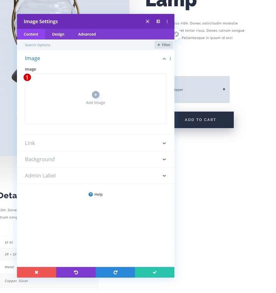
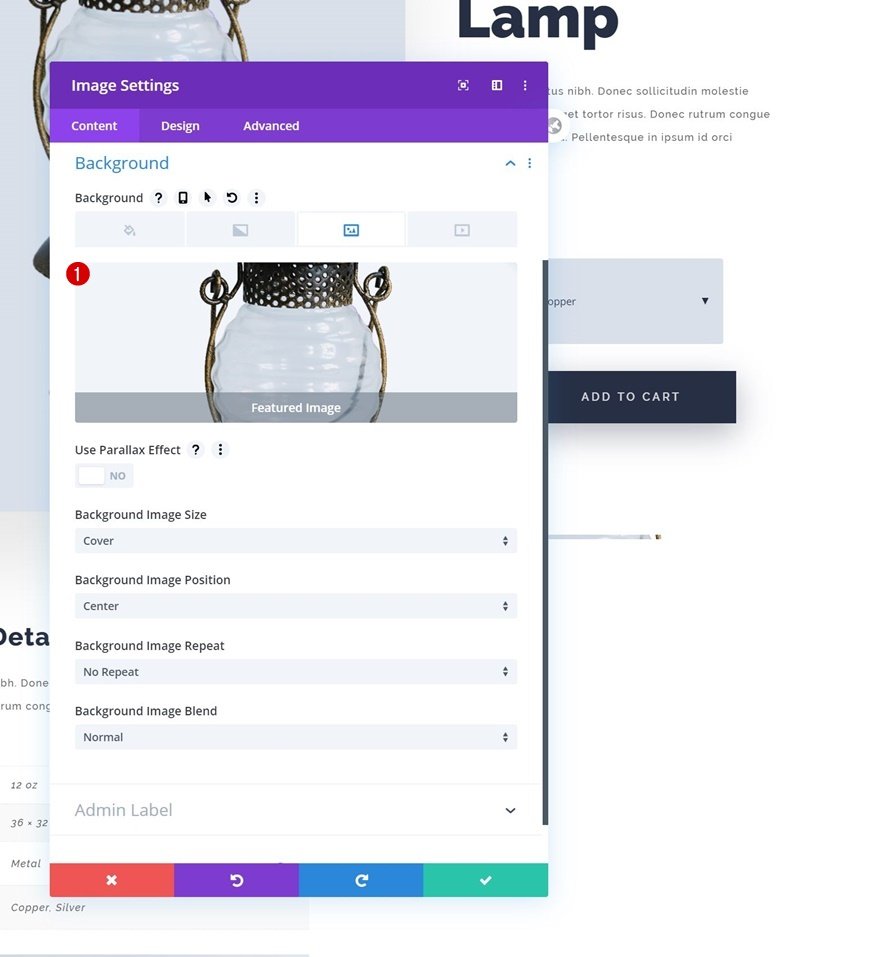
13. Add Image Module to Column 2
- Leave Image Box Empty
The only module we require in column 2 is a regular Image Module. Make sure the content field is left blank.
- Add Dynamic Background Image
Alternatively, we’re utilizing dynamic content to link the background photo to the product’s featured image.
Background Image: Featured Image
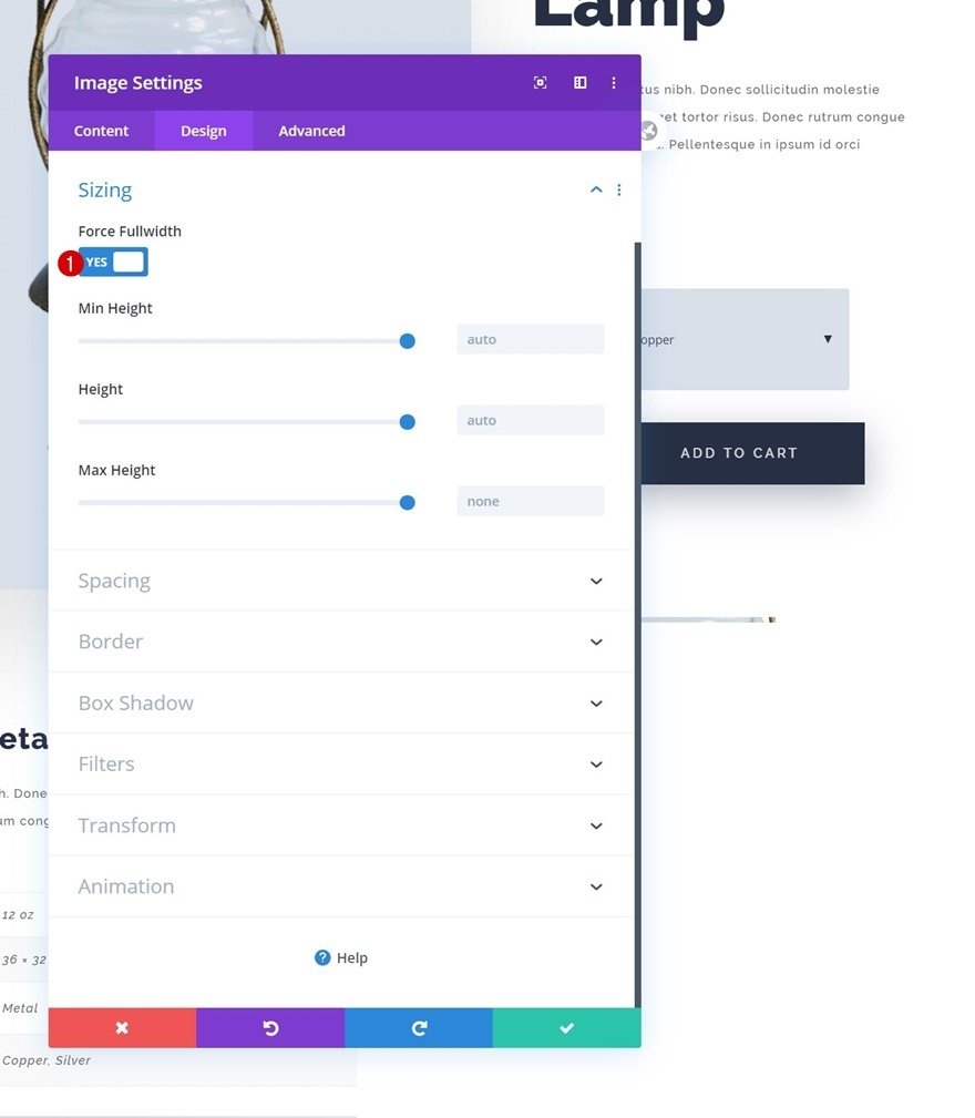
- Sizing
In the size options, we’ve also made the Image Module fullwidth.
Force Fullwidth: Yes
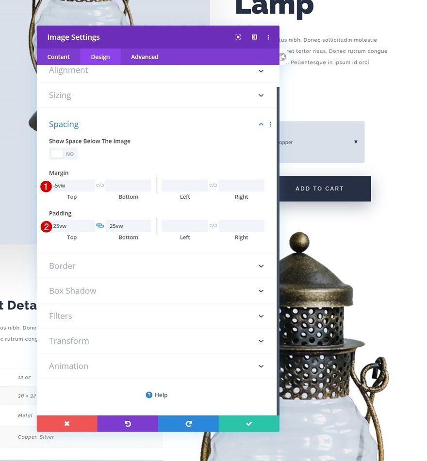
- Spacing
Next, we’ll change the spacing settings to increase the module’s size and generate some top overlap. Top Margin: -5vw; Top Padding: 25vw; Bottom Padding: 25vw
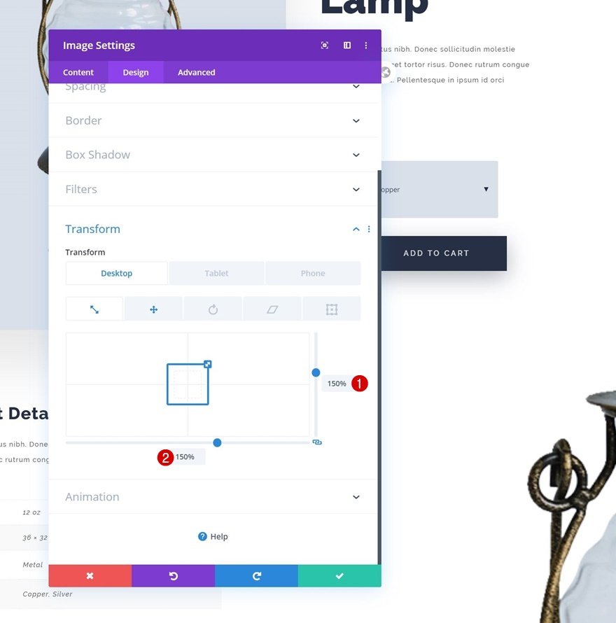
- Transform scale
Then, by adjusting the transform scale settings, we’ll expand the module’s size even further. Right: 150%; Bottom: 150%
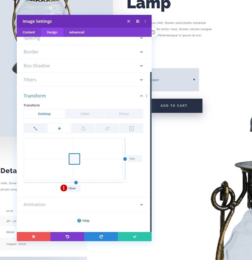
- Transform translate
We’ll also use a bottom transform translate value to reposition the Image Module.
Bottom: 18vw
- Visibility Finally, we want this module to only appear on the desktop. As a result, the complete module will be hidden on tablet and phone. The design is finished after that is done!
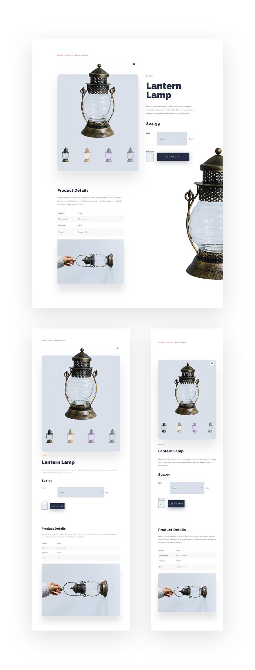
Here are the results after all 5 major steps you’ve done.


Final words
We hope that you will have much useful information about how to create a custom product page with Divi theme by reading our today’s.
If you have any questions, feel free to reach out to us via the comments section below. We would love to help you out.
Thank you for reading and we’ll see you in the next article.
